Pages

Showing posts with label Copperplate. Show all posts

Friday, 20 December 2013

The final pieces in situ...

I decided to re-do the inside cover for the box in the same copper colour as the other piece. I still haven't managed to find the flow and balance of the flourishes that I had in the original attempt, but the technical execution of the actual writing is much better, so I've decided to go with the new one. It's so difficult to bring it all together in a final piece and do everything to my satisfaction, but I guess that is what will ultimately drive my improvement!

Also, cutting pieces down and mounting them is a considerable pain, especially when you cut your finger with the scalpel and have to avoid dripping blood on your work!

Thursday, 19 December 2013

A little something for my Mum

It's my Mum's 70th birthday - we're throwing her a party at the weekend and I've been inspired to get my pens out to do a couple of little pieces for the guest book. After 18 months of no calligraphy I genuinely have no idea how I've survived without it. It's been wonderful to spend the last few days rediscovering my love of Copperplate, and I've really had to struggle to tear myself away from it!

Anyway, here are the pieces - I hope she likes them.

Tuesday, 3 April 2012

A Cunning Plan (otherwise known as Wedding calligraphy #2)

Actually just a table plan, but I thought a cunning plan sounded more interesting. Back in my post about place cards I mentioned that my pictures of the table plan-in-progress had got eaten somewhere between memory card and computer - I am happy to announce that my husband is a genius and has caused them to reappear from the abyss.

Laid out but not mounted yet.
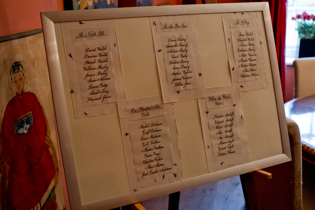
So, my table plan consisted of 5 tables of 9 all named after various places in One Hundred Acre Wood. After seeing some invites printed and overlaid with vellum paper, I thought I'd use a similar idea and write out the names on vellum paper and mount this over cornflower Khadi paper (the idea being that you could still see the flowers through the overlaid paper). All this mounted on some Ivory Canford card and stuck in a nice frame would look lovely.

I think it did look nice in the end, but writing copperplate on vellum paper is not to be attempted lightly (or if you have a short temper). The trouble is that vellum paper (and we're talking vellum paper, as opposed to proper Vellum here) doesn't absorb ink very well. Or at all, really. If you try and use gouache then the paper crinkles up and you loose the intensity of colour as it dries; if you use ink (I used Moon Palace Sumi ink in the end) it keeps it's lovely intensity but takes a long time to dry. The surface tended to be both skiddy and scratchy all at the same time - in short an absolute nightmare to write on. I attempted most of the tables at least twice, and found it really difficult to control uneven descenders and wobbly ascenders. Persistence, however, paid off and I finally had an acceptable version of each for the finished thing. I have a sneaking suspicion that if you prepare the surface with gum sandarac then writing on vellum paper becomes a lot easier - unfortunately I had neither the time nor the means to experiment with this before needing the finished thing.

Cutting and sticking materials.


Other important equipment for assembling the plan can be seen on the right and include: a putty rubber, a prit-stick, scissors, a soft pencil, double sided tape, a very sharp scalpel + cutting mat (be careful with these!), and a metal ruler.
The nice thing about khadi papers is that they can be torn along the edge of a ruler giving you a nice straight edge, but maintaining the nice ragged, rustic look of the natural edges.


All in all I think it turned out rather well considering I'd never attempted anything like it before, and was really just making it up seat-of-the-pants style. The finished thing, mounted and framed looked like this:

(Photo courtesy of the wonderful Kirsten Hunter)


Aside from the aforementioned trouble with the vellum paper, if I were to do a similar piece again I'd probably double mount the tables with a stronger colour behind the khadi paper (perhaps dark purple or blue), and include a similarly mounted title at the top (either simply 'Table Plan' or the Bride and Groom's names and wedding date) to prevent it looking a little bit on the naked side. We live and learn!

Tomorrow, I'm very excited to be heading into London to attend the CLAS Living Letter IV exhibition: All that Glisters at the Oxo Gallery on the South Bank. It'll also be visiting the Design Centre at Sunderland University, and Bath Central Library over the coming weeks, so do go along if you have the opportunity - it features beautiful works from some of the country's top calligraphers and I am anticipating being truly inspired by their skill (I've had a sneak peak at the catalogue and know I won't be disappointed). I'll report back here once I've recovered!

Friday, 2 March 2012

Wedding calligraphy #1

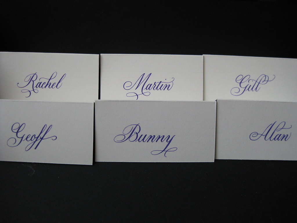
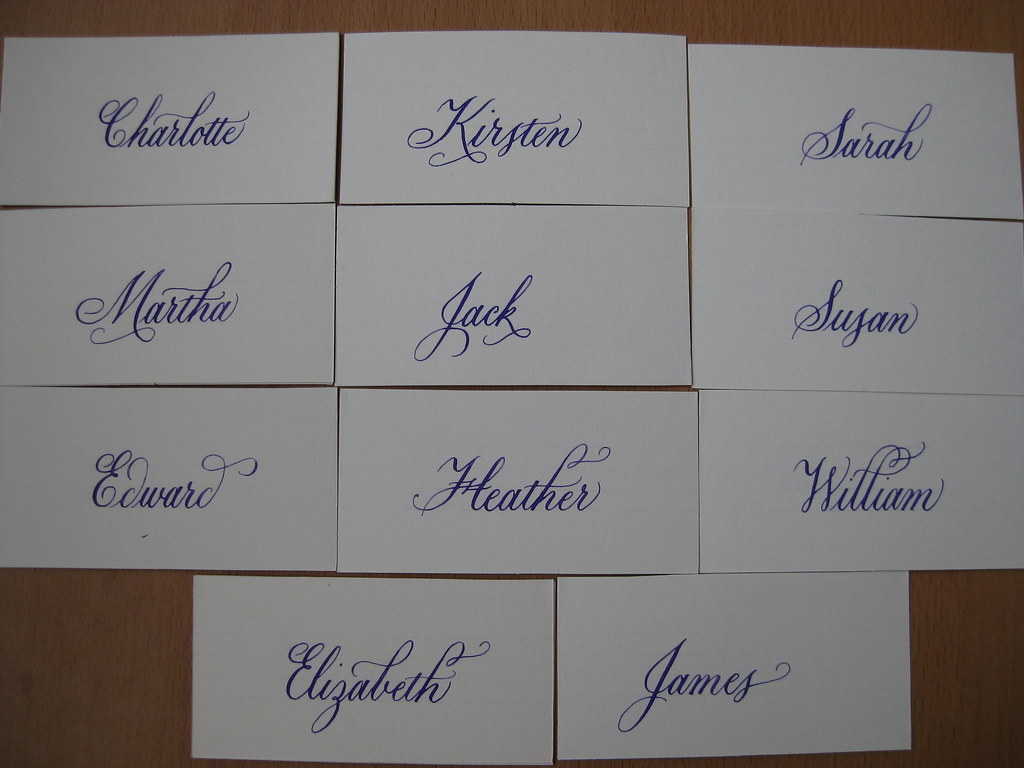
Here's a sneaky peak at some of the place cards I wrote out for my wedding in February. The colour scheme included creams and purples, so for the place cards I mixed some purple gouache and used it with a Brause 66EF nib.


The names were originally written on standard ivory tent-style place cards (from Hobbycraft), but once we'd decided to get the favours from the world famous Grasmere gingerbread shop Sarah Nelson's, I cut each 'tent' in half to give a flat card and tucked them inside a strip of ribbon tied round each box.

Elizabeth is officially the most gorgeous name to write in Copperplate. More people should call their daughters Elizabeth.

I had great fun practicing some little flourishes to add to each of the names. Some lend themselves more naturally to this approach than others, but trying to find something to add to every name was a nice challenge.


I had a lot of positive feedback from our guests, with many of them saying that they'd be keeping their cards as a memento of the day. Unfortunately I don't yet have any pictures of the cards in situ, but I hope that one might crop up somewhere.

I also wrote out our table plan in copperplate. My pictures of this, as a work in progress, got eaten on the journey from the camera to the computer :-( but I should be able to obtain some pictures of the finished thing to share with you soon. The creation of the table plan is worthy of an entire post on it's own! (now there's something to look forward to).


Saturday, 24 December 2011

Happy Christmas :-)

Gold gouache on black card. Brause 66EF nib.

I hope you all have a lovely Christmas and get to enjoy some time off over the coming days.


And while I had the Gold gouache out...


Tuesday, 13 December 2011

Putting my Copperplate into practice

Wow, it would appear to be quite a long time since my last post - the last few weeks have flown by in a whirl of invitations, envelopes and settling in our new cat!

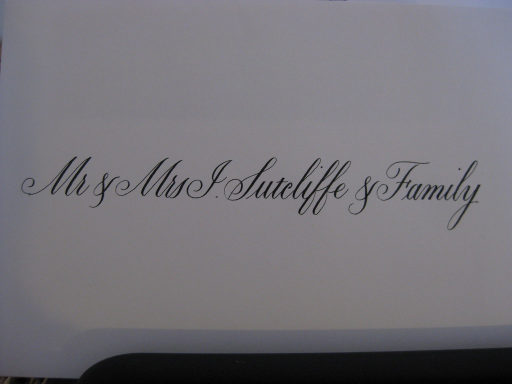
Working through my first full set of  wedding invitations and envelopes has been quite a steep learning curve. Copperplate script is a very popular style when it comes to wedding stationary, whether it's the whole invitation laid out in beautiful swirly writing or just the names added to pre-printed cards; it adds an extra dimension and a touch of something a little bit special. Having the envelopes addressed in the same lets the recipient know that this isn't any ordinary bit of post, and usually grabs their attention from the pile they've picked up from the mat.


Once the most appropriate x-height, nib and ink have been decided upon there are a few more things that need attention: it's important to settle on a particular style of capitals so that the appearance throughout the envelope and card is unified and doesn't look undecided, and it's also important to establish a method for working.


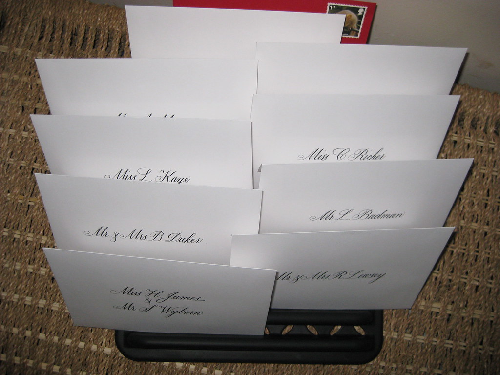
Envelopes drying out in my drying rack


One piece of kit that's essential is some form of envelope drying rack. Now you can by lovely wooden ones from places such as Paperinkarts in the States, which hold 9 envelopes (I've not managed to find a UK stockist of such things), or I chose to use a plastic dish rack which holds 20 envelopes or invitation inserts and was relatively cheap from Amazon! Whatever you decide to use, it's an absolute must in terms of organising your work.


If you haven't thought about it first, it very quickly becomes clear that you need a quick and reliable method of centring names and working out where best to sit them in relation to the text above and below them. The first is easily done with a strip of paper the width of the envelope or invitation, folded centrally and marked off with the start position of each name (working from a practice version written out beforehand). For the second, guidelines marked with an x on the appropriate line help immensely. I'm sure that eventually, when I become practised enough, I'll be able to judge more easily where things start and finish, but for the moment it's safest for me to do a rehearsal version first (on layout paper) to guard against any nasty surprises!


 As for the cat, it's best to try and keep him safely out of the room so that he doesn't walk muddy paw-prints all over your work!

Doesn't he look hard-done-by?

Monday, 24 October 2011

Dealing with my gilt complex (with thanks to Terry Pratchett)

This week I have mainly been...

1) Panicking about how much calligraphy I want to do (and how little time there is in which to do it)

5 Months have passed since I first joined the CLAS Copperplate Special Interest Group and that can mean only one thing - it's time for another round of envelope exchanges. Disappointingly, only three of the five envelopes I was expecting to receive in the last round turned up, so this time I offered to be in two groups, thereby doubling the number of exciting envelopes that will drop through the door (I know, I didn't think about the 'twice the amount of work' aspect at the time!). On a more positive note, one of the recipients of my envelopes last time was impressed enough to feel the need to write back, so I am busy preparing another envelope to send in reply :-)

2) Gilding/Making a card for a friend (This bit is slightly more interesting and involves more pictures... )

Next weekend we are off to a friend's birthday party and, not needing much of an excuse, I thought I'd have a go at making her a card. Last time I was at a workshop my tutor showed me a commissioned piece that she had recently finished that was gold leaf on an acrylic wash background. 'Oooh', I thought, 'that looks pretty - I wonder if I could do that'.

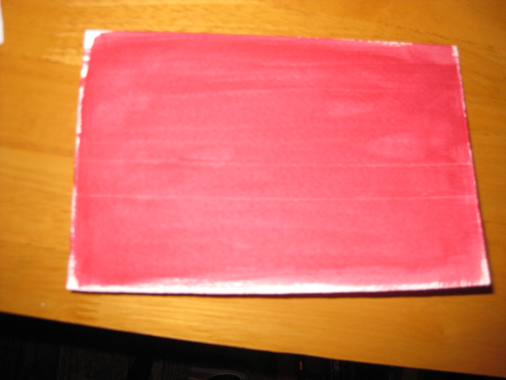
A very out-of-focus picture of a card with acrylic wash
My ever wonderful Mum (who is a watercolour artist and veritable mine of information on all things crafty) had previously provided me with some cards of watercolour grade paper with deckled edges, a book of gold leaf (loose), some size (glue) for sticking the gold leaf to the paper, and a large flat brush for washes. I watered down some crimson acrylic paint and painted a fairly intense wash on two cards (see right) and a piece of watercolour paper for experiments.

I hadn't taped any of these down (mainly because I've lost my masking tape) and to my horror they immediately began to curl up. 'Fallen at the first hurdle', I thought, but actually as they dried they flattened out again - phew!

Some experimentation in black ink on layout paper ensued, to get the right nib size and finalise the Italic variation I would use, and after this I ruled up on the test card (using a white pastel pencil - this shows up against the paint, but will also rub out). Initially I just used the plain size in the nib reservoir to write onto the prepared paper, however not only is it a bugger to see once it's dry, but it's also very thin and flowed too quickly out of the nib. I persevered and made a fairly messy attempt at sticking the gold leaf to it, but I learned some useful lessons before attempting one of the cards.

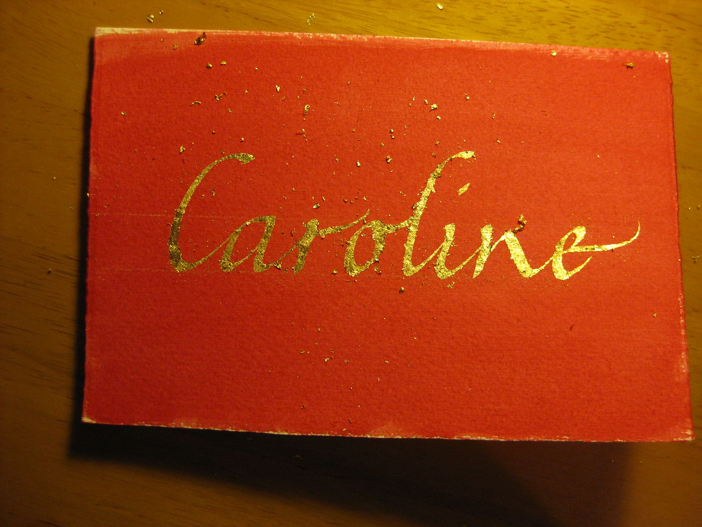
Immediately after the gold had been applied - gold bits EVERYWHERE!

The second time around I added some Dr. Marten's Pen White to the size which had the double effect of thickening the liquid and allowing me to see where I'd written. I then used two very small brushes to apply bits of gold leaf to the writing. Two bits of advice: press the leaf on, don't brush; and DON'T BREATHE! - the stuff is lighter than a feather and will get *everywhere*.


Brushed down, but not birnished


 After replacing any usable bits of gold leaf back in the book, I used an old (soft is the key) make-up brush to brush gently over the surface to get rid of any bits that weren't stuck down. The card then looked like this:


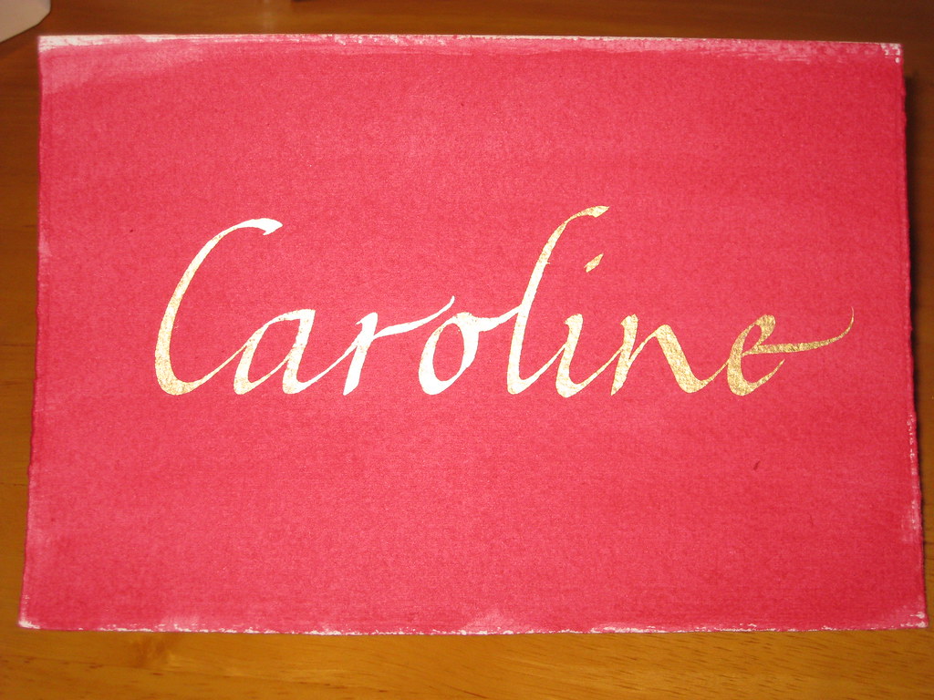
 Finally, some patience was required to let the gold and size dry thoroughly before burnishing (rubbing over to bring out the shine) with a soft cloth. There are special tools to do this, and I have heard that a piece of silk works very well too, but having neither of these I plumped for a soft cotton hanky and it seemed to do the trick:


 The result is pleasing, no? Anyhow, I hope she likes it - I had great fun doing it, and will definitely be doing more in the future!


Monday, 5 September 2011

Birthday Bonanza

After a long and not-so-hot summer, September hits our family with a quadruple-whammy of birthdays in the first week alone. This can get expensive (admittedly one of the birthdays is my own, so I can't complain too much :-)) but it's also a great time to try and get creative. After spotting one of the envelope exchange jobs I'd done for my most recipient, my sister requested a hand-made card for her own birthday and I was happy to get scribbling with a few experiments.

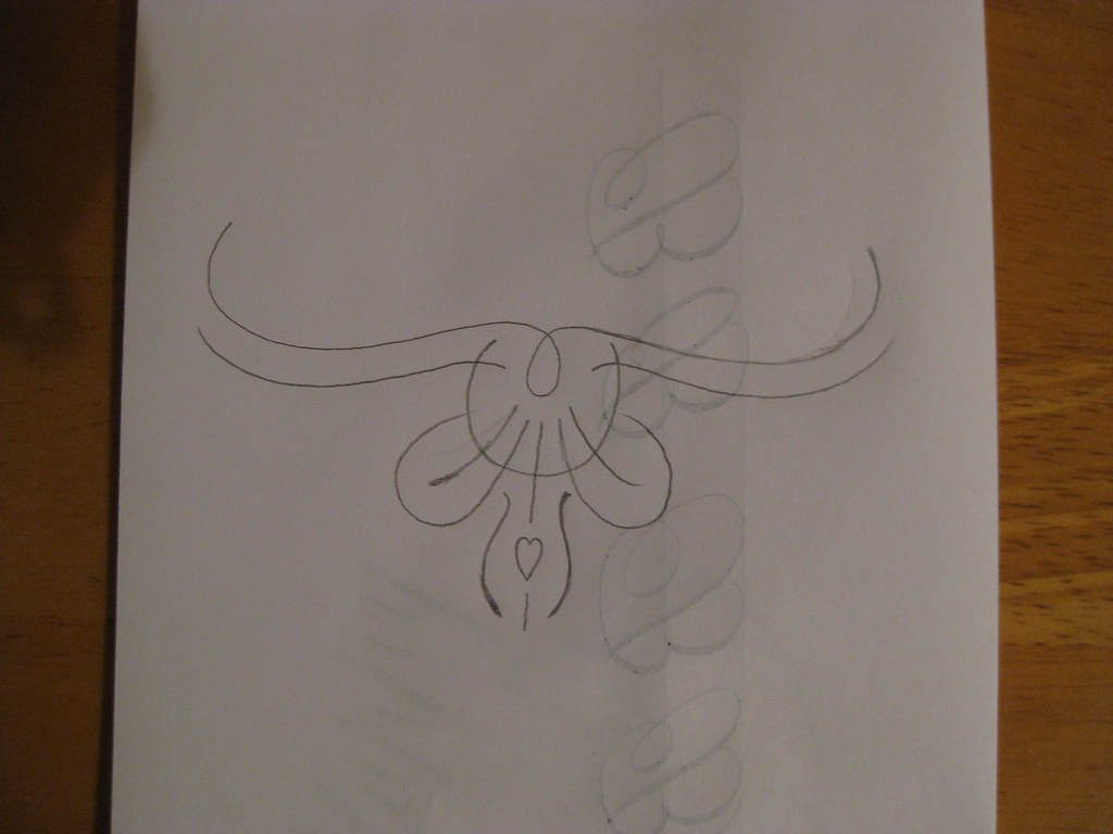
Pencil sketch of the flourish


 After a little consideration of my efforts, I settled for a simple 'Happy Birthday' in gold gouache on front front of the card with a little hand-designed flourish (more of a doodle) underneath (see right).


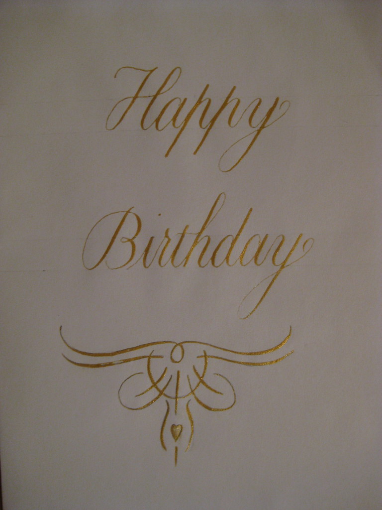
Final 'rough'


As usual the final practice version of the card turned out to be the best one *sigh*, but I set about making four usable cards, each slightly different for the other.


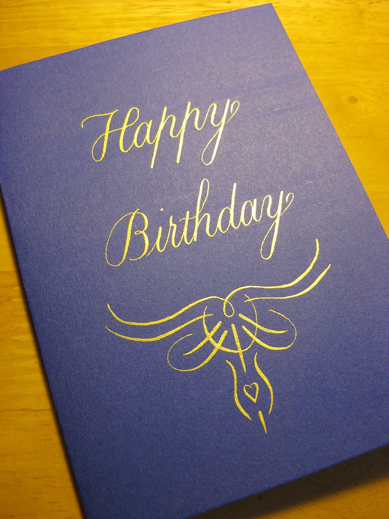
The finished version sent to my sister looked a little like this:
Final version: Schminke Gold Pearl Gouache on Purple card, done with a Brause 66EF nib
(in fact it looked suspiciously like that!) the final four can be seen here in the gallery.
 

Friday, 24 June 2011

I'm on a roll

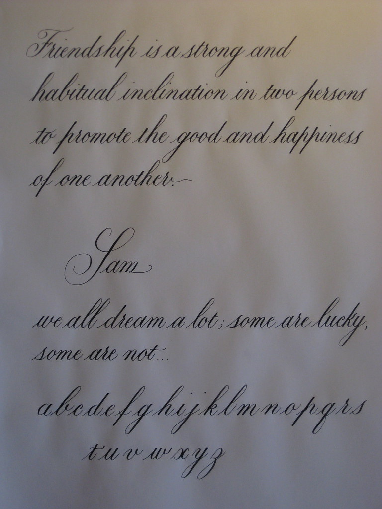
Just a quick one to show off a page of Copperplate I produced last night:

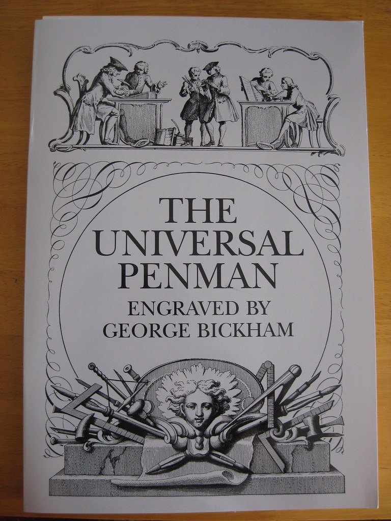
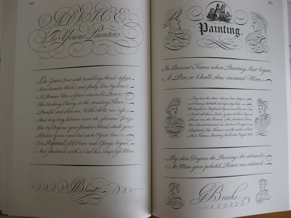
This was written using an EF Principal nib and Higgins Eternal ink. The top paragraph was copied from the wonderful Universal Penman by George Bickham. An incredible book produced in the 18th Century showcasing engraved Copperplate and Roundhand scripts from seemingly all the Master Penmen of the age. If you don't have a copy go and buy one now - you can spend hours marvelling at it, and it's got lots to copy and experiment with, including some pretty spectacular flourishing.
The other quote on there was just what I happened to be listening to at the time. A prize for anyone who can name the musical!


Thursday, 23 June 2011

I have come to the conclusion...

...that Envelope Exchange envelopes are like buses; you wait ages for the first one and then three turn up at once! Two more have arrived since my last post here - both nice examples of Copperplate, the most recent one being an absolutely superb example of what you can achieve in terms of layout and making the most of the space available - it rather raises the bar! (although in my defence I believe they've all been at it a bit longer than I have).

In turn I have sent my second envelope off to:
This one was written using my Brause 66EF nib in Dr. Martin's Bleedproof White. It's actually a dark purple envelope, but seems to have come out more black in the photo.

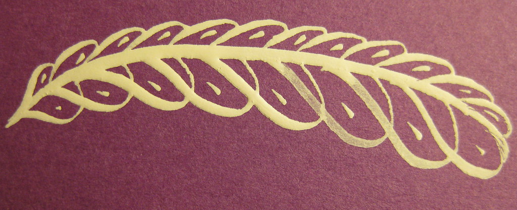
I also added a little offhand flourish like the feather pictured left (this was one of my practice ones). I'm always slightly terrified of adding things to an envelope that I'm pleased with, just in case I ruin it, but it's no excuse not to try really.


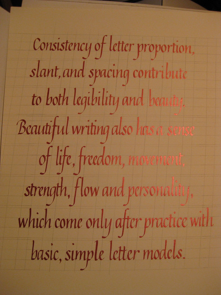
 Having received the set of Brause Bandzug nibs I mentioned here, I embarked on the 8 lines of continuous text needed for the CLAS certificate. I also decided to have a look and see what it looked like using the Schminke Red Pearl gouache watered down to use as ink. The results of my first attempt looked like this:
(apologies for the rather under-exposed photo - click for bigger)
I have to admit that I had huge difficulties getting the ink to flow nicely from the nib, resulting in several severely botched letters (it seemed reluctant to flow from both tines at once). I think it was simply a case of it being too thick ('Sorry Gromit, that was a bit thick!'), but having started I tried to persevere. Layout-wise it's not too bad, apart from needing to be consistently an inch further to the right, and this photo shows the pearl sheen of the ink really well. Unfortunately I don't think it's good enough to send in, so will have to do it again (probably just in black this time), but I was encouraged to see that amongst all the mistakes there's also so really nice lettering in there.
The deadline for entries is the 30th of June, so I'm going to be hard-pushed to get it all done in time, but if I work hard over the weekend I might be lucky!

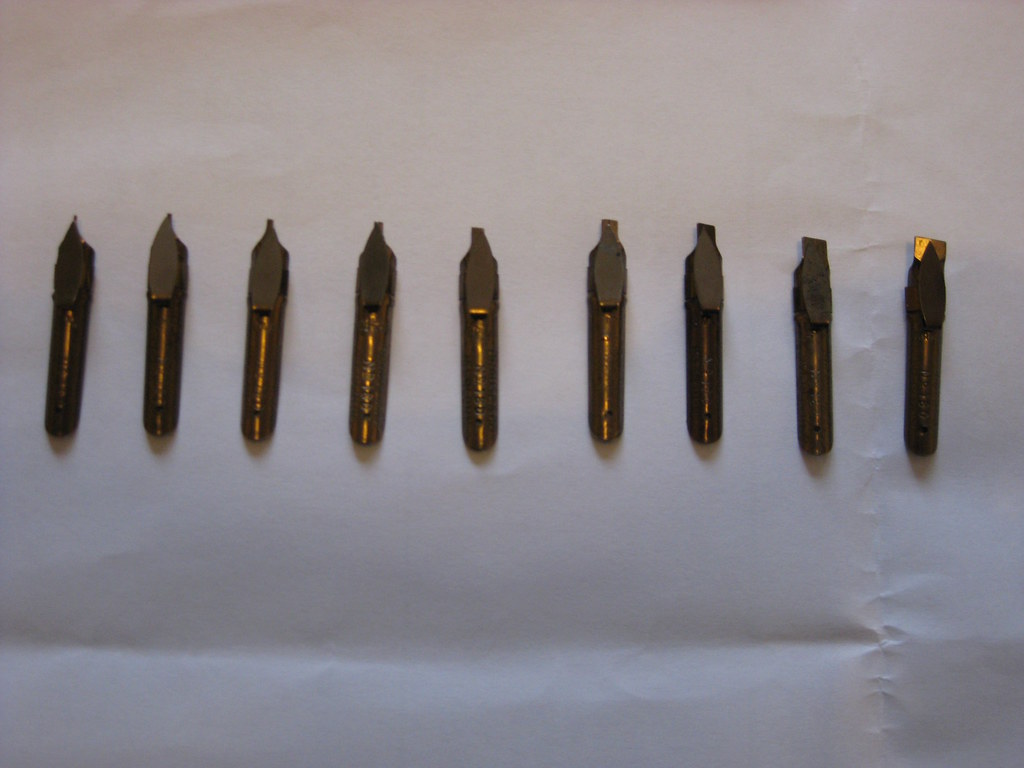
And finally, here's a picture of the full set of Bandzugs in all their glory:

Wednesday, 15 June 2011

It's here!
Yesterday I received my first Envelope Exchange envelope! I love getting post anyway, and to arrive home to find a beautifully handmade and embossed envelope addressed to me in elegant, sloping Copperplate really made my day.
You may remember my anticipation in receiving my first envelope way back in this post. I have to admit I'd all but given up hope of getting last month's envelope, believing it to be lost in the post or forgotten about, but the sender celebrated a milestone birthday in May and had been rather rushed of their feet so didn't have a chance to send it until June. The beauty of the envelope and the touching letter it contained more than made up for the delay in receiving it, and I'm looking forward not only to returning the exchange, but also writing to the sender to tell them how much it brightened up my day :-)

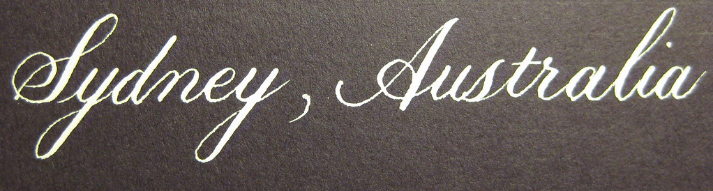
Speaking of the exchange scheme, I really must get on with this month's effort as it needs to wing it's way all the way to sunny Australia! I'm not sure I've ever had cause to post something to Oz before, so it's all very exciting. And can anyone enlighten me as to where I can get my sticky paws on some slightly more interesting stamps? I mean, Liz II is all very well and good, but I was hoping to get something a little more... picturesque. Do I just go into a post office and ask for  a book of 'exciting stamps' ?!
Wednesday, 8 June 2011

Spaced out

Apologies for the recent radio-silence, things have been getting a little hectic of late and suddenly it's more than three weeks since I posted anything!

The eagerly awaited parcel finally turned up, and included a couple of Brause Rose nibs, some Brause 66EF nibs (plus special oblique holder for them), and Brause Bandzug 2.5mm broad-edged nib and some Moon Palace Sumi ink. Of all the contents I was only disappointed with the Brause Rose nib, but I will happily admit that I've hardly given it a chance and perseverance may prove that I'm entirely wrong - it just seemed to give very thick and messy lines :-(

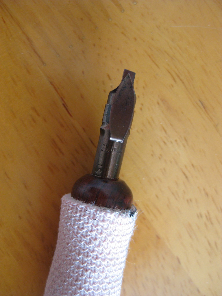
Brause Bandzug 2.5mm nib
The Brause Bandzug (left) I am absolutely in love with. The Bandzug is a far better quality broad-edged nib than the Speedball nibs I have been using. Crisp, clean and smooth lines are consistently produced, and the reservoir holds seemingly no end of ink. It has a right-oblique cut for right-handed calligraphers that helps maintain nib-angle and is an absolute joy to write with. So much so that I've ordered the rest of the set (you can by sets of 9) so that I can have the complete range from 0.5mm right the way through to 5mm. Brilliant. What's more, the numbers assigned to each nib correspond to their width in mm - so no more having to remember which set of numbers is which width (as with almost every other manufacturer)! It's almost as like they thought about it.


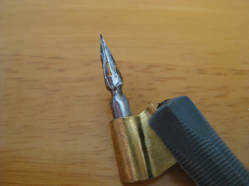
Brause 66EF nib
The 66EF (right) is also lovely to write with. Smooth running without being excessively 'sharp' it produces nice hairlines and is particularly good for smaller  x-heights. Used in combination with the fantastically rich black Moon Palace Sumi I've been enjoying the results immensely.
The aforementioned Sumi ink seems to flow well from both of these nibs, but it has needed watering down a touch for use with some of my other copperplate nibs (the EF Principal in particular).


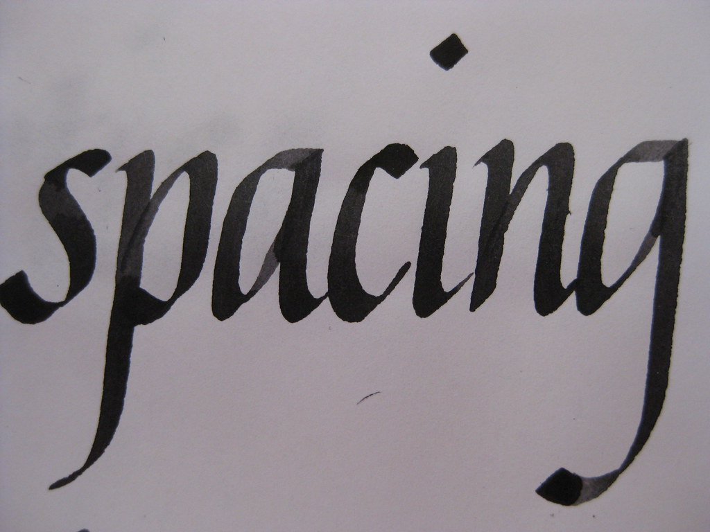
But enough waffle from me about calligraphy tools, what about the actual writing? Well for the last couple of weeks I've been working mainly on my Italics (just because they're easier to pick up and put down if time is tight) and playing with the above nibs. I'm fairly pleased with how my letter forms are coming on, but something was still looking a bit funny about the sheets I was producing. I asked my tutor, and he spotted it straight away:

Brause Bandzug nib, Higgins eternal ink (I think)
Both internal letter spacing and between words (I want to write inter-wordal, but don't think it's allowed really!). I've been working hard on this and it's getting a lot better - the consistency looks miles better and some of the practice sheets I'm really quite proud of, so I'm thinking of having a go at a CLAS Certificate to see what the pros think!


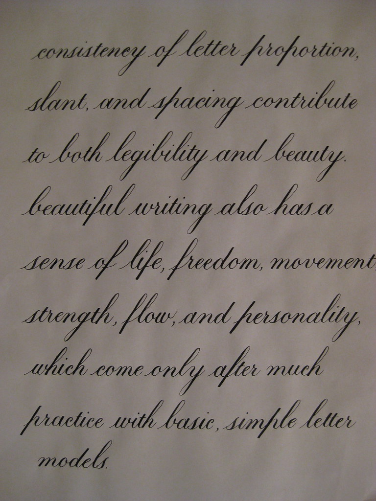
Here's a bit of Copperplate to show I haven't abandoned it! This is the text I'm thinking of using for the continuous prose bit of the certificate. I'm beginning to really prefer the 1:1:1 ratio for Copperplate - I think it always looks much more elegant than the 2:3:2 that I started with, so I'll stick with what I like best :-)


That's about it from me - I'm going to try posting more frequently in the future with the idea of keeping the length a little bit more manageable. Well done if you made it this far!

Wednesday, 18 May 2011

Taking a break from the pointed pen

This time last week I was wittering on about looking forward to learning the basics of Carolingian minuscule at my evening class. Here's how I got on:

(click for bigger)
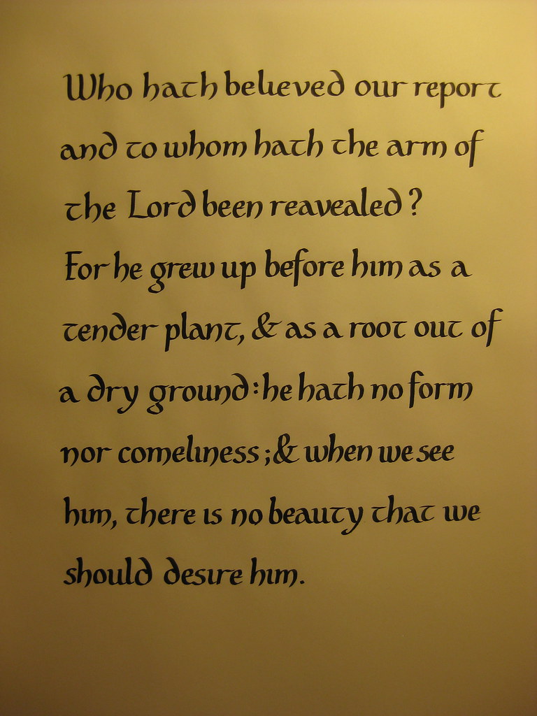
We tend to spend the first half of the evening discussing a particular script and practising the basic letter forms, and if we feel we're getting on well enough we can then go on and try using it for a passage of writing. I'm a firm believer in running before I can walk, so like to practice by writing things out rather than just copying out the alphabet ad nauseum.
The rounded bowl-shapes of the m, n and h lean more towards Uncial than Carolingian (as does the rounded ascender of the d), but my Calligrapher's Bible used these and I preferred the more distinctive look it gave over the straighter stems that were more like Foundation hand. A great hand for anything with a slightly Celtic feel to it - especially with a Celtic-knot border. Care needs to be taken over the spacing though, as it really shows up any overly-large white spaces (or any cramped lettering).


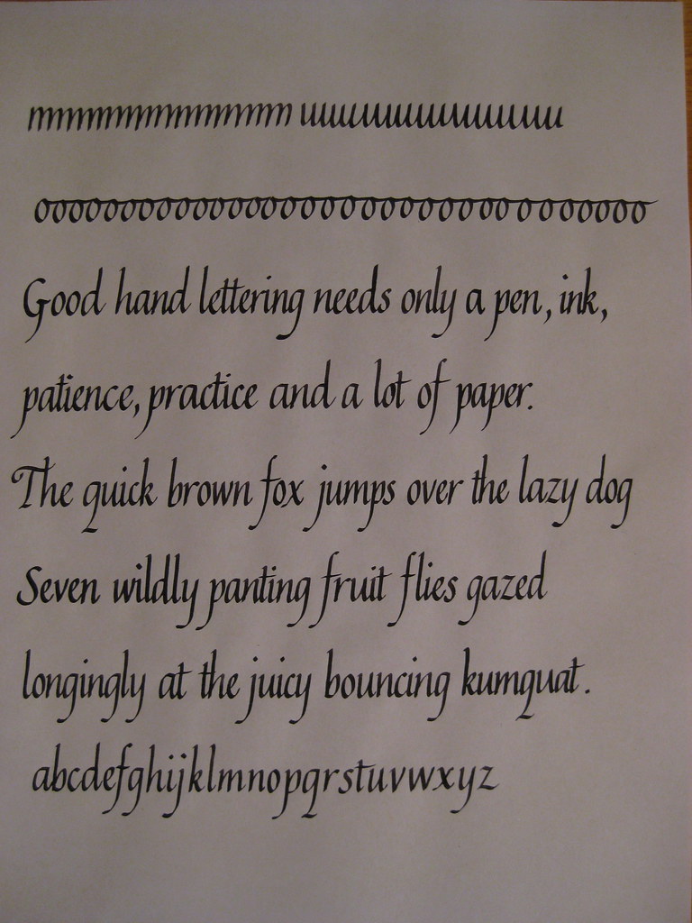
In other news, my Italics also seem to be progressing well. Here's a practice page from last week:
Much more consistent than earlier attempts, but this does appear to have been at the detriment of my Copperplate script, which I've been taking a little break from recently.


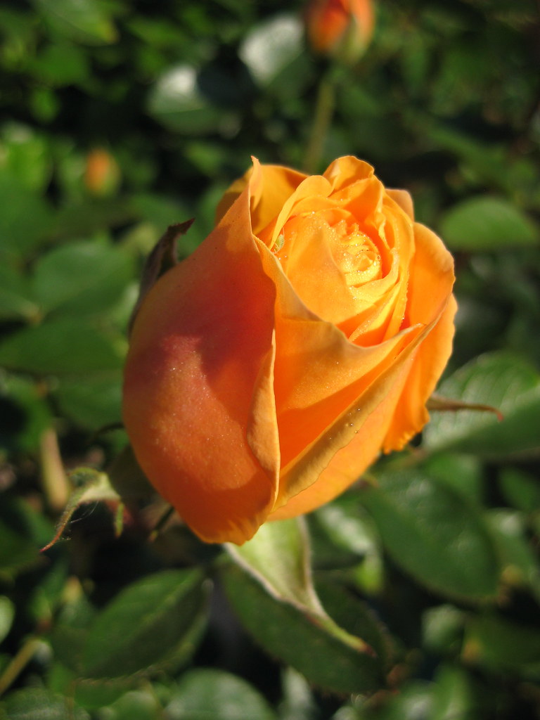
The lovely blossoming Crab Apple tree that I posted a picture of last time has sadly become a casualty of the building works at home :-( but we do have some lovely roses (see right) to make up for it a little bit. Looking forward to choosing a replacement tree to plant in November though.


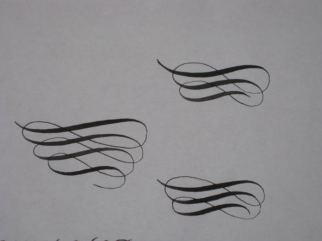
And here's an early attempt at some flourishing. Still waiting [im]patiently for my parcel...

Tuesday, 10 May 2011

Getting distracted

A couple of weeks ago I had every intention of diligently pursuing Dr. Joe Vitolo's videos on IAMPETH on Copperplate majuscules, but I appear to have got distracted by several other things and am yet to find the time to watch them.

First off I received my copy of Ken Fraser's Copperplate Handwriting and spent some time going back to basics and working my way through some pages of exercises. I won't go into too much detail here as I intend to write a proper review of it as soon as I get the chance. Then the builders moved in at home, bringing with them their own special kind of chaos; next I thought I'd try my hand at some offhand flourishing exercises (which is an excellent way of ruining a perfectly serviceable nib, but very satisfying all the same - pictures to follow); and finally I received my list of envelope exchange addresses for the next 6 months :-)

The envelope exchange is run by the CLAS Copperplate Special Interest Group and basically means you complete an envelope design for a different person each month. It's great because not only do you have a small project to focus on, but you get to receive a lovely envelope each month too. Obviously I'm not going to be posting pictures of people's names and addresses, but let's just say that the one I've sent this month is PURPLE with silver ink :-) (and even a small attempt at a flourish in the corner). I'm quite pleased with the way it's turned out, but have learnt that Winsor & Newton metallic inks need to be thinned with water before being used for pointed pen work.

Things I'm looking forward to include:
  • receiving my fist envelope exchange envelope
  • receiving my latest order from John Neal Bookseller, which includes a DVD on flourishing techniques and some nibs to play with
  • attending some workshops with renowned local calligrapher Gaynor Goffe
  • learning Carolingian at my class tomorrow evening
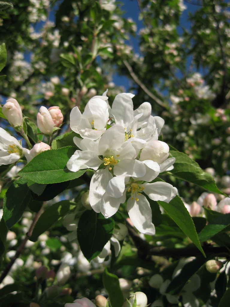
And because this post would be otherwise entirely devoid of pretty pictures, here's some Crab Apple blossom:

Tuesday, 26 April 2011

Dr. ... Qui?

It would appear that I haven't posted for a while - how very remiss of me! I have however been doing some scribbling, with some interesting results.

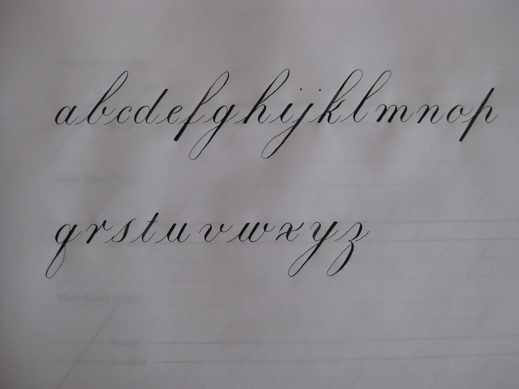
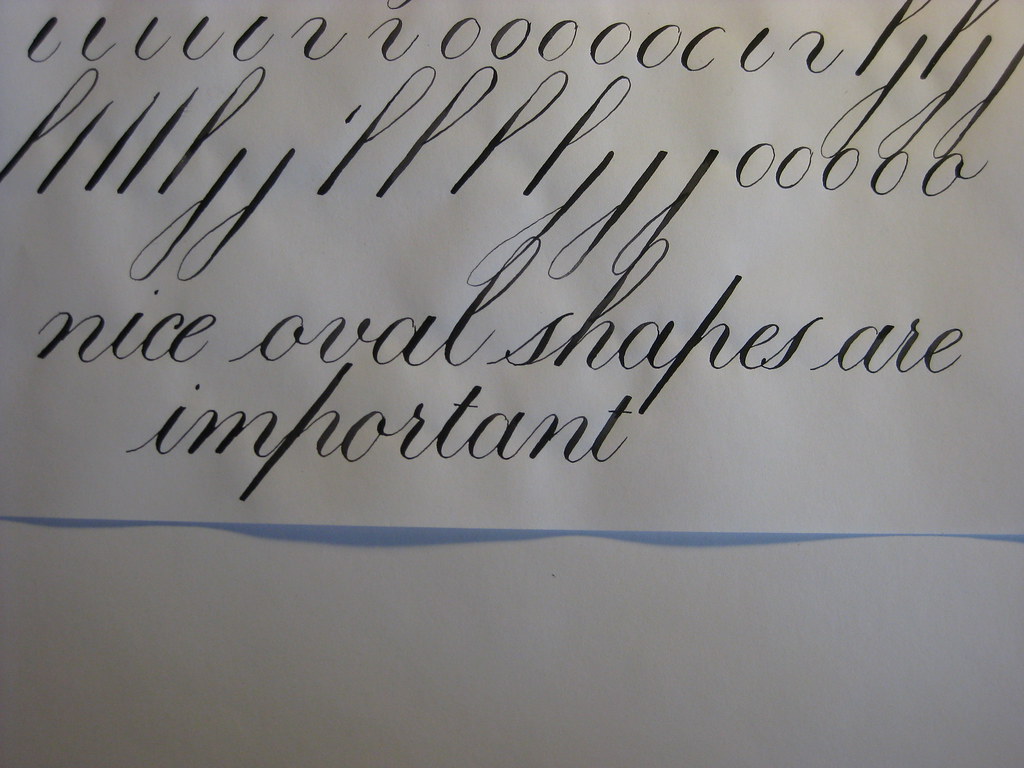
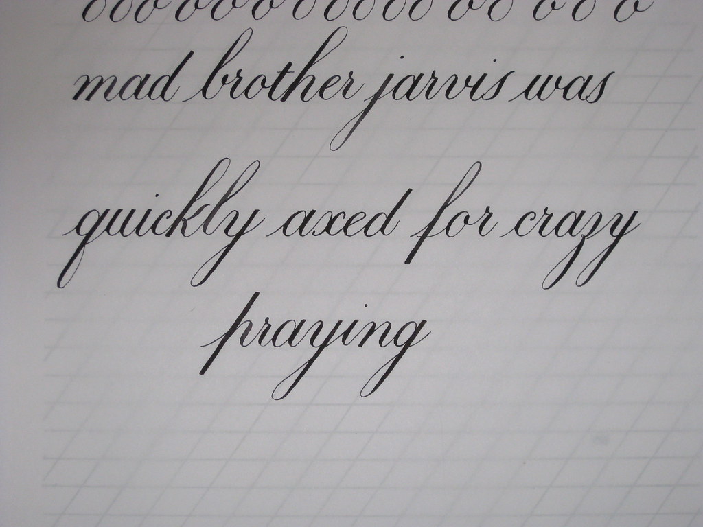
After the monumental efforts of my last post, and having come to the conclusion that I need to slow down and relax, I decided to have a play around with a different method of writing Copperplate script. To this end I visited the IAMPETH website and watched my way through Dr. Joe Vitolo's series of clips on how to write his particular style of Copperplate (the lessons can be found here). The most obvious difference between Dr. Joe's method and the Winters book that I had been using is that Dr. Joe is far more concerned with the perfect formation of the individual letters than developing a flowing style of handwriting: he lifts the pen and turns the paper round and does all sorts in order to get the most consistent shapes. This is not to say that the resulting script doesn't look seamlessly written, it does and it's really rather lovely, it's just a different approach - and one that emphasizes what works best for you at that. So I've been playing around with the minuscules again, with the following results:

This was my first attempt - I'll probably never get it this good again. Rats.

Poor Brother Jarvis, I seem to be  becoming obsessed with him!

Not too bad for first attempts I think. I also took advantage of the clip that goes through how to adjust the flange on an oblique pen-holder properly - it makes a lot of difference!


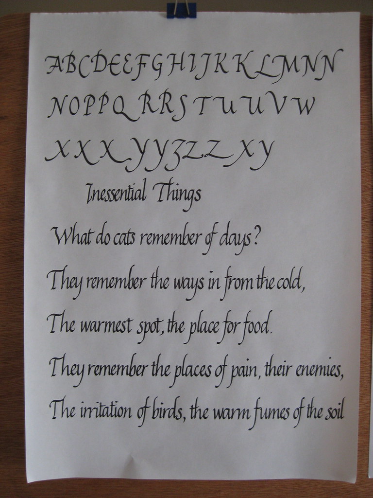
 Over the Easter weekend I also took the time to refresh my memory of the Italic script. It's amazing how quickly it drops off if you don't practice regularly, so I think I should probably set aside one or two days a week for this.

The poem is by Brian Patten - one of my favourites.


I really must learn how to spell


Apart from being a bit rusty I found the letter forms came back to me quite quickly, and I've certainly developed a flow that wasn't there before. However, I do find that writing with this pen (a Rotring ArtPen 1.5mm) makes my hand hurt a significant amount. I'm probably gripping too much.


That's all for now folks, next I'm going to have a look at Dr. Joe's take on Capitals (and carry on practising my Italics). Oh, and Calligraphy classes start up again next week - hurrah!

p.s. A prize for anyone who gets the Bill Bailey reference.

Friday, 15 April 2011

Lessons for life, from a Bear of very little brain.

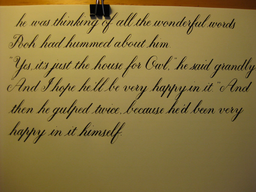
So here, as promised in this post, is the completed extract from 'In which Eeyore finds the Wolery and Owl moves into it' as written by Me:


(Apologies for the dodgy image quality - this is a scan, but I'm still working on the best way of sharing images of my work. Hopefully it's better when you view the larger images).

This is my favourite ever Winnie-the-Pooh excerpt, and I thought it would be a nice way of starting off practising longer pieces. Instead of rambling interminably about the various aspects of what I've written I thought I'd try and keep it succinct in the following way:

Good Things
  • Relatively consistent looking throughout the three-and-a-bit pages
  • Only one spelling mistake (that I've noticed) - sorry Eeyore!
  • There were no 'second attempts' at any of these pages - it's all as written the first time round.
Less-good Things 
  • I made a spelling mistake
  • The baseline is a bit wobbly and inconsistent
  • I'm having trouble keeping the 'h' downstrokes straight - mostly I need to come fruther back round with the ascender loop
  • I need to take far more care with the baseline parts of the letters h and n to make sure that they have even depth (this is partly why the lines are a bit wobbly)
Next time I will:
  • Choose a shorter passage!
  • TAKE MY TIME over each letter and word
  • Use darker guidelines or draw light pencil lines on the paper
  • Relax and warm up properly - it can be so tempting just to launch straight into it and only hit your stride some lines later
  • Take more care sqauring-off  and re-touching letters. NB this should be done with a finer nib
This piece was done using my Brause 361 nib and Higgins Eternal ink on Winsor & Newton Smooth Surface Cartridge Paper. This paper has a nice off-white colour and is just about smooth enough for pointed pen work, as long as you're relaxed about it. It's quite thick though, hence my difficulty in seeing the guidelines!

I learnt so much doing this piece; the main one being SLOW DOWN. It's so easy to think you can write faster just because you can write joined up, but it's a recipe for disaster. I recently saw the following in a Copperplate newsletter: Rules for Copperplate writing:
                                     Rule One - WRITE SLOWLY
                                     Rule Two - See Rule One

This pretty much sums it up I think! That being said, it is important to try and find the balance between 'slow' and 'flow', which I think comes from being relaxed both mentally and physically. So next time I'll be doing my best to slow down and relax, and also keep in mind the technical issues I want to correct without it stressing me out. If anyone has any further pointers for me to add to my list - just shout!

Tuesday, 12 April 2011

Sunshine, stained glass and struggles with Copperplate.

What fantastic weather we've had these last few days! It's so good to be reminded what it feels like to be warm enough to go out in t-shirt and shorts. I realise that that probably was summer, but I enjoyed it nonetheless.

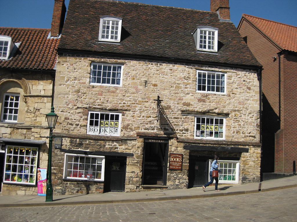
On Friday I took a little trip up to Lincoln for the day to meet my Big Sis. Lincoln happens to be about halfway between the two of us, and as neither of us had been there before we decided it would be a nice place to explore. The weather obliged with wall-to-wall sunshine and we spent a lovely day pootling round the old part of the town looking in all the interesting shops and going round the Cathedral. The Imperial Tea shop on Steep Hill is well worth a visit (although the lady behind the counter gave the distinct impression she'd never made a cup of tea before), as is Pimento's tea room where we had lunch.
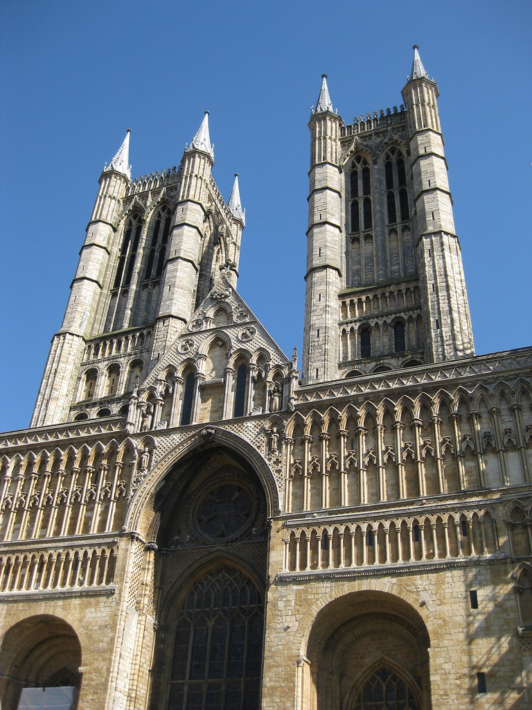
Lincoln is, of course, dominated by the Cathedral which is impressively large. So large in fact that it's impossible to get a decent picture of it without wide-angle lens. Unfortunately I only have a little compact camera and this is the best I could do:

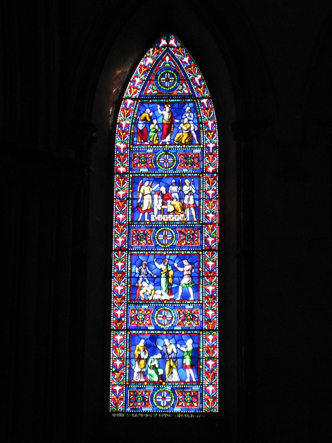
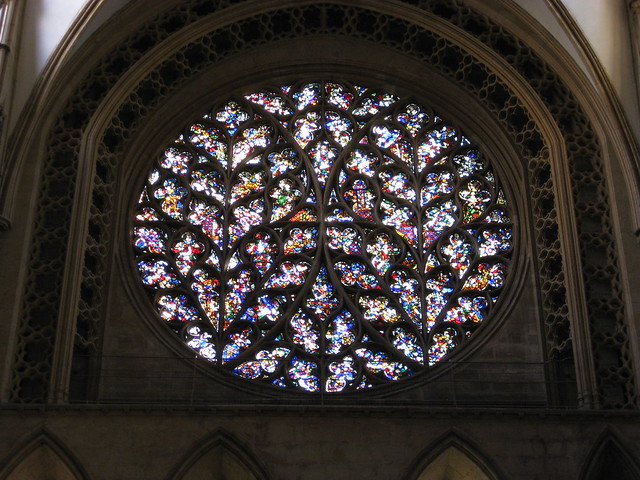
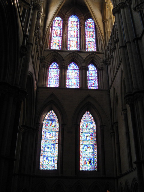
 Aside from being quite big, it also boasts some lovely stained glass, which looked spectacular in the cool darkness of the cathedral, backlit by the bright sunshine outside.
A lovely day was had all round - maybe next time we'll catch an Evensong or go on the roof-top tour.

Despite the blue sky and sunshine I did manage to persuade myself to stay indoors long enough to do a bit of calligraphy over the weekend. Yet more copperplate I'm afraid, but this time I've been having fun with the capitals, whilst still keeping the minuscules ticking along. Majascules, I have discovered, are simultaneously fun and frustrating; there's a lot more freedom in their creation, but it does mean you have to use your judgement with the flourishes - how much/where/how big etc. and this takes time to get an eye for.
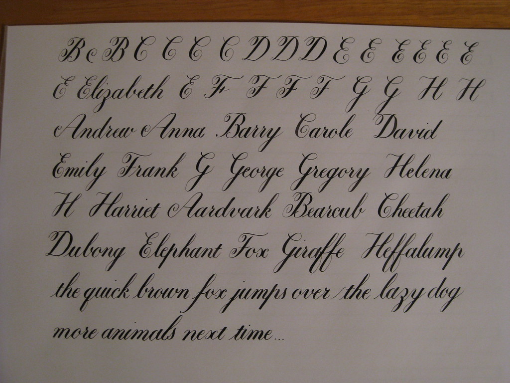
(this page was done with an EF Princiapl and Higgins Eternal ink)

 This is one of my practice pages for the A-H group, including some names and some animals. I was reliably informed that a Dubong was a real animal, but in fact it turns out that I'm slightly deaf and it is in fact a Dugong. So apologies to all you Dugongs out there reading this. Heffalumps are of course entirely real and not at all made up.


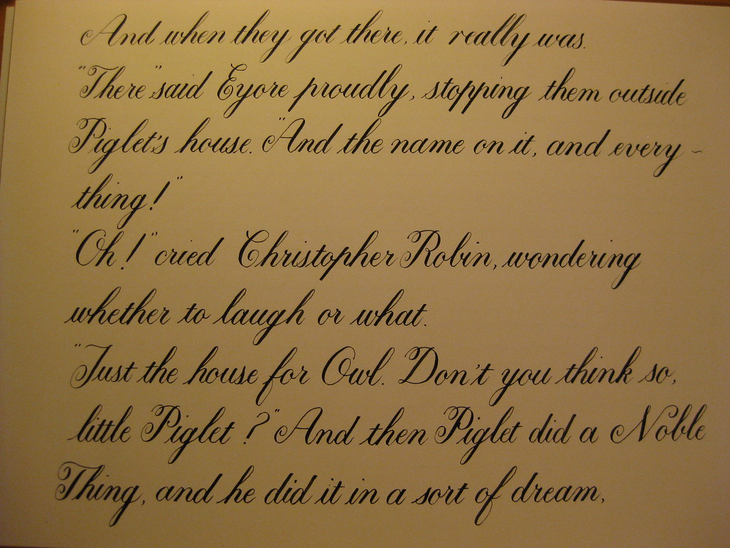
After another couple of pages along similar lines (if you'll excuse the pun) I thought I'd bite off more than I can chew and write out one of my favourite passages from Winnie the Pooh. I've been working on this for a couple of days and have to admit that I was finding it rather frustrating. The tines of my nib kept catching on the paper, my letters wobbly and inconsistent and I was generally struggling and finding it quite hard work. HOWEVER, yesterday evening I had a bit of an epiphany: I've been gripping my pen far too tight in an effort to control it, and have consequently worn the tines unevenly. Now, when I relaxed my grip and moved my hand further down the pen I found that not only did it stop catching on the paper, but my flow and control had come back! Magic! Here is the first section:

Lesson 1: Relaxation = Control.

The rest of the story is on it's way (in a much more relaxed fashion, naturally). More next time on 'other useful things I've learnt by trying to run before I can walk' :-) ttfn.