Pages

Showing posts with label Brause 66EF nib. Show all posts

Friday, 2 March 2012

Wedding calligraphy #1

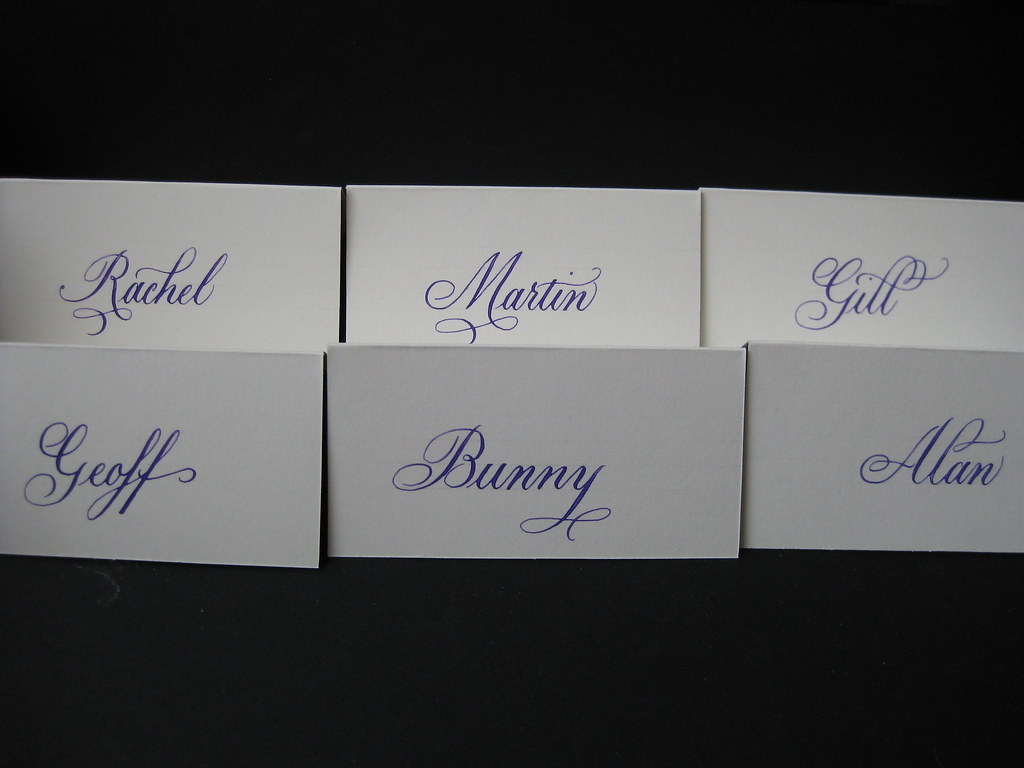
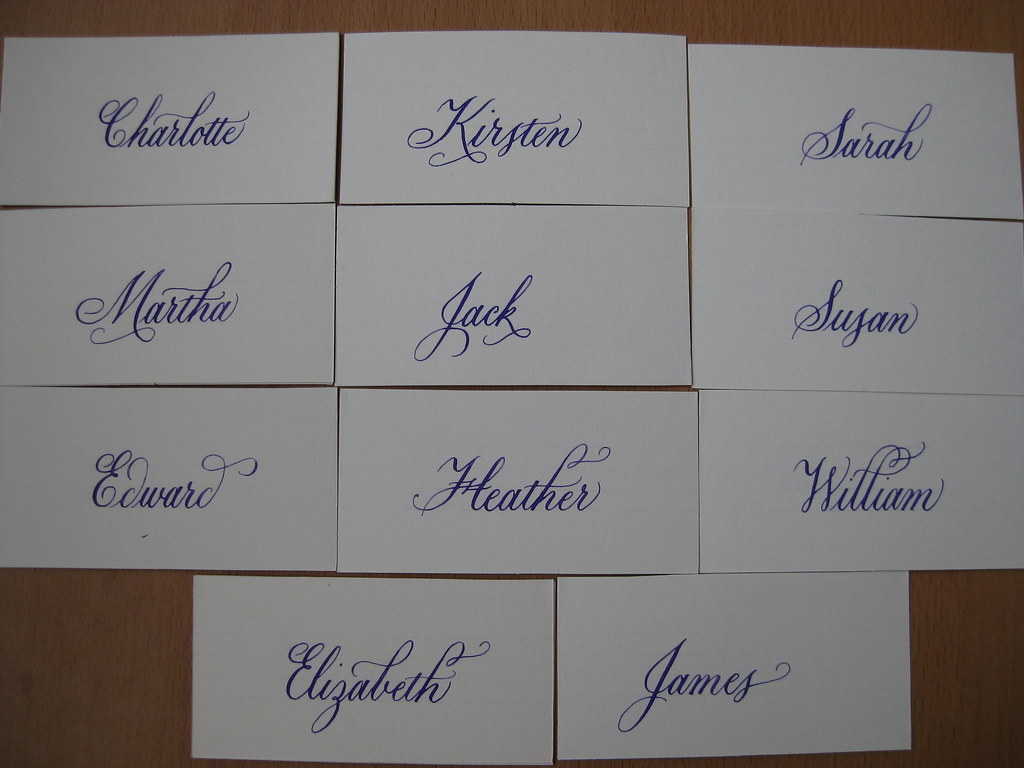
Here's a sneaky peak at some of the place cards I wrote out for my wedding in February. The colour scheme included creams and purples, so for the place cards I mixed some purple gouache and used it with a Brause 66EF nib.


The names were originally written on standard ivory tent-style place cards (from Hobbycraft), but once we'd decided to get the favours from the world famous Grasmere gingerbread shop Sarah Nelson's, I cut each 'tent' in half to give a flat card and tucked them inside a strip of ribbon tied round each box.

Elizabeth is officially the most gorgeous name to write in Copperplate. More people should call their daughters Elizabeth.

I had great fun practicing some little flourishes to add to each of the names. Some lend themselves more naturally to this approach than others, but trying to find something to add to every name was a nice challenge.


I had a lot of positive feedback from our guests, with many of them saying that they'd be keeping their cards as a memento of the day. Unfortunately I don't yet have any pictures of the cards in situ, but I hope that one might crop up somewhere.

I also wrote out our table plan in copperplate. My pictures of this, as a work in progress, got eaten on the journey from the camera to the computer :-( but I should be able to obtain some pictures of the finished thing to share with you soon. The creation of the table plan is worthy of an entire post on it's own! (now there's something to look forward to).


Saturday, 24 December 2011

Happy Christmas :-)

Gold gouache on black card. Brause 66EF nib.

I hope you all have a lovely Christmas and get to enjoy some time off over the coming days.


And while I had the Gold gouache out...


Monday, 5 September 2011

Birthday Bonanza

After a long and not-so-hot summer, September hits our family with a quadruple-whammy of birthdays in the first week alone. This can get expensive (admittedly one of the birthdays is my own, so I can't complain too much :-)) but it's also a great time to try and get creative. After spotting one of the envelope exchange jobs I'd done for my most recipient, my sister requested a hand-made card for her own birthday and I was happy to get scribbling with a few experiments.

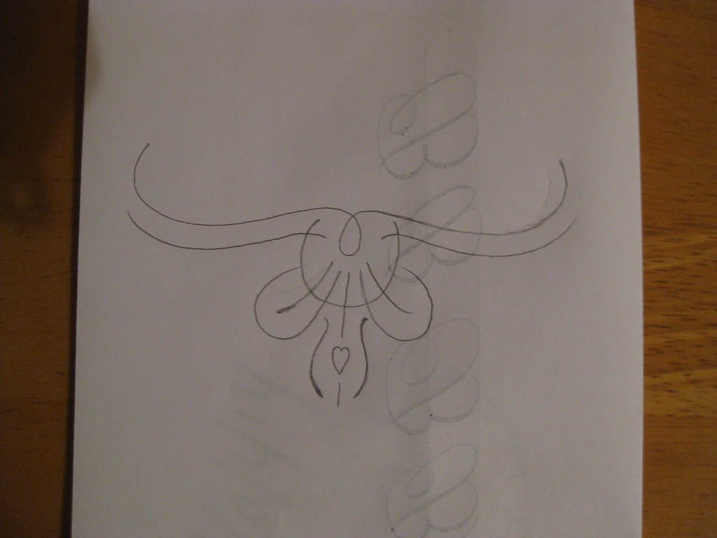
Pencil sketch of the flourish


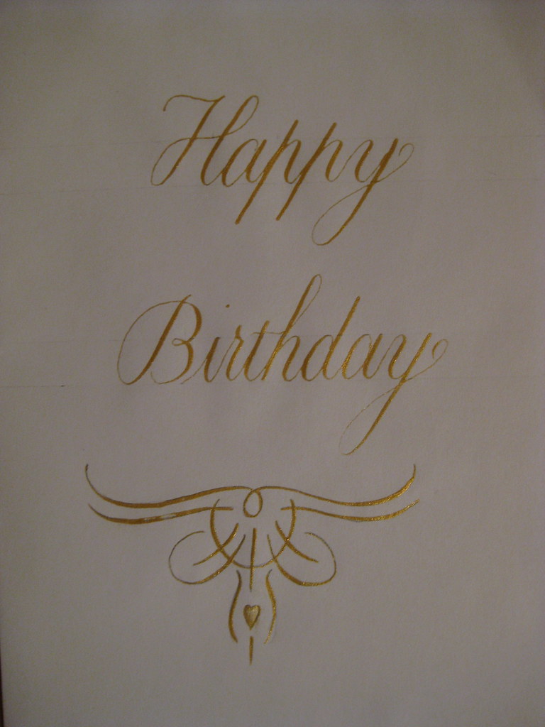
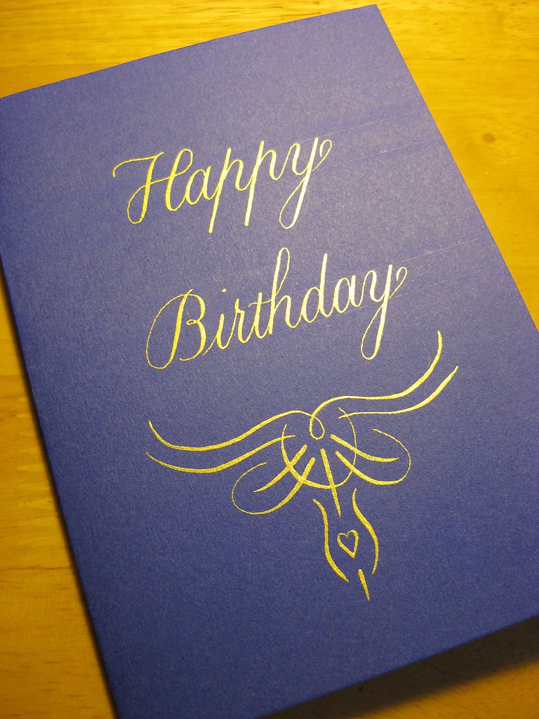
 After a little consideration of my efforts, I settled for a simple 'Happy Birthday' in gold gouache on front front of the card with a little hand-designed flourish (more of a doodle) underneath (see right).


Final 'rough'


As usual the final practice version of the card turned out to be the best one *sigh*, but I set about making four usable cards, each slightly different for the other.


The finished version sent to my sister looked a little like this:
Final version: Schminke Gold Pearl Gouache on Purple card, done with a Brause 66EF nib
(in fact it looked suspiciously like that!) the final four can be seen here in the gallery.
 

Thursday, 23 June 2011

I have come to the conclusion...

...that Envelope Exchange envelopes are like buses; you wait ages for the first one and then three turn up at once! Two more have arrived since my last post here - both nice examples of Copperplate, the most recent one being an absolutely superb example of what you can achieve in terms of layout and making the most of the space available - it rather raises the bar! (although in my defence I believe they've all been at it a bit longer than I have).

In turn I have sent my second envelope off to:
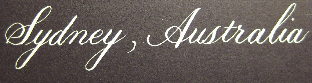
This one was written using my Brause 66EF nib in Dr. Martin's Bleedproof White. It's actually a dark purple envelope, but seems to have come out more black in the photo.

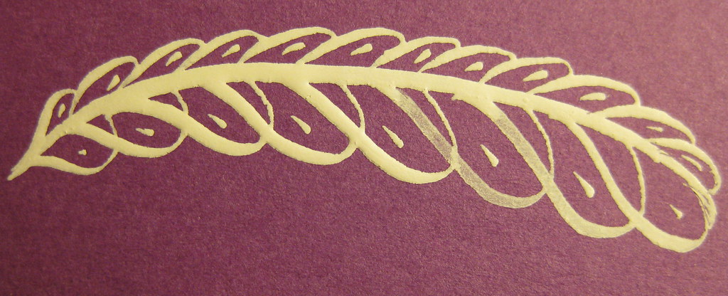
I also added a little offhand flourish like the feather pictured left (this was one of my practice ones). I'm always slightly terrified of adding things to an envelope that I'm pleased with, just in case I ruin it, but it's no excuse not to try really.


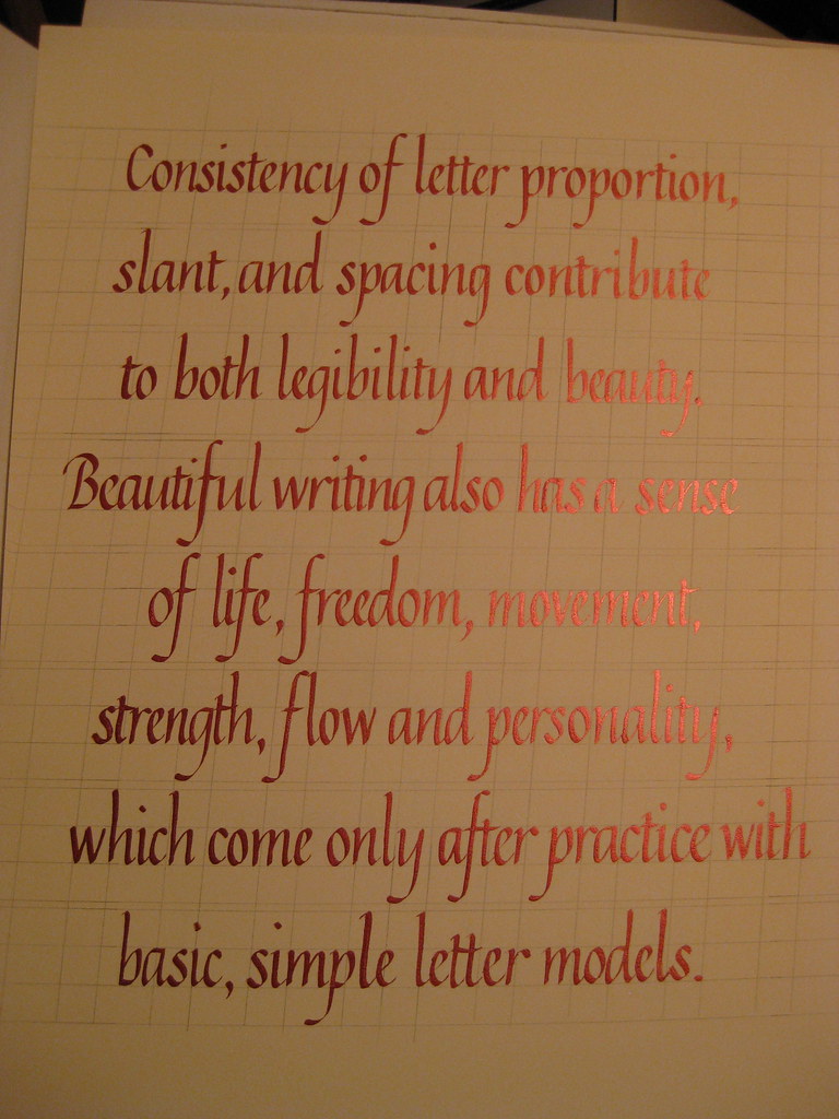
 Having received the set of Brause Bandzug nibs I mentioned here, I embarked on the 8 lines of continuous text needed for the CLAS certificate. I also decided to have a look and see what it looked like using the Schminke Red Pearl gouache watered down to use as ink. The results of my first attempt looked like this:
(apologies for the rather under-exposed photo - click for bigger)
I have to admit that I had huge difficulties getting the ink to flow nicely from the nib, resulting in several severely botched letters (it seemed reluctant to flow from both tines at once). I think it was simply a case of it being too thick ('Sorry Gromit, that was a bit thick!'), but having started I tried to persevere. Layout-wise it's not too bad, apart from needing to be consistently an inch further to the right, and this photo shows the pearl sheen of the ink really well. Unfortunately I don't think it's good enough to send in, so will have to do it again (probably just in black this time), but I was encouraged to see that amongst all the mistakes there's also so really nice lettering in there.
The deadline for entries is the 30th of June, so I'm going to be hard-pushed to get it all done in time, but if I work hard over the weekend I might be lucky!

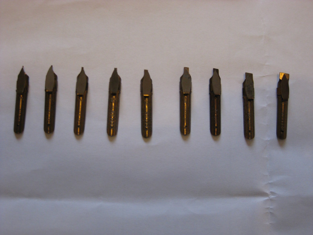
And finally, here's a picture of the full set of Bandzugs in all their glory:

Wednesday, 8 June 2011

Spaced out

Apologies for the recent radio-silence, things have been getting a little hectic of late and suddenly it's more than three weeks since I posted anything!

The eagerly awaited parcel finally turned up, and included a couple of Brause Rose nibs, some Brause 66EF nibs (plus special oblique holder for them), and Brause Bandzug 2.5mm broad-edged nib and some Moon Palace Sumi ink. Of all the contents I was only disappointed with the Brause Rose nib, but I will happily admit that I've hardly given it a chance and perseverance may prove that I'm entirely wrong - it just seemed to give very thick and messy lines :-(

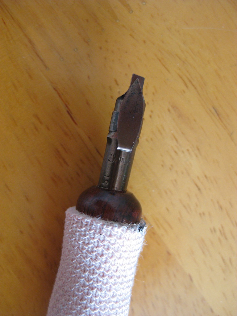
Brause Bandzug 2.5mm nib
The Brause Bandzug (left) I am absolutely in love with. The Bandzug is a far better quality broad-edged nib than the Speedball nibs I have been using. Crisp, clean and smooth lines are consistently produced, and the reservoir holds seemingly no end of ink. It has a right-oblique cut for right-handed calligraphers that helps maintain nib-angle and is an absolute joy to write with. So much so that I've ordered the rest of the set (you can by sets of 9) so that I can have the complete range from 0.5mm right the way through to 5mm. Brilliant. What's more, the numbers assigned to each nib correspond to their width in mm - so no more having to remember which set of numbers is which width (as with almost every other manufacturer)! It's almost as like they thought about it.


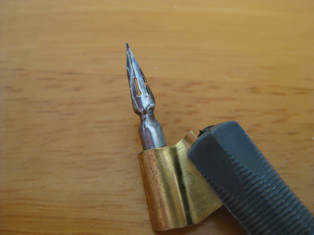
Brause 66EF nib
The 66EF (right) is also lovely to write with. Smooth running without being excessively 'sharp' it produces nice hairlines and is particularly good for smaller  x-heights. Used in combination with the fantastically rich black Moon Palace Sumi I've been enjoying the results immensely.
The aforementioned Sumi ink seems to flow well from both of these nibs, but it has needed watering down a touch for use with some of my other copperplate nibs (the EF Principal in particular).


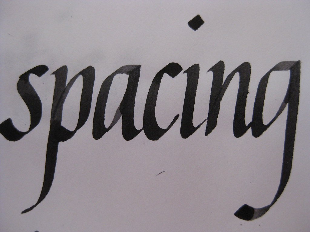
But enough waffle from me about calligraphy tools, what about the actual writing? Well for the last couple of weeks I've been working mainly on my Italics (just because they're easier to pick up and put down if time is tight) and playing with the above nibs. I'm fairly pleased with how my letter forms are coming on, but something was still looking a bit funny about the sheets I was producing. I asked my tutor, and he spotted it straight away:

Brause Bandzug nib, Higgins eternal ink (I think)
Both internal letter spacing and between words (I want to write inter-wordal, but don't think it's allowed really!). I've been working hard on this and it's getting a lot better - the consistency looks miles better and some of the practice sheets I'm really quite proud of, so I'm thinking of having a go at a CLAS Certificate to see what the pros think!


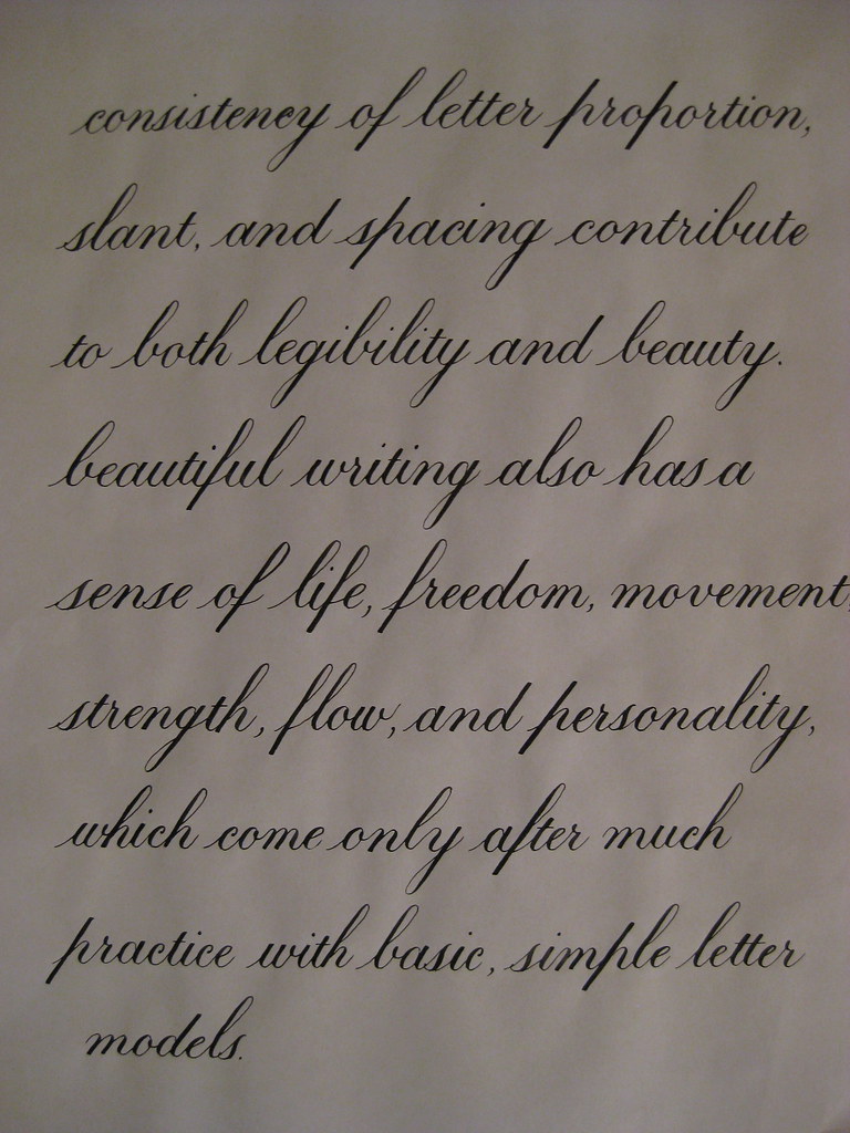
Here's a bit of Copperplate to show I haven't abandoned it! This is the text I'm thinking of using for the continuous prose bit of the certificate. I'm beginning to really prefer the 1:1:1 ratio for Copperplate - I think it always looks much more elegant than the 2:3:2 that I started with, so I'll stick with what I like best :-)


That's about it from me - I'm going to try posting more frequently in the future with the idea of keeping the length a little bit more manageable. Well done if you made it this far!