The eagerly awaited parcel finally turned up, and included a couple of Brause Rose nibs, some Brause 66EF nibs (plus special oblique holder for them), and Brause Bandzug 2.5mm broad-edged nib and some Moon Palace Sumi ink. Of all the contents I was only disappointed with the Brause Rose nib, but I will happily admit that I've hardly given it a chance and perseverance may prove that I'm entirely wrong - it just seemed to give very thick and messy lines :-(
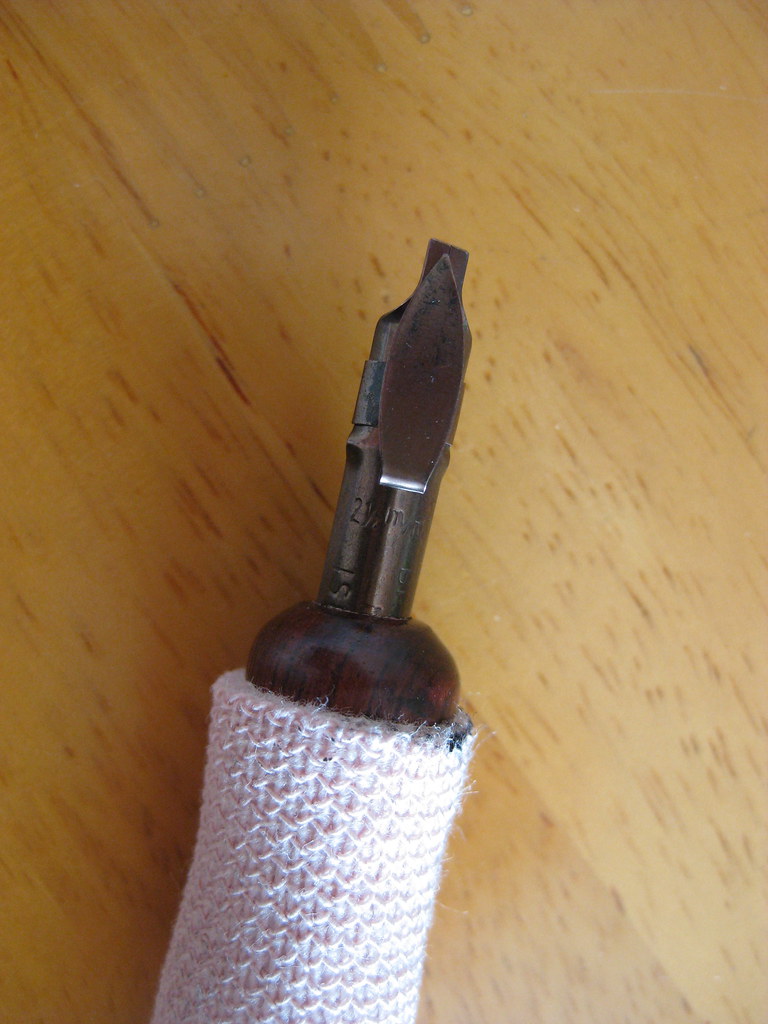 |
| Brause Bandzug 2.5mm nib |
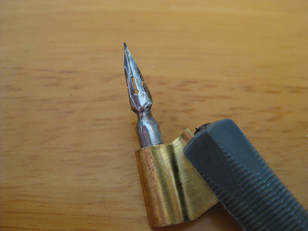 |
| Brause 66EF nib |
The aforementioned Sumi ink seems to flow well from both of these nibs, but it has needed watering down a touch for use with some of my other copperplate nibs (the EF Principal in particular).
But enough waffle from me about calligraphy tools, what about the actual writing? Well for the last couple of weeks I've been working mainly on my Italics (just because they're easier to pick up and put down if time is tight) and playing with the above nibs. I'm fairly pleased with how my letter forms are coming on, but something was still looking a bit funny about the sheets I was producing. I asked my tutor, and he spotted it straight away:
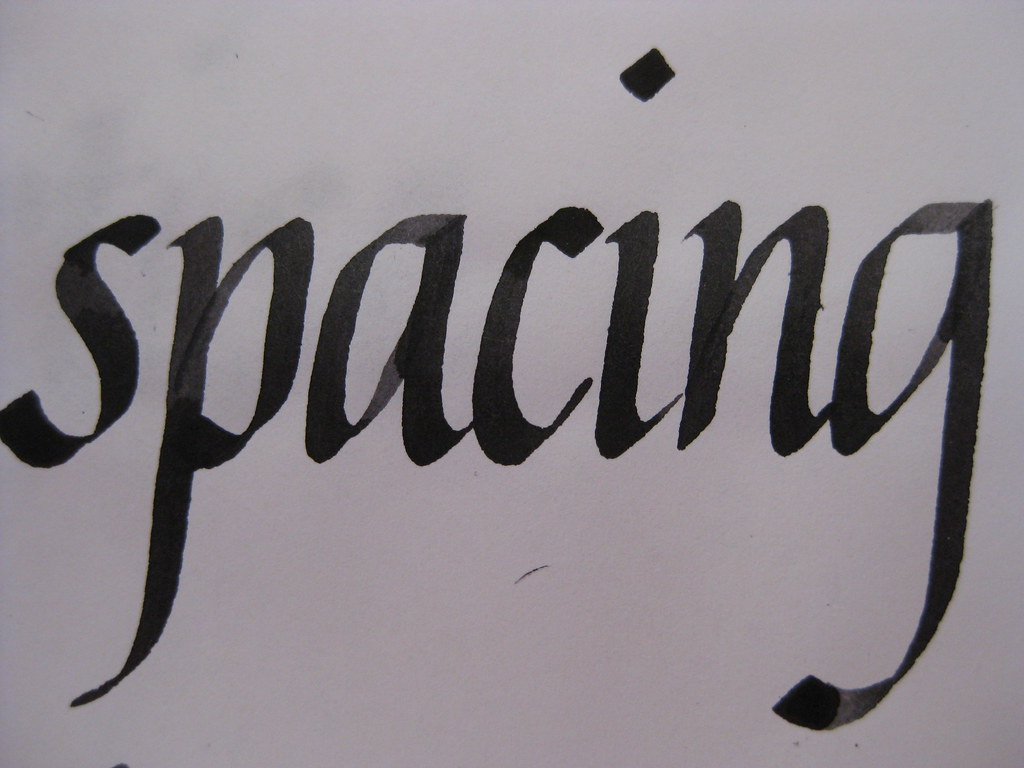 |
| Brause Bandzug nib, Higgins eternal ink (I think) |
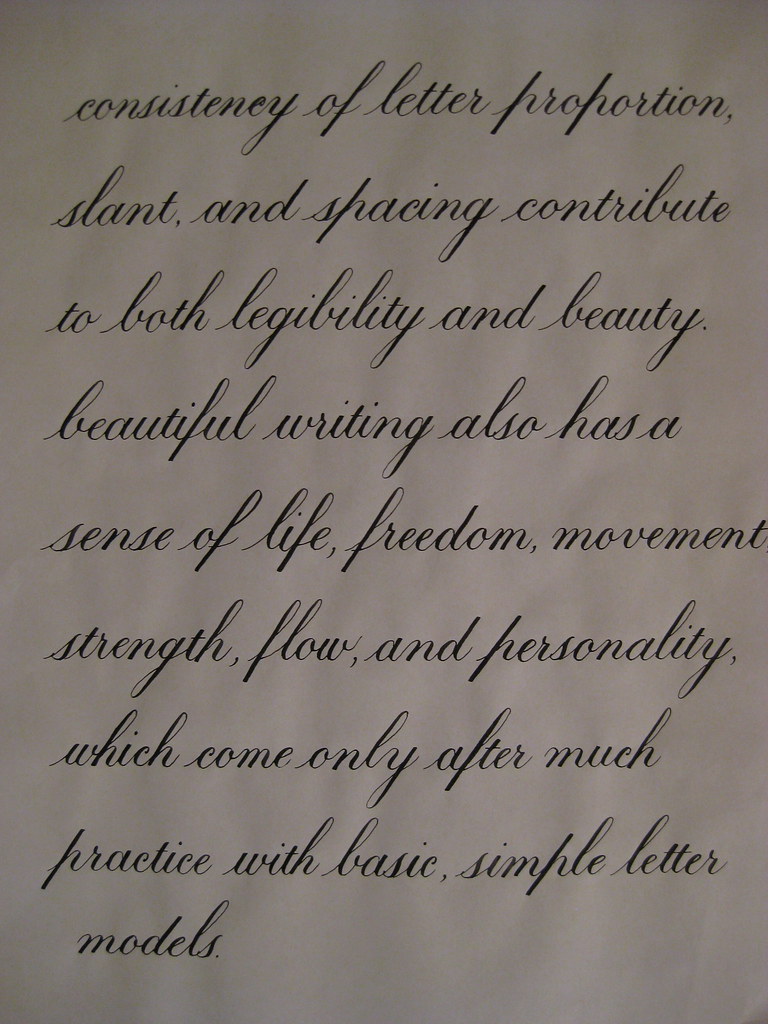
Here's a bit of Copperplate to show I haven't abandoned it! This is the text I'm thinking of using for the continuous prose bit of the certificate. I'm beginning to really prefer the 1:1:1 ratio for Copperplate - I think it always looks much more elegant than the 2:3:2 that I started with, so I'll stick with what I like best :-)
That's about it from me - I'm going to try posting more frequently in the future with the idea of keeping the length a little bit more manageable. Well done if you made it this far!
No comments:
Post a Comment