Showing posts with label Calligaphy. Show all posts
Showing posts with label Calligaphy. Show all posts
Wednesday, 12 October 2011
Scissors and glue
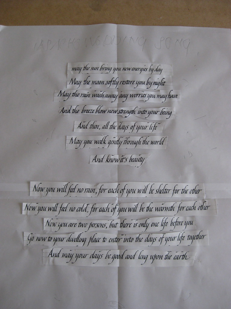
Here's a quick picture of a paste-up I did over the weekend for a piece using the Apache Wedding Blessing:
This is two sheets of A3; landscape and taped together. Written in a No. 3 Mitchell Roundhand nib and black gouache. It's currently laid out at 3 body-widths spacing, but it may end up being 2 1/2, with the second block split to keep the narrowness of the first. I'll also have a play around with the text centred and offset before deciding on the final layout. Quite pleased with how the Italics are coming on though!
Tuesday, 13 September 2011
Capital punishment
Another weekend, another fabulous course with Gaynor Goffe at Flatford Mill. Most of the usual suspects were there, with the addition of a couple of new faces too. This time I thought I'd dedicate the weekend to getting my capitals sorted out. Majascules always seem to get neglected - it's very easy to work hard on perfecting the minuscules of a particular hand, but when you come to write out a quote, poem or name you suddenly realise you have absolutely no idea how to form the capitals properly. Very annoying!
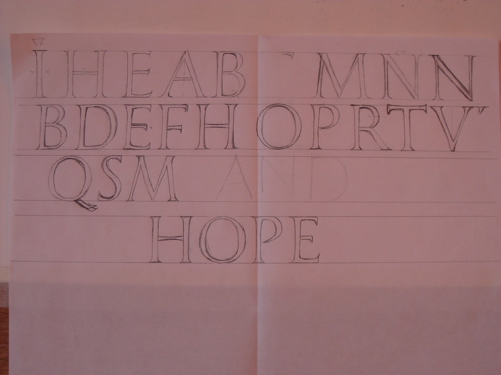
I have, on previous occasions, tried my hand at flourished Italic capitals but found the attempt more than a little frustrating not really knowing anything about the correct proportions or pen angles. This time I jumped in a at the deep end and decided to learn the strict proportions of Roman Capitals, and then branch out into a few variations, including some drawn capitals. A typical sheet from the course looked something like this:
At the top are a few lines of the ordinary Roman caps, followed by some experiments in size (but using the same nib) and then a more relaxed, slightly forward leaning alphabet in the middle and at the bottom. This latter variation really appealed to me - I didn't find it at all taxing to write and it seemed to flow quite naturally so I decided to prepare a small haiku to lay out and write up as a finished piece.
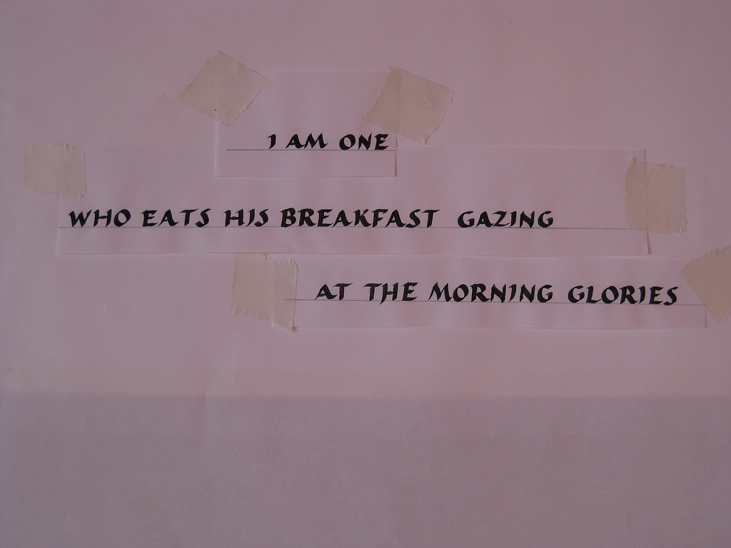
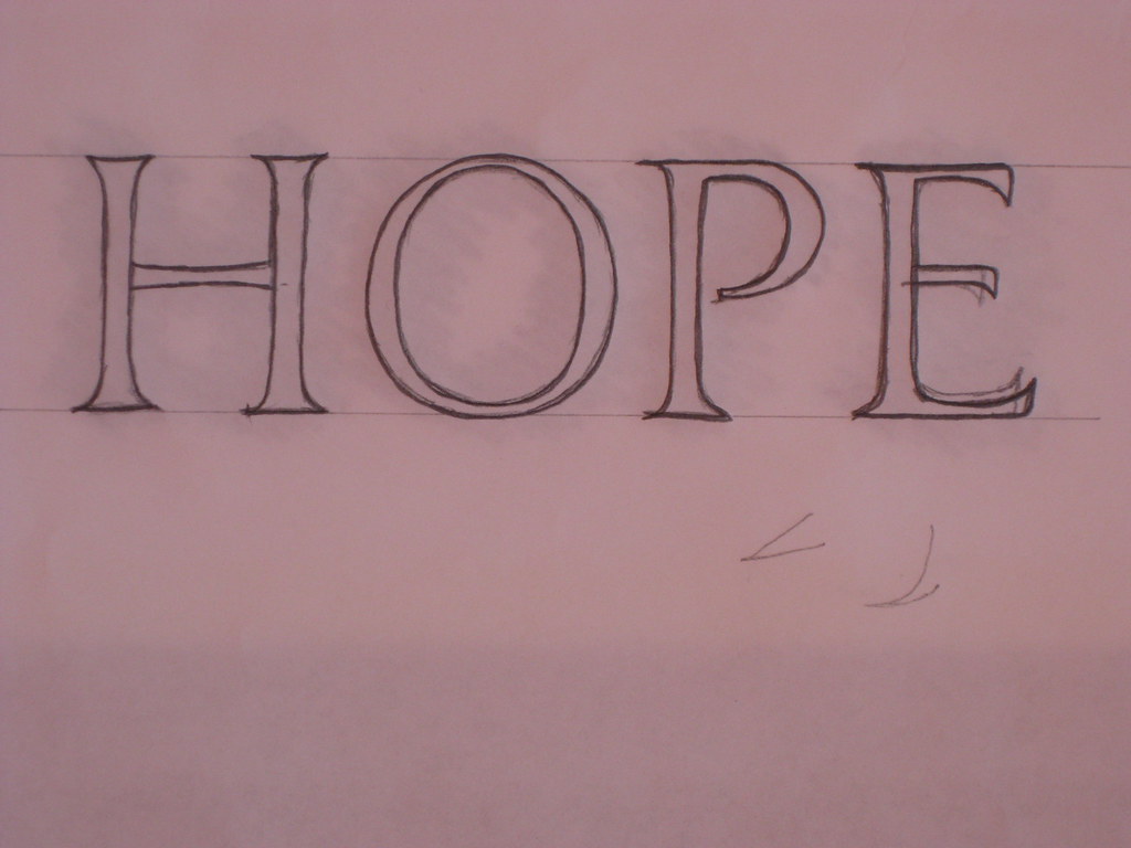
Left is the layout paste-up for the finished piece. Written with a William Mitchell No.2 square cut nib in black gouache this is a slightly squat, more flowing variation of the Roman caps I had been working on. As always, I ruled up for two attempts at a final version.
This one I am particularly proud of :
Other work over the weekend included drawn Roman caps with serifs, and formal and flourished Italic caps
I have, on previous occasions, tried my hand at flourished Italic capitals but found the attempt more than a little frustrating not really knowing anything about the correct proportions or pen angles. This time I jumped in a at the deep end and decided to learn the strict proportions of Roman Capitals, and then branch out into a few variations, including some drawn capitals. A typical sheet from the course looked something like this:
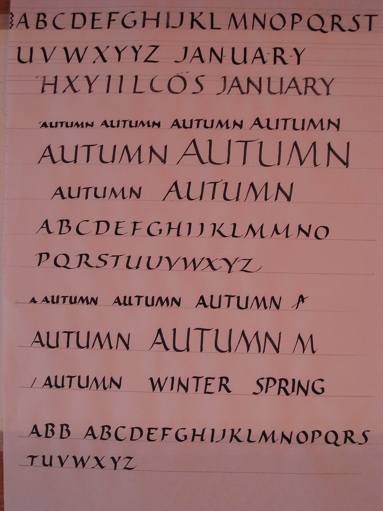 |
| Roman Caps and their variations. WM No.2 nib with black gouache. |
 |
Left is the layout paste-up for the finished piece. Written with a William Mitchell No.2 square cut nib in black gouache this is a slightly squat, more flowing variation of the Roman caps I had been working on. As always, I ruled up for two attempts at a final version.
This one I am particularly proud of :
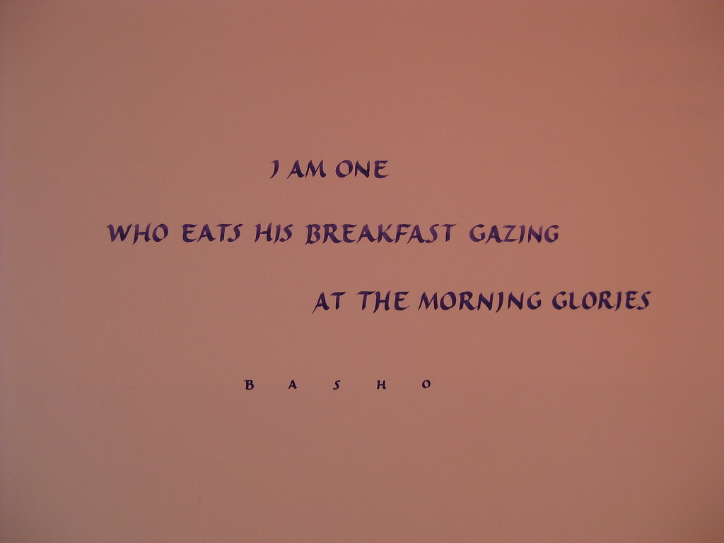 | ||
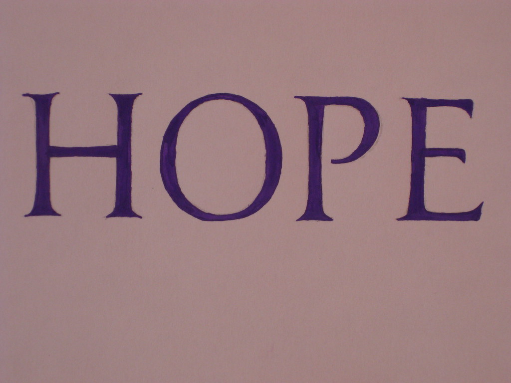
| Final piece - No. 2 nib with custom-mixed Purple gouache (W&N designers) |
|
|
|
|

Monday, 5 September 2011
Birthday Bonanza
After a long and not-so-hot summer, September hits our family with a quadruple-whammy of birthdays in the first week alone. This can get expensive (admittedly one of the birthdays is my own, so I can't complain too much :-)) but it's also a great time to try and get creative. After spotting one of the envelope exchange jobs I'd done for my most recipient, my sister requested a hand-made card for her own birthday and I was happy to get scribbling with a few experiments.
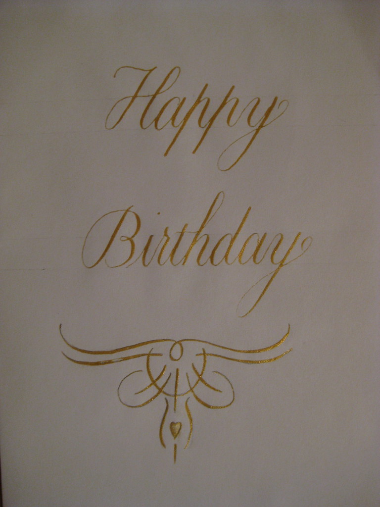
After a little consideration of my efforts, I settled for a simple 'Happy Birthday' in gold gouache on front front of the card with a little hand-designed flourish (more of a doodle) underneath (see right).
As usual the final practice version of the card turned out to be the best one *sigh*, but I set about making four usable cards, each slightly different for the other.
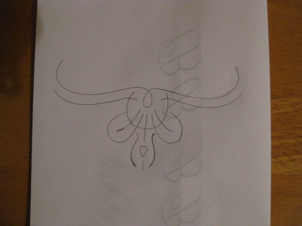 |
| Pencil sketch of the flourish |
After a little consideration of my efforts, I settled for a simple 'Happy Birthday' in gold gouache on front front of the card with a little hand-designed flourish (more of a doodle) underneath (see right).
 |
| Final 'rough' |
As usual the final practice version of the card turned out to be the best one *sigh*, but I set about making four usable cards, each slightly different for the other.
The finished version sent to my sister looked a little like this:
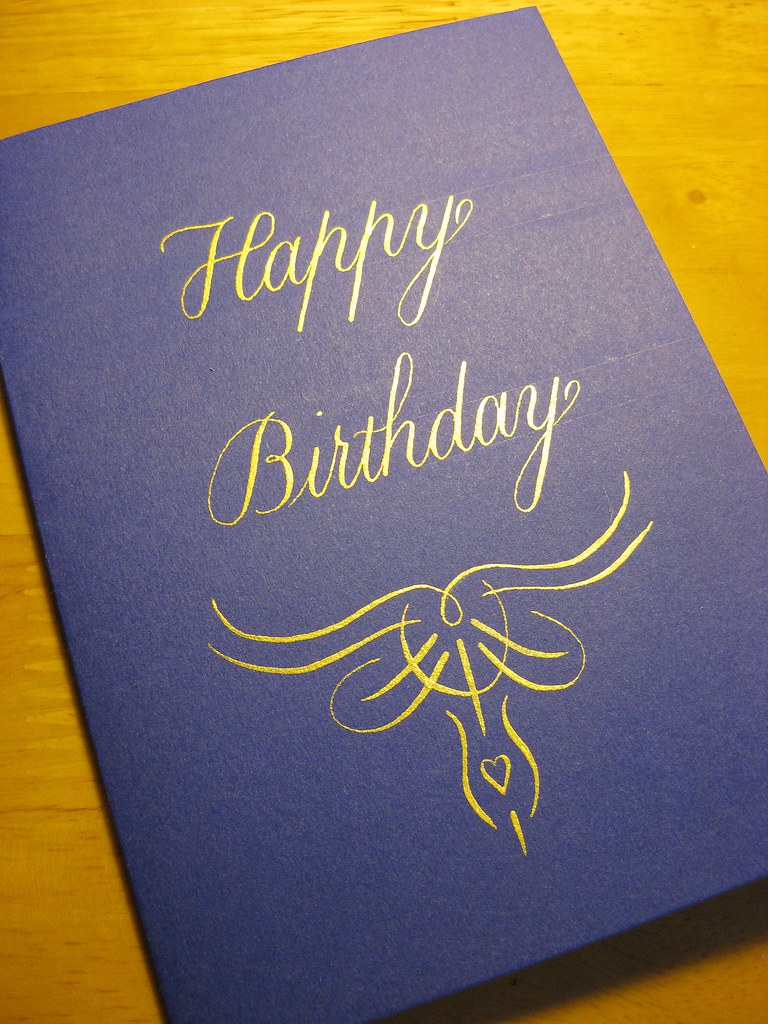 | |
| Final version: Schminke Gold Pearl Gouache on Purple card, done with a Brause 66EF nib |
Wednesday, 8 June 2011
Spaced out
Apologies for the recent radio-silence, things have been getting a little hectic of late and suddenly it's more than three weeks since I posted anything!
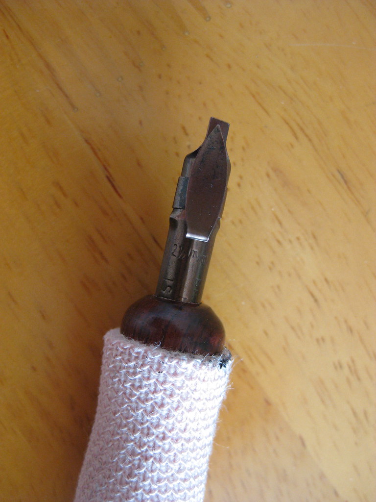
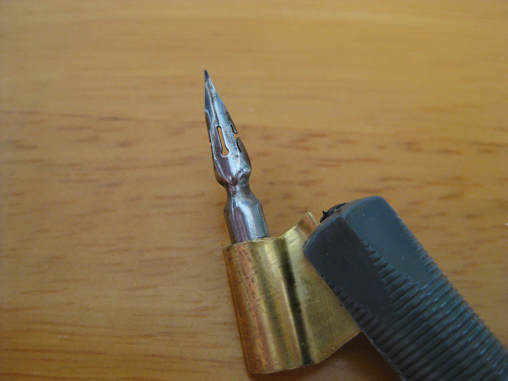
The eagerly awaited parcel finally turned up, and included a couple of Brause Rose nibs, some Brause 66EF nibs (plus special oblique holder for them), and Brause Bandzug 2.5mm broad-edged nib and some Moon Palace Sumi ink. Of all the contents I was only disappointed with the Brause Rose nib, but I will happily admit that I've hardly given it a chance and perseverance may prove that I'm entirely wrong - it just seemed to give very thick and messy lines :-(
The Brause Bandzug (left) I am absolutely in love with. The Bandzug is a far better quality broad-edged nib than the Speedball nibs I have been using. Crisp, clean and smooth lines are consistently produced, and the reservoir holds seemingly no end of ink. It has a right-oblique cut for right-handed calligraphers that helps maintain nib-angle and is an absolute joy to write with. So much so that I've ordered the rest of the set (you can by sets of 9) so that I can have the complete range from 0.5mm right the way through to 5mm. Brilliant. What's more, the numbers assigned to each nib correspond to their width in mm - so no more having to remember which set of numbers is which width (as with almost every other manufacturer)! It's almost as like they thought about it.
The 66EF (right) is also lovely to write with. Smooth running without being excessively 'sharp' it produces nice hairlines and is particularly good for smaller x-heights. Used in combination with the fantastically rich black Moon Palace Sumi I've been enjoying the results immensely.
The aforementioned Sumi ink seems to flow well from both of these nibs, but it has needed watering down a touch for use with some of my other copperplate nibs (the EF Principal in particular).
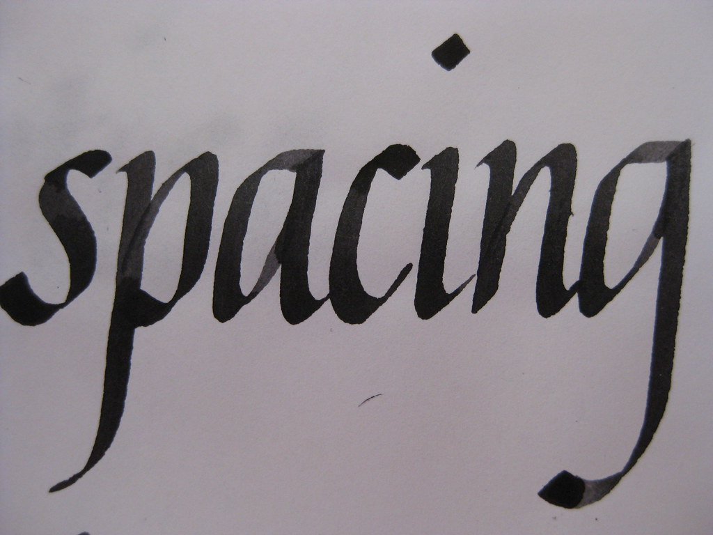
But enough waffle from me about calligraphy tools, what about the actual writing? Well for the last couple of weeks I've been working mainly on my Italics (just because they're easier to pick up and put down if time is tight) and playing with the above nibs. I'm fairly pleased with how my letter forms are coming on, but something was still looking a bit funny about the sheets I was producing. I asked my tutor, and he spotted it straight away:
Both internal letter spacing and between words (I want to write inter-wordal, but don't think it's allowed really!). I've been working hard on this and it's getting a lot better - the consistency looks miles better and some of the practice sheets I'm really quite proud of, so I'm thinking of having a go at a CLAS Certificate to see what the pros think!
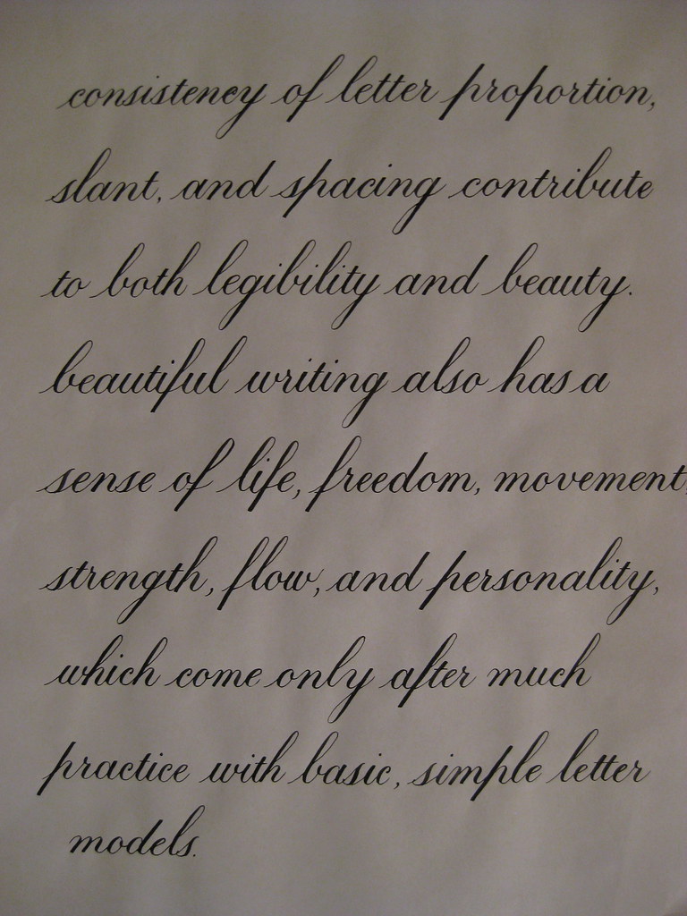
Here's a bit of Copperplate to show I haven't abandoned it! This is the text I'm thinking of using for the continuous prose bit of the certificate. I'm beginning to really prefer the 1:1:1 ratio for Copperplate - I think it always looks much more elegant than the 2:3:2 that I started with, so I'll stick with what I like best :-)
That's about it from me - I'm going to try posting more frequently in the future with the idea of keeping the length a little bit more manageable. Well done if you made it this far!
The eagerly awaited parcel finally turned up, and included a couple of Brause Rose nibs, some Brause 66EF nibs (plus special oblique holder for them), and Brause Bandzug 2.5mm broad-edged nib and some Moon Palace Sumi ink. Of all the contents I was only disappointed with the Brause Rose nib, but I will happily admit that I've hardly given it a chance and perseverance may prove that I'm entirely wrong - it just seemed to give very thick and messy lines :-(
 |
| Brause Bandzug 2.5mm nib |
 |
| Brause 66EF nib |
The aforementioned Sumi ink seems to flow well from both of these nibs, but it has needed watering down a touch for use with some of my other copperplate nibs (the EF Principal in particular).
But enough waffle from me about calligraphy tools, what about the actual writing? Well for the last couple of weeks I've been working mainly on my Italics (just because they're easier to pick up and put down if time is tight) and playing with the above nibs. I'm fairly pleased with how my letter forms are coming on, but something was still looking a bit funny about the sheets I was producing. I asked my tutor, and he spotted it straight away:
 |
| Brause Bandzug nib, Higgins eternal ink (I think) |
Here's a bit of Copperplate to show I haven't abandoned it! This is the text I'm thinking of using for the continuous prose bit of the certificate. I'm beginning to really prefer the 1:1:1 ratio for Copperplate - I think it always looks much more elegant than the 2:3:2 that I started with, so I'll stick with what I like best :-)
That's about it from me - I'm going to try posting more frequently in the future with the idea of keeping the length a little bit more manageable. Well done if you made it this far!
Wednesday, 9 February 2011
Here goes...
Today I am very excited by the prospect of going to my first Calligraphy evening class. Having dabbled for some months now, I've decided to 'get help'! I've almost finished teaching myself the Copperplate alphabet (miniscules) and have suddenly got distracted by the thought that I really ought to master Italic, and develop a suitably lovely cursive hand into the bargain too. Getting distracted by the next project before really getting to grips with the original one is par for the course with me, but I'm hoping that going to a class and getting some direction will help keep me on the narrow at least, if not the straight.
Hopefully there will pictures of my progress a-plenty in the coming weeks. There'll certainly be lots of inspiration with evening classes, a weekend residential course and a visit to the CLAS exhibition at the British Library all coming up fairly soon.
Hopefully there will pictures of my progress a-plenty in the coming weeks. There'll certainly be lots of inspiration with evening classes, a weekend residential course and a visit to the CLAS exhibition at the British Library all coming up fairly soon.
Subscribe to:
Posts (Atom)