Last weekend I spent a very enjoyable weekend on the 'Calligraphy for Beginners and Improvers' course run by the Field Studies Council at their
Flatford Mill Centre in Suffolk. Our tutor for the weekend was the wonderful
Gaynor Goffe who gave us her undivided attention for several hours each day, and led the more novice of us through several experiments in calligraphic variations and also in the use of colour.
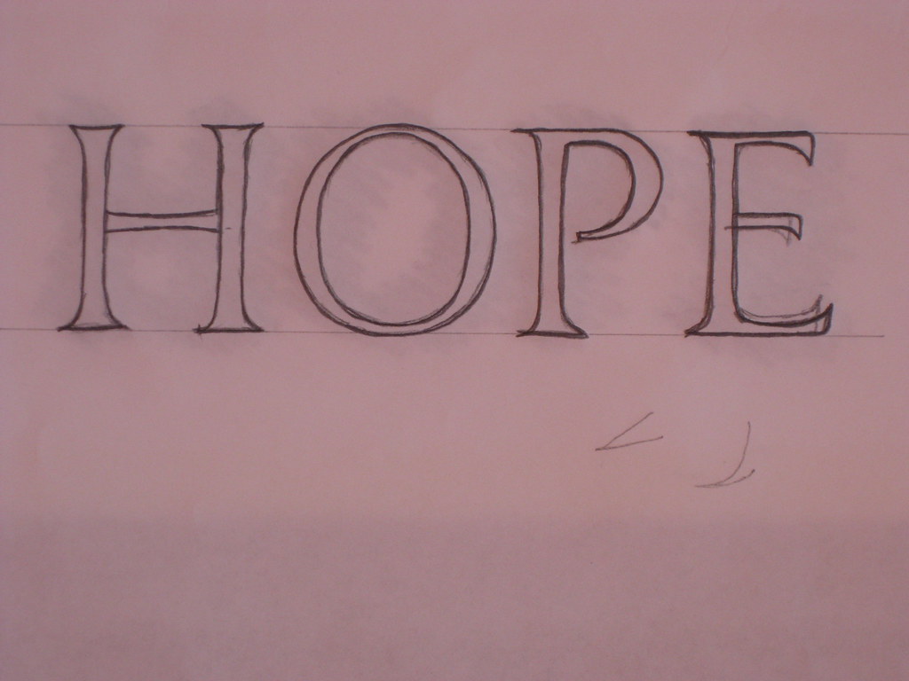
My own efforts were focused on developing my Italics, and one of the very first things Gaynor got me to do was completely change the mechanics of how I write. She got me writing with a far more sweeping gesture moving the whole arm instead of just flexing my fingers. This is wonderful for developing rhythm, but makes you lose most of your control at first (at least that's my excuse).
 |
| A new technique (click for bigger) |
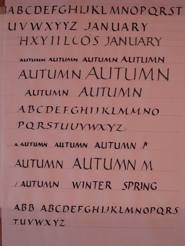
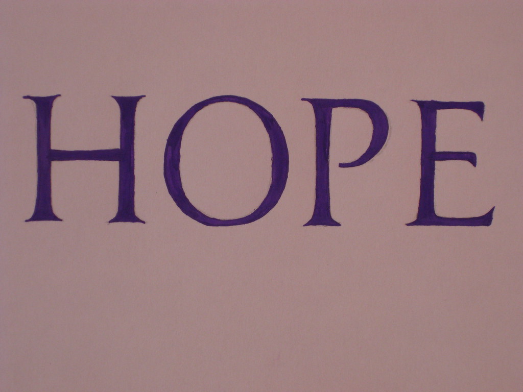
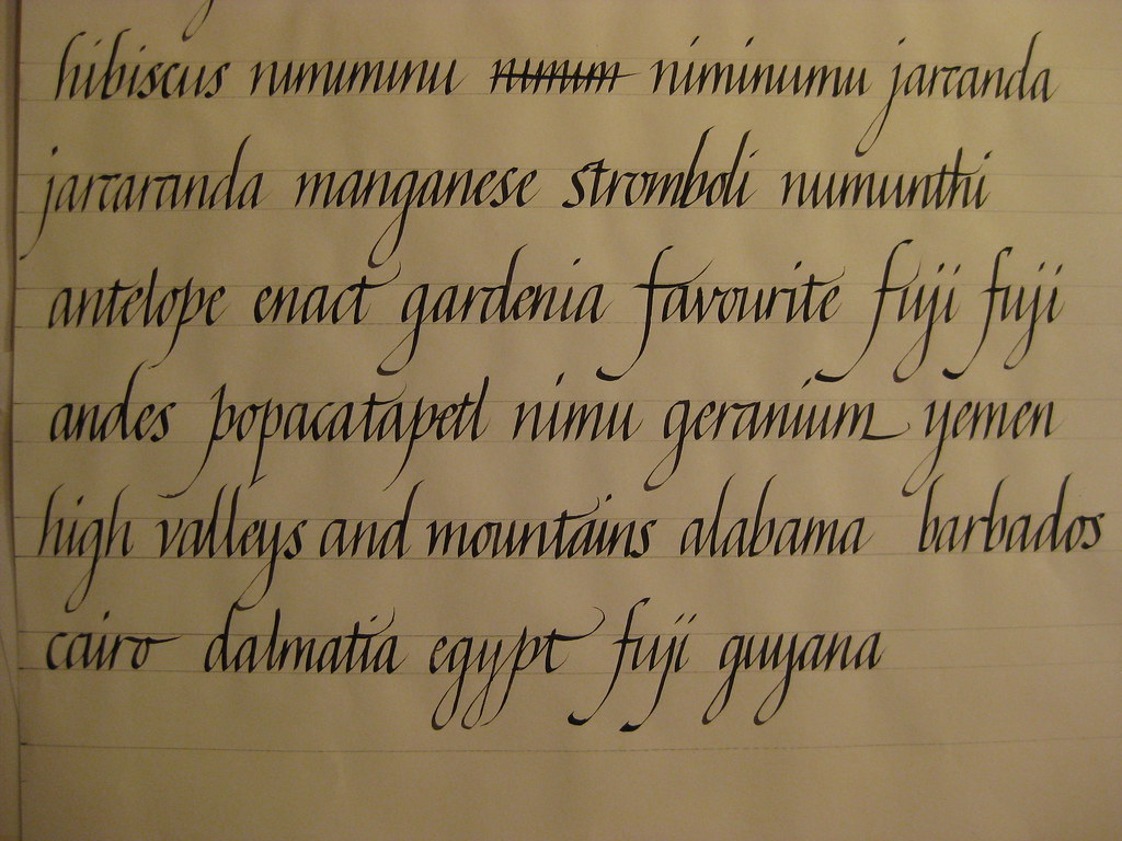
Pages of practice ensued (I got through a small rainforest) the one on the right being a better example from when I'd regained a modicum of control. Basic concepts were taught and practised using a relatively large nib (2mm), but as we became more proficient we were encouraged to move on to smaller sizes, and then on to italic variations.
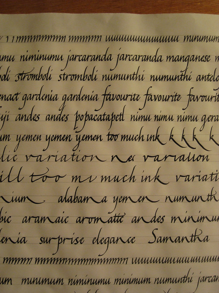 |
| Smaller nib size, and some variations |
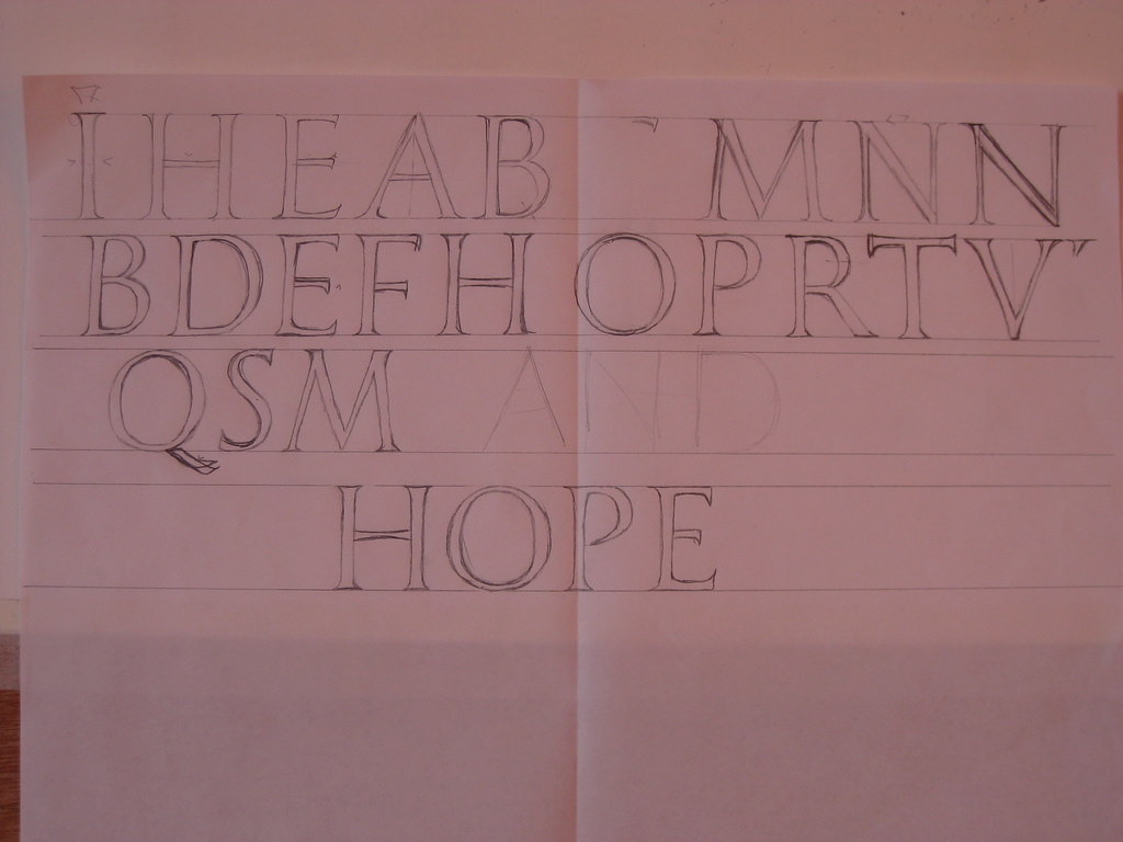
The main variations included sharpened italic, variations in proportion and spacing, and finally variations produced by picking certain letters, or groups of letters, and consistently extending them (see left).
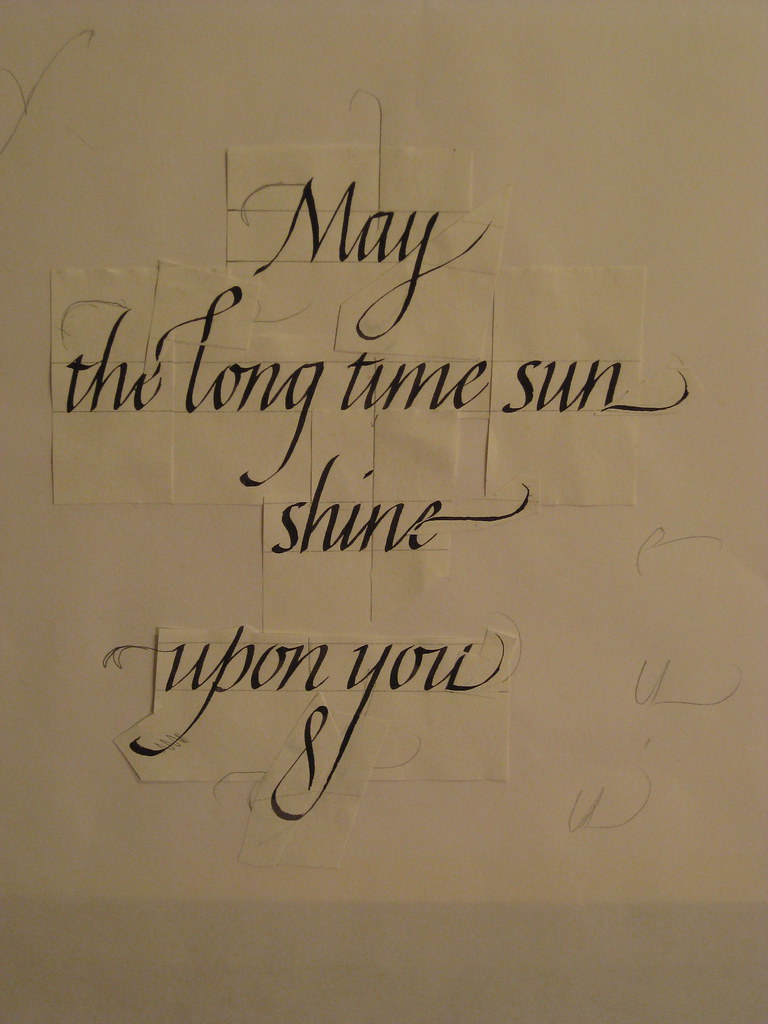 |
| Flourishing (paste-up) |
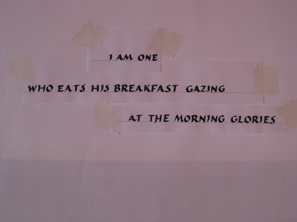
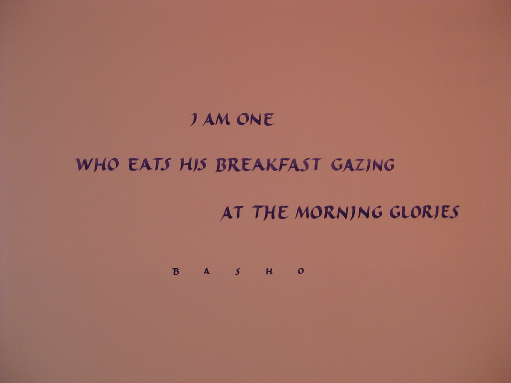
Hot on the heels of these Gaynor went through adding some flourishes with me - this was by far the most engaging and enjoyable part for me, and steep learning curve in terms of what works and what doesn't (and which flourishes work in combination with others). To the right is a paste-up of the my favourite piece or work from the weekend. As well as a considerable amount of technical tuition, I also learnt heaps of tips and tricks for ruling up, laying-out and centring pieces of work. As you can see from the picture, all the individual flourishes are pasted on - this allowed to me play around with different combinations of flourishes without having to write the piece out hundreds of times. The finished piece, I think deserves a big picture all of it's own.
 |
| Flourishes - final version |
The weekend was incredibly intense - every time I felt I'd got a handle on one thing we were whisked on to the next, but it was definitely the best use of the time available; if you wait until you've perfected one thing before trying something else, you'll basically never get past step one. Gaynor persuaded us to lay aside fears of 'getting it wrong' and got us to just give new things a go. Sometimes it worked, sometimes it didn't, but I learnt something from
everything I tried. The challenge over the next few weeks is to re-visit all the things we covered during the course and try to consolidate it all.
Oh, and Flatford Mill is a beautiful place for a course like this!