Pages

Tuesday 26 April 2011

Dr. ... Qui?

It would appear that I haven't posted for a while - how very remiss of me! I have however been doing some scribbling, with some interesting results.

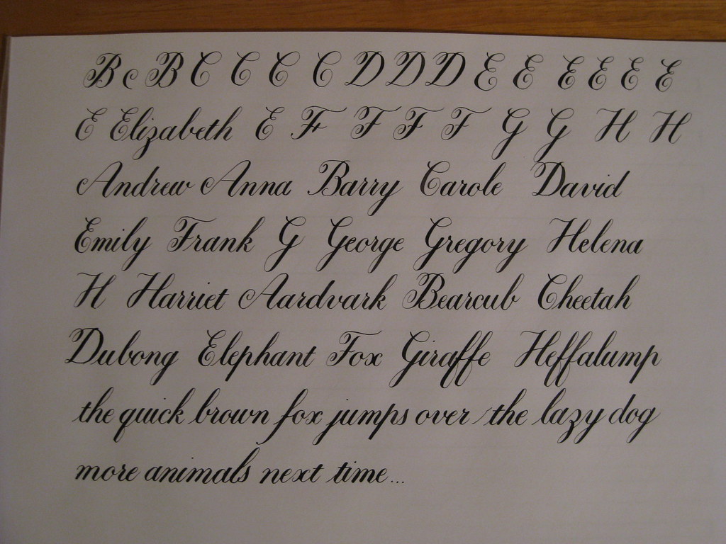
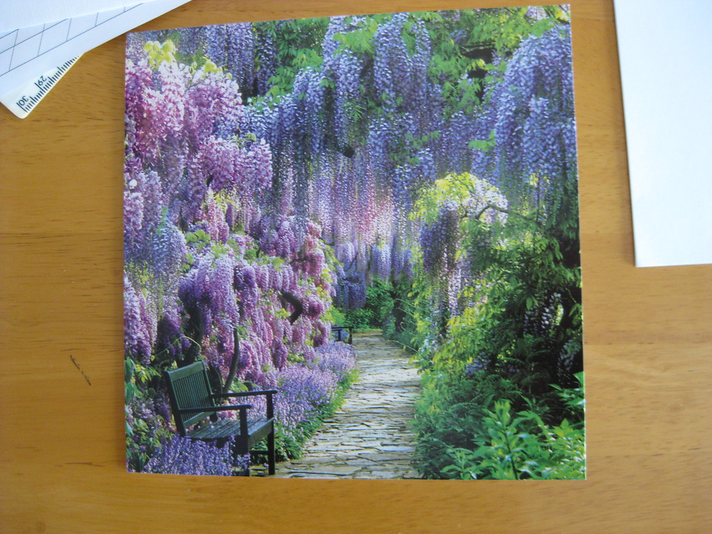
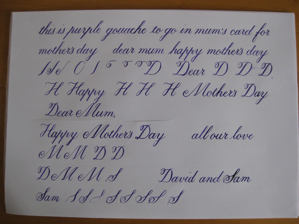
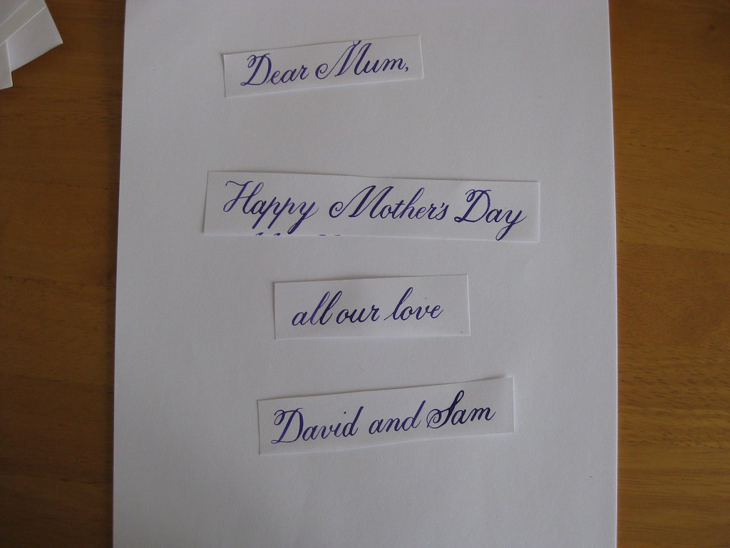
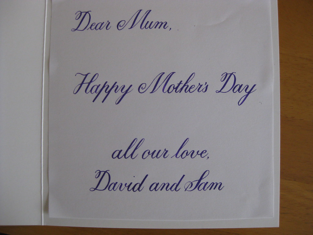
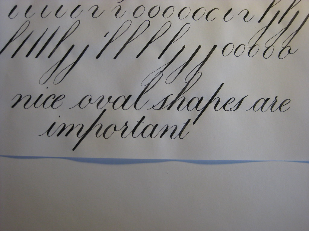
After the monumental efforts of my last post, and having come to the conclusion that I need to slow down and relax, I decided to have a play around with a different method of writing Copperplate script. To this end I visited the IAMPETH website and watched my way through Dr. Joe Vitolo's series of clips on how to write his particular style of Copperplate (the lessons can be found here). The most obvious difference between Dr. Joe's method and the Winters book that I had been using is that Dr. Joe is far more concerned with the perfect formation of the individual letters than developing a flowing style of handwriting: he lifts the pen and turns the paper round and does all sorts in order to get the most consistent shapes. This is not to say that the resulting script doesn't look seamlessly written, it does and it's really rather lovely, it's just a different approach - and one that emphasizes what works best for you at that. So I've been playing around with the minuscules again, with the following results:

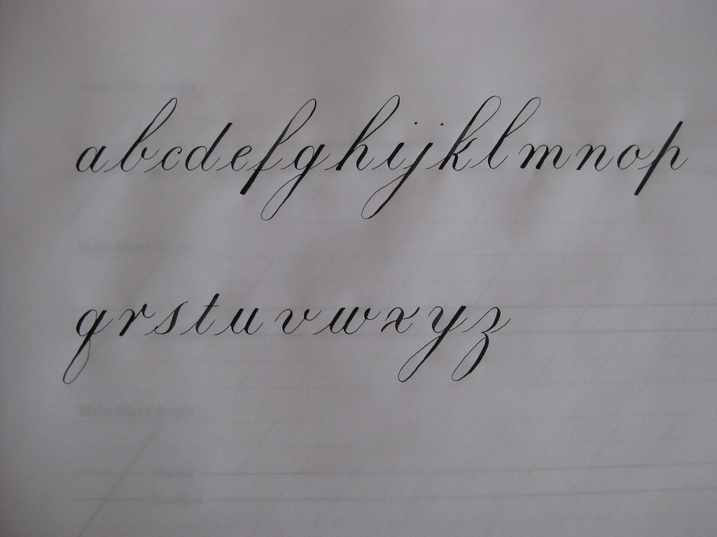
This was my first attempt - I'll probably never get it this good again. Rats.

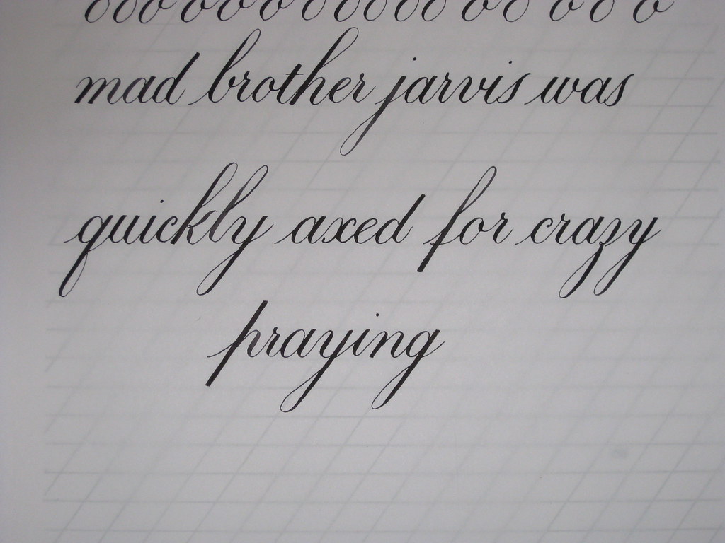
Poor Brother Jarvis, I seem to be  becoming obsessed with him!

Not too bad for first attempts I think. I also took advantage of the clip that goes through how to adjust the flange on an oblique pen-holder properly - it makes a lot of difference!


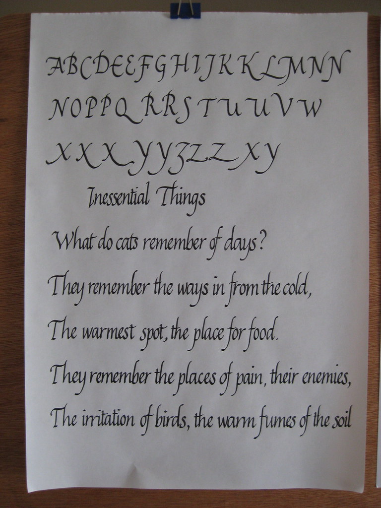
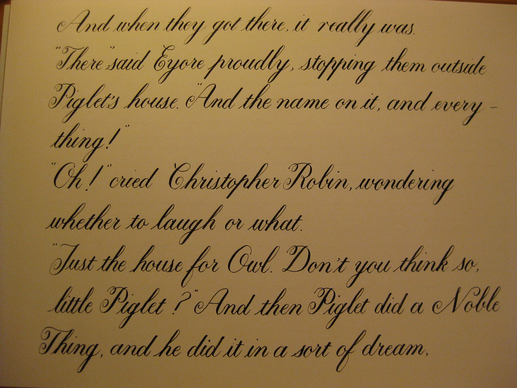
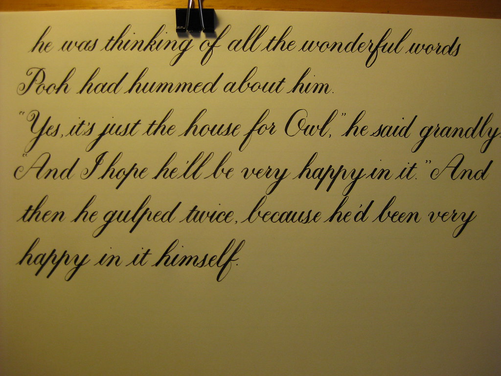
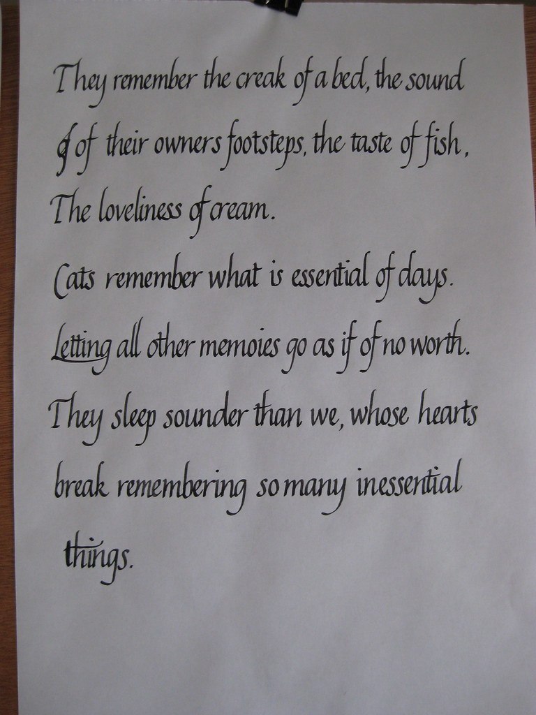
 Over the Easter weekend I also took the time to refresh my memory of the Italic script. It's amazing how quickly it drops off if you don't practice regularly, so I think I should probably set aside one or two days a week for this.

The poem is by Brian Patten - one of my favourites.


I really must learn how to spell


Apart from being a bit rusty I found the letter forms came back to me quite quickly, and I've certainly developed a flow that wasn't there before. However, I do find that writing with this pen (a Rotring ArtPen 1.5mm) makes my hand hurt a significant amount. I'm probably gripping too much.


That's all for now folks, next I'm going to have a look at Dr. Joe's take on Capitals (and carry on practising my Italics). Oh, and Calligraphy classes start up again next week - hurrah!

p.s. A prize for anyone who gets the Bill Bailey reference.

Friday 15 April 2011

Lessons for life, from a Bear of very little brain.

So here, as promised in this post, is the completed extract from 'In which Eeyore finds the Wolery and Owl moves into it' as written by Me:


(Apologies for the dodgy image quality - this is a scan, but I'm still working on the best way of sharing images of my work. Hopefully it's better when you view the larger images).

This is my favourite ever Winnie-the-Pooh excerpt, and I thought it would be a nice way of starting off practising longer pieces. Instead of rambling interminably about the various aspects of what I've written I thought I'd try and keep it succinct in the following way:

Good Things
  • Relatively consistent looking throughout the three-and-a-bit pages
  • Only one spelling mistake (that I've noticed) - sorry Eeyore!
  • There were no 'second attempts' at any of these pages - it's all as written the first time round.
Less-good Things 
  • I made a spelling mistake
  • The baseline is a bit wobbly and inconsistent
  • I'm having trouble keeping the 'h' downstrokes straight - mostly I need to come fruther back round with the ascender loop
  • I need to take far more care with the baseline parts of the letters h and n to make sure that they have even depth (this is partly why the lines are a bit wobbly)
Next time I will:
  • Choose a shorter passage!
  • TAKE MY TIME over each letter and word
  • Use darker guidelines or draw light pencil lines on the paper
  • Relax and warm up properly - it can be so tempting just to launch straight into it and only hit your stride some lines later
  • Take more care sqauring-off  and re-touching letters. NB this should be done with a finer nib
This piece was done using my Brause 361 nib and Higgins Eternal ink on Winsor & Newton Smooth Surface Cartridge Paper. This paper has a nice off-white colour and is just about smooth enough for pointed pen work, as long as you're relaxed about it. It's quite thick though, hence my difficulty in seeing the guidelines!

I learnt so much doing this piece; the main one being SLOW DOWN. It's so easy to think you can write faster just because you can write joined up, but it's a recipe for disaster. I recently saw the following in a Copperplate newsletter: Rules for Copperplate writing:
                                     Rule One - WRITE SLOWLY
                                     Rule Two - See Rule One

This pretty much sums it up I think! That being said, it is important to try and find the balance between 'slow' and 'flow', which I think comes from being relaxed both mentally and physically. So next time I'll be doing my best to slow down and relax, and also keep in mind the technical issues I want to correct without it stressing me out. If anyone has any further pointers for me to add to my list - just shout!

Wednesday 13 April 2011

The 360th degree

Continuing the theme of awe-inspiring religious buildings, take a few seconds to have a  look at this 360 degree panorama of the inside of St. Paul's Cathedral in London.

http://www.sphericalimages.com/st-pauls-cathedral-gigapan/stpauls-giga-pan.html

Even if churches aren't your thing, try zooming in as close as you can go and having a look at the artwork on the ceiling - the level of detail is truly staggering.

Also, you can make yourself feel really dizzy by holding down pan-right (or left - whichever takes your fancy) and spinning round and round. Bet you're not allowed to do that if you actually visit St. P's :-)

Just thought I'd share!

Tuesday 12 April 2011

Sunshine, stained glass and struggles with Copperplate.

What fantastic weather we've had these last few days! It's so good to be reminded what it feels like to be warm enough to go out in t-shirt and shorts. I realise that that probably was summer, but I enjoyed it nonetheless.

On Friday I took a little trip up to Lincoln for the day to meet my Big Sis. Lincoln happens to be about halfway between the two of us, and as neither of us had been there before we decided it would be a nice place to explore. The weather obliged with wall-to-wall sunshine and we spent a lovely day pootling round the old part of the town looking in all the interesting shops and going round the Cathedral. The Imperial Tea shop on Steep Hill is well worth a visit (although the lady behind the counter gave the distinct impression she'd never made a cup of tea before), as is Pimento's tea room where we had lunch.
Lincoln is, of course, dominated by the Cathedral which is impressively large. So large in fact that it's impossible to get a decent picture of it without wide-angle lens. Unfortunately I only have a little compact camera and this is the best I could do:

 Aside from being quite big, it also boasts some lovely stained glass, which looked spectacular in the cool darkness of the cathedral, backlit by the bright sunshine outside.
A lovely day was had all round - maybe next time we'll catch an Evensong or go on the roof-top tour.

Despite the blue sky and sunshine I did manage to persuade myself to stay indoors long enough to do a bit of calligraphy over the weekend. Yet more copperplate I'm afraid, but this time I've been having fun with the capitals, whilst still keeping the minuscules ticking along. Majascules, I have discovered, are simultaneously fun and frustrating; there's a lot more freedom in their creation, but it does mean you have to use your judgement with the flourishes - how much/where/how big etc. and this takes time to get an eye for.
(this page was done with an EF Princiapl and Higgins Eternal ink)

 This is one of my practice pages for the A-H group, including some names and some animals. I was reliably informed that a Dubong was a real animal, but in fact it turns out that I'm slightly deaf and it is in fact a Dugong. So apologies to all you Dugongs out there reading this. Heffalumps are of course entirely real and not at all made up.


After another couple of pages along similar lines (if you'll excuse the pun) I thought I'd bite off more than I can chew and write out one of my favourite passages from Winnie the Pooh. I've been working on this for a couple of days and have to admit that I was finding it rather frustrating. The tines of my nib kept catching on the paper, my letters wobbly and inconsistent and I was generally struggling and finding it quite hard work. HOWEVER, yesterday evening I had a bit of an epiphany: I've been gripping my pen far too tight in an effort to control it, and have consequently worn the tines unevenly. Now, when I relaxed my grip and moved my hand further down the pen I found that not only did it stop catching on the paper, but my flow and control had come back! Magic! Here is the first section:

Lesson 1: Relaxation = Control.

The rest of the story is on it's way (in a much more relaxed fashion, naturally). More next time on 'other useful things I've learnt by trying to run before I can walk' :-) ttfn.

Monday 4 April 2011

Experiments in Gouache (for Mother's Day)

Exhibit A
On Saturday I spent a very happy afternoon doing something that I've been meaning to have a crack at for quite a while now: having bought a suitably pretty card for Mother's Day (exhibit A) I decided not only to have a go at a few copperplate majascules (capitals), but also to play around with using watered down gouache as ink.

Gouache is similar to watercolour but has a higher pigment : water ratio so produces a more intense and opaque finish. I'd read about watering it down to use as ink in several places and thought it might be more fun to try  than merely going out and buying lots of different coloured inks. The one I used for the inside of Mum's card was Winsor & Newton's Designer Gouache in Brilliant Purple. This type of paint is sold in small tubes so it's easy to use as little (or as much) as you feel like - I started off with 1/2 an inch of paint squeezed into a small pot that I then watered down with drops of distilled water from a dropper. I think in the end I used about 10 drops, but you just have to keep dropping and mixing and trying it out on a bit of scrap paper until you're happy with the consistency.

I used my mixing brush to load the nib with the inky mixture and then set about getting a feel for the flow, and also making my first stab a the capitals I'd need for the card. My practice page looked a bit like this:
 As you can see, my capitals aren't amazing but the Eleanor Winters book builds them up stroke-by-stroke and you soon get the hang of how they're constructed.

From this page I made a paste-up of how I wanted the various lines positioned (I'm not yet confident enough to just 'go for it'), and marked on a second sheet the spacing so I could then go ahead and attempt a good copy.
I opted for setting it out on paper and sticking this into the card rather than writing directly on the card itself - mainly because I'm a chicken, but also partly because I wasn't sure how the surface of the card would take the gouache 'ink', and I didn't have time to get a second one if it all went horribly wrong!

I'm pleased to say that I only needed one attempt to get a good copy that I was relatively happy with. The finished thing ended up looking like this: 

 I was quite nervous when I first put pen to paper, but soon found myself enjoying the flow of ink and the sense of achievement. One thing about attempting majascules is that it makes the miniscules seem much easier! I was nearly tempted try a little flourishing as well... but I know my limitations - one step at a time, I think.


Overall, I was really pleased with how my experiments turned out. I did find that the gouache mixture tended to dry up quite quickly, especially under the heat of my desk lamp, but you can keep adding a drop of water and it dries on the paper in a beautifully uniform manner. It's a bit of a faff for everyday practising, but I'll definitely be trying some different combinations out for finished pieces.

Apart from my colourful adventures I also made cake (surprise!). This time it was Nigel Slater's Black Banana Cake. Seriously yummy and easy peasy to make - we've eaten one of them already (so it's a good job I made two!).

Friday 1 April 2011

How happy are you?

Never mind the official Census - the Today Programme has the right idea. Click here to participate in The Other Census.