Wow, it would appear to be quite a long time since my last post - the last few weeks have flown by in a whirl of invitations, envelopes and settling in our new cat!
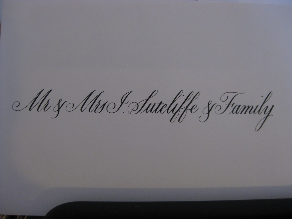
Working through my first full set of wedding invitations and envelopes has been quite a steep learning curve. Copperplate script is a very popular style when it comes to wedding stationary, whether it's the whole invitation laid out in beautiful swirly writing or just the names added to pre-printed cards; it adds an extra dimension and a touch of something a little bit special. Having the envelopes addressed in the same lets the recipient know that this isn't any ordinary bit of post, and usually grabs their attention from the pile they've picked up from the mat.
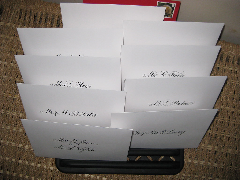
Once the most appropriate x-height, nib and ink have been decided upon there are a few more things that need attention: it's important to settle on a particular style of capitals so that the appearance throughout the envelope and card is unified and doesn't look undecided, and it's also important to establish a method for working.
 |
| Envelopes drying out in my drying rack |
One piece of kit that's essential is some form of envelope drying rack. Now you can by lovely wooden ones from places such as
Paperinkarts in the States, which hold 9 envelopes (I've not managed to find a UK stockist of such things), or I chose to use a plastic dish rack which holds 20 envelopes or invitation inserts and was relatively cheap from Amazon! Whatever you decide to use, it's an absolute must in terms of organising your work.
If you haven't thought about it first, it very quickly becomes clear that you need a quick and reliable method of centring names and working out where best to sit them in relation to the text above and below them. The first is easily done with a strip of paper the width of the envelope or invitation, folded centrally and marked off with the start position of each name (working from a practice version written out beforehand). For the second, guidelines marked with an x on the appropriate line help immensely. I'm sure that eventually, when I become practised enough, I'll be able to judge more easily where things start and finish, but for the moment it's safest for me to do a rehearsal version first (on layout paper) to guard against any nasty surprises!
As for the cat, it's best to try and keep him safely out of the room so that he doesn't walk muddy paw-prints all over your work!
Doesn't he look hard-done-by?