Pages

Showing posts with label Moon Palace Sumi ink. Show all posts

Tuesday, 3 April 2012

A Cunning Plan (otherwise known as Wedding calligraphy #2)

Actually just a table plan, but I thought a cunning plan sounded more interesting. Back in my post about place cards I mentioned that my pictures of the table plan-in-progress had got eaten somewhere between memory card and computer - I am happy to announce that my husband is a genius and has caused them to reappear from the abyss.

Laid out but not mounted yet.
So, my table plan consisted of 5 tables of 9 all named after various places in One Hundred Acre Wood. After seeing some invites printed and overlaid with vellum paper, I thought I'd use a similar idea and write out the names on vellum paper and mount this over cornflower Khadi paper (the idea being that you could still see the flowers through the overlaid paper). All this mounted on some Ivory Canford card and stuck in a nice frame would look lovely.

I think it did look nice in the end, but writing copperplate on vellum paper is not to be attempted lightly (or if you have a short temper). The trouble is that vellum paper (and we're talking vellum paper, as opposed to proper Vellum here) doesn't absorb ink very well. Or at all, really. If you try and use gouache then the paper crinkles up and you loose the intensity of colour as it dries; if you use ink (I used Moon Palace Sumi ink in the end) it keeps it's lovely intensity but takes a long time to dry. The surface tended to be both skiddy and scratchy all at the same time - in short an absolute nightmare to write on. I attempted most of the tables at least twice, and found it really difficult to control uneven descenders and wobbly ascenders. Persistence, however, paid off and I finally had an acceptable version of each for the finished thing. I have a sneaking suspicion that if you prepare the surface with gum sandarac then writing on vellum paper becomes a lot easier - unfortunately I had neither the time nor the means to experiment with this before needing the finished thing.

Cutting and sticking materials.


Other important equipment for assembling the plan can be seen on the right and include: a putty rubber, a prit-stick, scissors, a soft pencil, double sided tape, a very sharp scalpel + cutting mat (be careful with these!), and a metal ruler.
The nice thing about khadi papers is that they can be torn along the edge of a ruler giving you a nice straight edge, but maintaining the nice ragged, rustic look of the natural edges.


All in all I think it turned out rather well considering I'd never attempted anything like it before, and was really just making it up seat-of-the-pants style. The finished thing, mounted and framed looked like this:
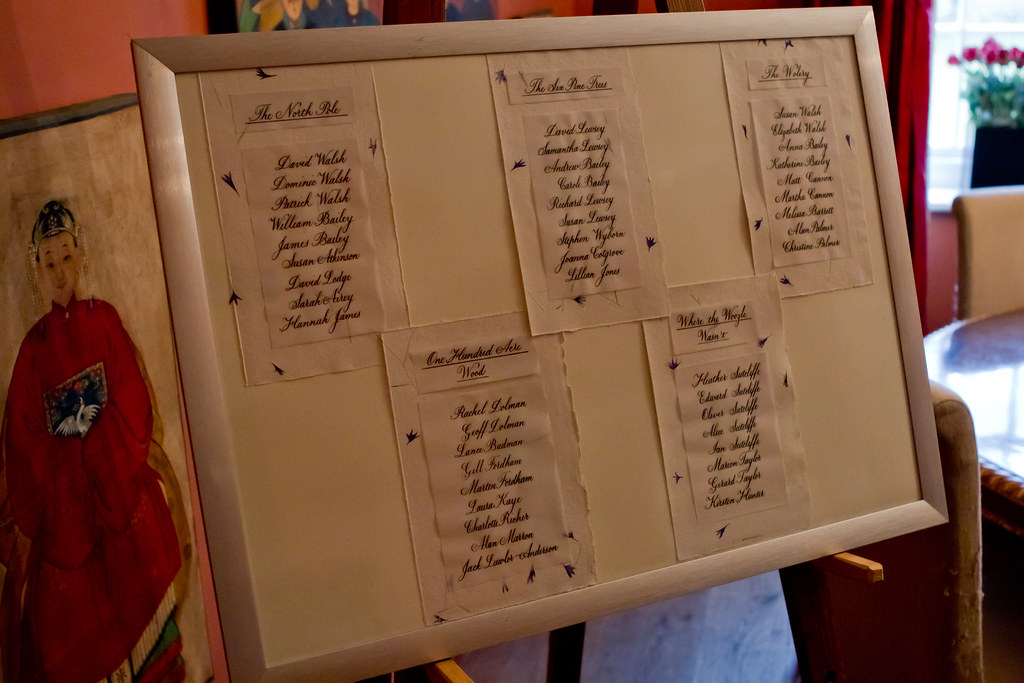
(Photo courtesy of the wonderful Kirsten Hunter)


Aside from the aforementioned trouble with the vellum paper, if I were to do a similar piece again I'd probably double mount the tables with a stronger colour behind the khadi paper (perhaps dark purple or blue), and include a similarly mounted title at the top (either simply 'Table Plan' or the Bride and Groom's names and wedding date) to prevent it looking a little bit on the naked side. We live and learn!

Tomorrow, I'm very excited to be heading into London to attend the CLAS Living Letter IV exhibition: All that Glisters at the Oxo Gallery on the South Bank. It'll also be visiting the Design Centre at Sunderland University, and Bath Central Library over the coming weeks, so do go along if you have the opportunity - it features beautiful works from some of the country's top calligraphers and I am anticipating being truly inspired by their skill (I've had a sneak peak at the catalogue and know I won't be disappointed). I'll report back here once I've recovered!

Wednesday, 8 June 2011

Spaced out

Apologies for the recent radio-silence, things have been getting a little hectic of late and suddenly it's more than three weeks since I posted anything!

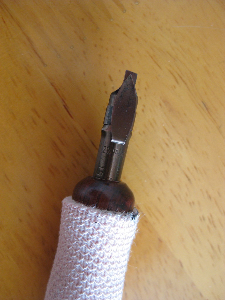
The eagerly awaited parcel finally turned up, and included a couple of Brause Rose nibs, some Brause 66EF nibs (plus special oblique holder for them), and Brause Bandzug 2.5mm broad-edged nib and some Moon Palace Sumi ink. Of all the contents I was only disappointed with the Brause Rose nib, but I will happily admit that I've hardly given it a chance and perseverance may prove that I'm entirely wrong - it just seemed to give very thick and messy lines :-(

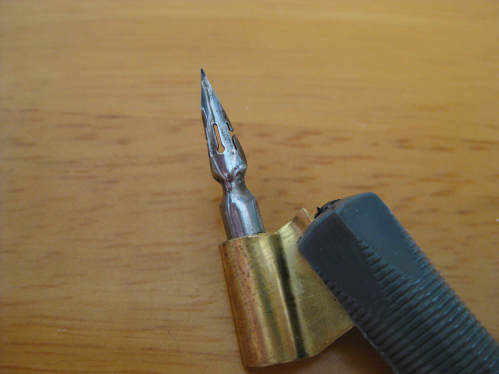
Brause Bandzug 2.5mm nib
The Brause Bandzug (left) I am absolutely in love with. The Bandzug is a far better quality broad-edged nib than the Speedball nibs I have been using. Crisp, clean and smooth lines are consistently produced, and the reservoir holds seemingly no end of ink. It has a right-oblique cut for right-handed calligraphers that helps maintain nib-angle and is an absolute joy to write with. So much so that I've ordered the rest of the set (you can by sets of 9) so that I can have the complete range from 0.5mm right the way through to 5mm. Brilliant. What's more, the numbers assigned to each nib correspond to their width in mm - so no more having to remember which set of numbers is which width (as with almost every other manufacturer)! It's almost as like they thought about it.


Brause 66EF nib
The 66EF (right) is also lovely to write with. Smooth running without being excessively 'sharp' it produces nice hairlines and is particularly good for smaller  x-heights. Used in combination with the fantastically rich black Moon Palace Sumi I've been enjoying the results immensely.
The aforementioned Sumi ink seems to flow well from both of these nibs, but it has needed watering down a touch for use with some of my other copperplate nibs (the EF Principal in particular).


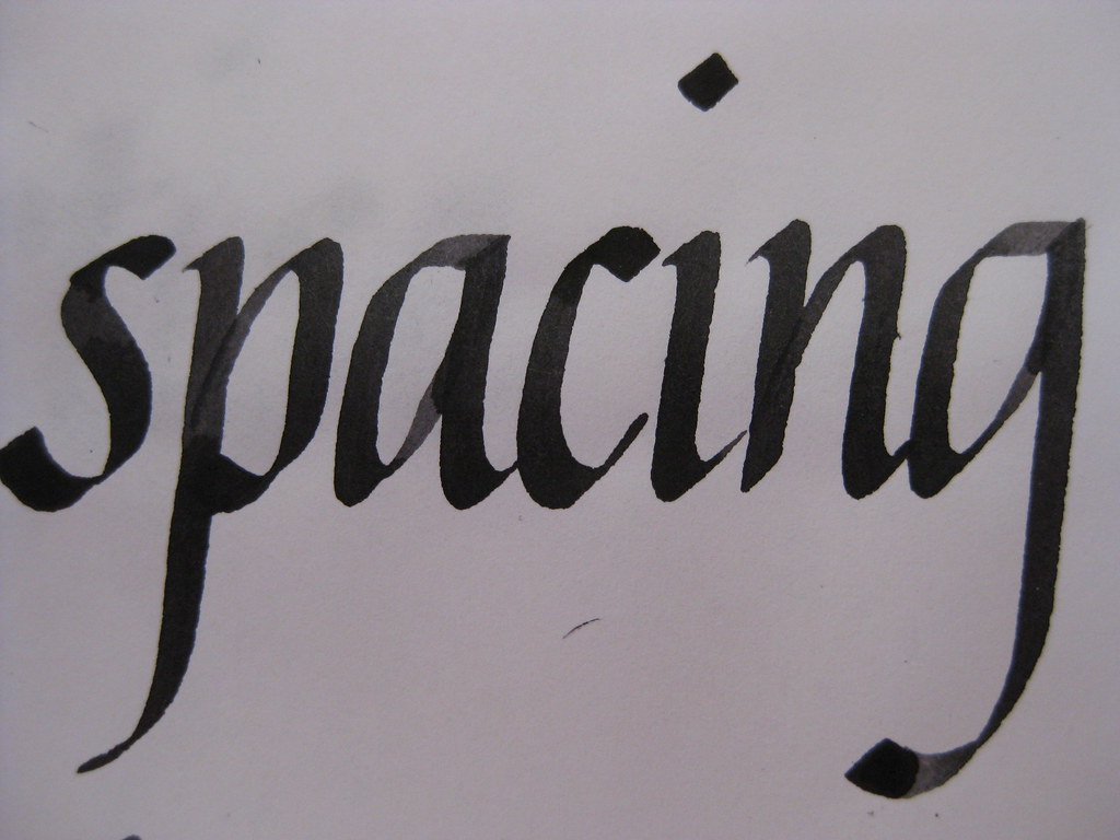
But enough waffle from me about calligraphy tools, what about the actual writing? Well for the last couple of weeks I've been working mainly on my Italics (just because they're easier to pick up and put down if time is tight) and playing with the above nibs. I'm fairly pleased with how my letter forms are coming on, but something was still looking a bit funny about the sheets I was producing. I asked my tutor, and he spotted it straight away:

Brause Bandzug nib, Higgins eternal ink (I think)
Both internal letter spacing and between words (I want to write inter-wordal, but don't think it's allowed really!). I've been working hard on this and it's getting a lot better - the consistency looks miles better and some of the practice sheets I'm really quite proud of, so I'm thinking of having a go at a CLAS Certificate to see what the pros think!


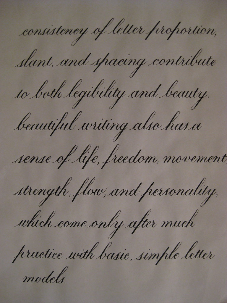
Here's a bit of Copperplate to show I haven't abandoned it! This is the text I'm thinking of using for the continuous prose bit of the certificate. I'm beginning to really prefer the 1:1:1 ratio for Copperplate - I think it always looks much more elegant than the 2:3:2 that I started with, so I'll stick with what I like best :-)


That's about it from me - I'm going to try posting more frequently in the future with the idea of keeping the length a little bit more manageable. Well done if you made it this far!