Pages

Showing posts with label Calligraphy. Show all posts

Sunday, 2 February 2014

Formal Uncials

Another half an hour to myself whilst the little one is napping, so I picked up my pilot pens and had a go at formal uncials. This was done with a 2.4mm nib, purple ink and a 4 nib-width x-height.

I used for my reference a section from Gillian Hazeldine's brilliant book Contemporary Calligraphy: how to use formal scripts today.

This is not a script I am at all used to working with, but there's so much you can do with it, with a little bit of creativity.

Monday, 27 January 2014

This says it all really...

New toys!

I have just bought myself a set of 3 Pilot Parallel pens. They're great fun, and absolutely ideal for grabbing and playing around with in the few minutes when my daughter is quiet or napping and I don't have time to set myself up for a long writing session. These were done with the 2.4mm pen and a cartridge of the violet ink that came with the set.

As you can see, we've been celebrating Burns Night!

Thursday, 19 December 2013

A little something for my Mum

It's my Mum's 70th birthday - we're throwing her a party at the weekend and I've been inspired to get my pens out to do a couple of little pieces for the guest book. After 18 months of no calligraphy I genuinely have no idea how I've survived without it. It's been wonderful to spend the last few days rediscovering my love of Copperplate, and I've really had to struggle to tear myself away from it!

Anyway, here are the pieces - I hope she likes them.

Saturday, 24 December 2011

Happy Christmas :-)

Gold gouache on black card. Brause 66EF nib.

I hope you all have a lovely Christmas and get to enjoy some time off over the coming days.


And while I had the Gold gouache out...


Monday, 24 October 2011

Dealing with my gilt complex (with thanks to Terry Pratchett)

This week I have mainly been...

1) Panicking about how much calligraphy I want to do (and how little time there is in which to do it)

5 Months have passed since I first joined the CLAS Copperplate Special Interest Group and that can mean only one thing - it's time for another round of envelope exchanges. Disappointingly, only three of the five envelopes I was expecting to receive in the last round turned up, so this time I offered to be in two groups, thereby doubling the number of exciting envelopes that will drop through the door (I know, I didn't think about the 'twice the amount of work' aspect at the time!). On a more positive note, one of the recipients of my envelopes last time was impressed enough to feel the need to write back, so I am busy preparing another envelope to send in reply :-)

2) Gilding/Making a card for a friend (This bit is slightly more interesting and involves more pictures... )

Next weekend we are off to a friend's birthday party and, not needing much of an excuse, I thought I'd have a go at making her a card. Last time I was at a workshop my tutor showed me a commissioned piece that she had recently finished that was gold leaf on an acrylic wash background. 'Oooh', I thought, 'that looks pretty - I wonder if I could do that'.

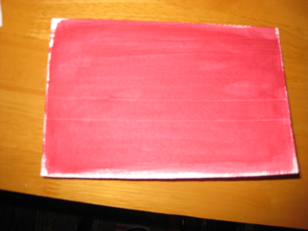
A very out-of-focus picture of a card with acrylic wash
My ever wonderful Mum (who is a watercolour artist and veritable mine of information on all things crafty) had previously provided me with some cards of watercolour grade paper with deckled edges, a book of gold leaf (loose), some size (glue) for sticking the gold leaf to the paper, and a large flat brush for washes. I watered down some crimson acrylic paint and painted a fairly intense wash on two cards (see right) and a piece of watercolour paper for experiments.

I hadn't taped any of these down (mainly because I've lost my masking tape) and to my horror they immediately began to curl up. 'Fallen at the first hurdle', I thought, but actually as they dried they flattened out again - phew!

Some experimentation in black ink on layout paper ensued, to get the right nib size and finalise the Italic variation I would use, and after this I ruled up on the test card (using a white pastel pencil - this shows up against the paint, but will also rub out). Initially I just used the plain size in the nib reservoir to write onto the prepared paper, however not only is it a bugger to see once it's dry, but it's also very thin and flowed too quickly out of the nib. I persevered and made a fairly messy attempt at sticking the gold leaf to it, but I learned some useful lessons before attempting one of the cards.

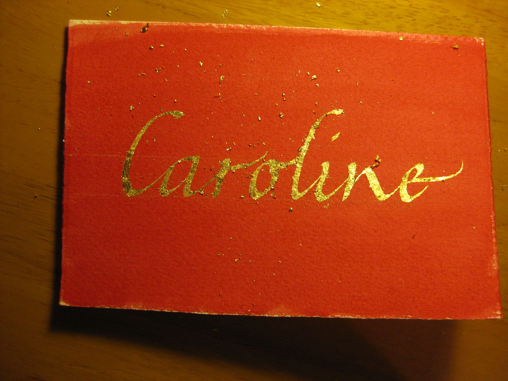
Immediately after the gold had been applied - gold bits EVERYWHERE!

The second time around I added some Dr. Marten's Pen White to the size which had the double effect of thickening the liquid and allowing me to see where I'd written. I then used two very small brushes to apply bits of gold leaf to the writing. Two bits of advice: press the leaf on, don't brush; and DON'T BREATHE! - the stuff is lighter than a feather and will get *everywhere*.


Brushed down, but not birnished


 After replacing any usable bits of gold leaf back in the book, I used an old (soft is the key) make-up brush to brush gently over the surface to get rid of any bits that weren't stuck down. The card then looked like this:


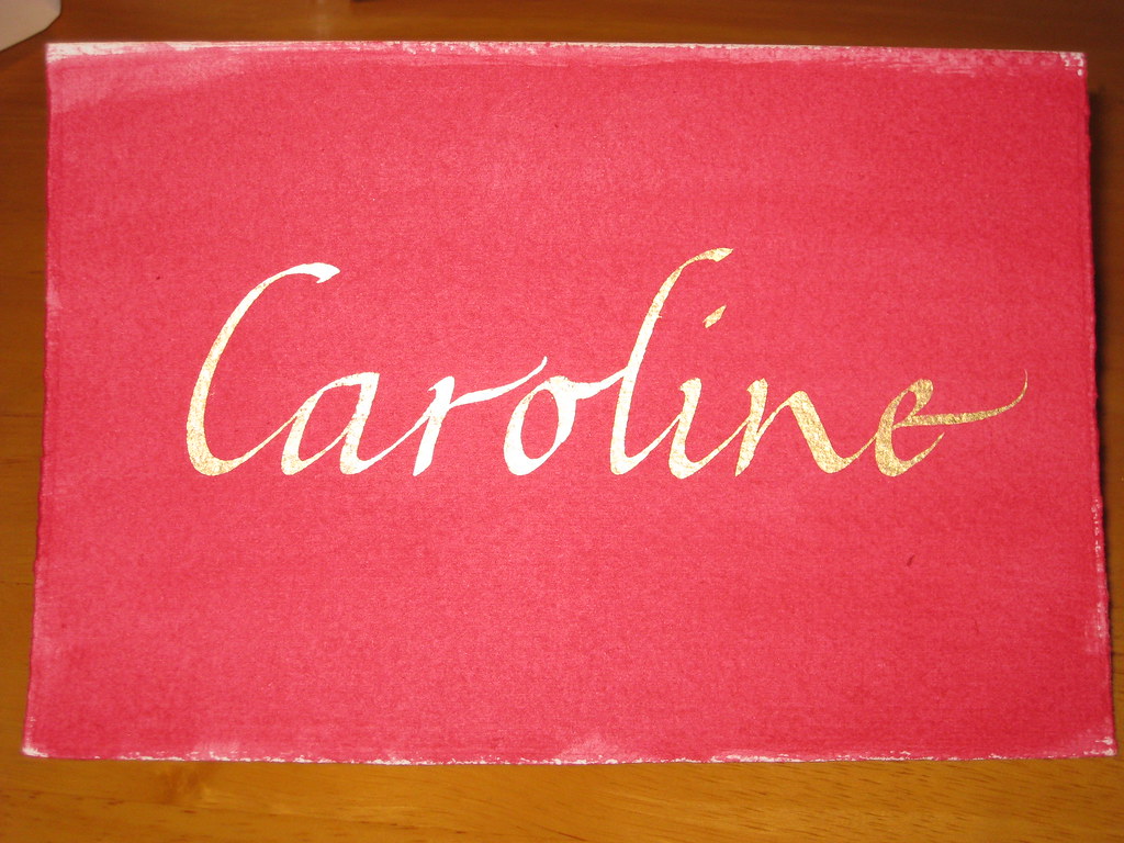
 Finally, some patience was required to let the gold and size dry thoroughly before burnishing (rubbing over to bring out the shine) with a soft cloth. There are special tools to do this, and I have heard that a piece of silk works very well too, but having neither of these I plumped for a soft cotton hanky and it seemed to do the trick:


 The result is pleasing, no? Anyhow, I hope she likes it - I had great fun doing it, and will definitely be doing more in the future!


Wednesday, 18 May 2011

Taking a break from the pointed pen

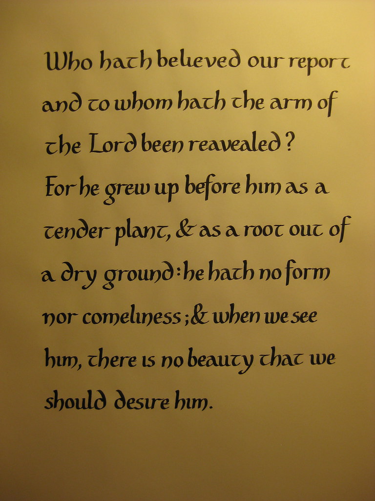
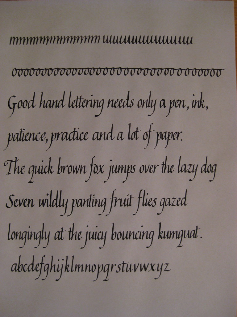
This time last week I was wittering on about looking forward to learning the basics of Carolingian minuscule at my evening class. Here's how I got on:

(click for bigger)
We tend to spend the first half of the evening discussing a particular script and practising the basic letter forms, and if we feel we're getting on well enough we can then go on and try using it for a passage of writing. I'm a firm believer in running before I can walk, so like to practice by writing things out rather than just copying out the alphabet ad nauseum.
The rounded bowl-shapes of the m, n and h lean more towards Uncial than Carolingian (as does the rounded ascender of the d), but my Calligrapher's Bible used these and I preferred the more distinctive look it gave over the straighter stems that were more like Foundation hand. A great hand for anything with a slightly Celtic feel to it - especially with a Celtic-knot border. Care needs to be taken over the spacing though, as it really shows up any overly-large white spaces (or any cramped lettering).


In other news, my Italics also seem to be progressing well. Here's a practice page from last week:
Much more consistent than earlier attempts, but this does appear to have been at the detriment of my Copperplate script, which I've been taking a little break from recently.


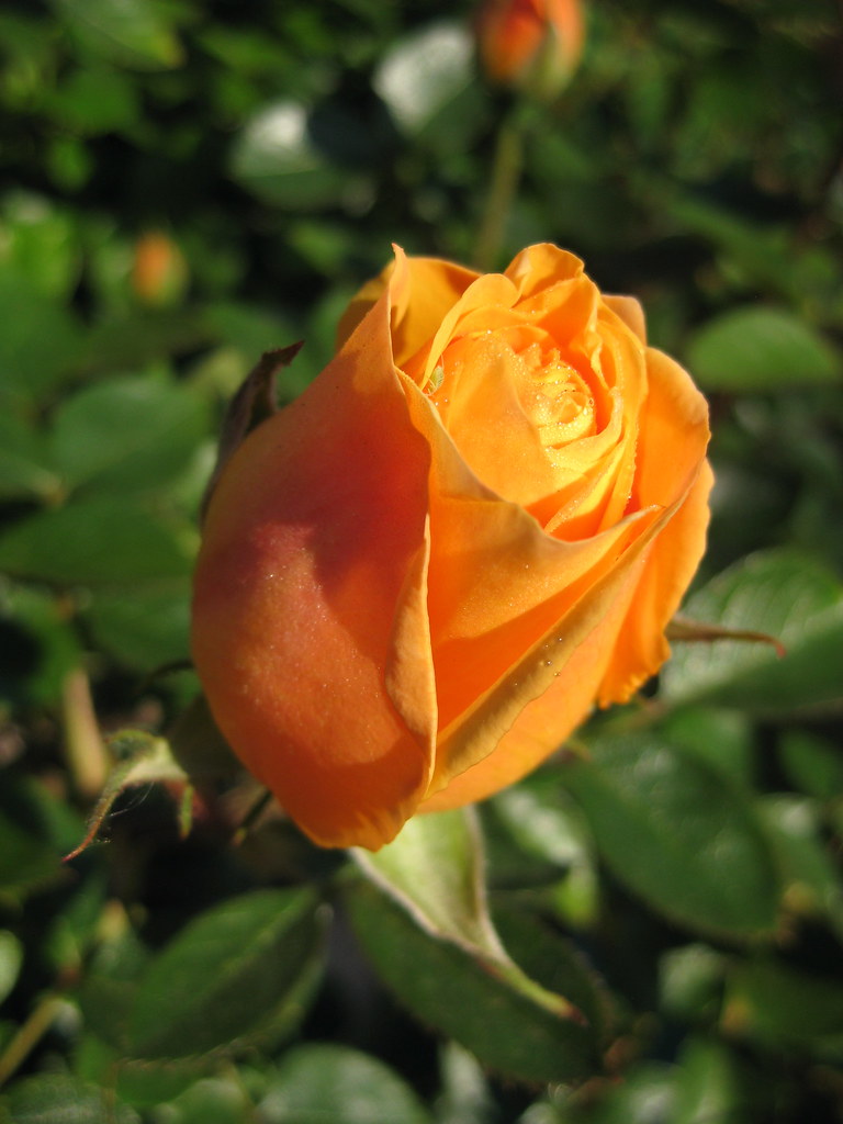
The lovely blossoming Crab Apple tree that I posted a picture of last time has sadly become a casualty of the building works at home :-( but we do have some lovely roses (see right) to make up for it a little bit. Looking forward to choosing a replacement tree to plant in November though.


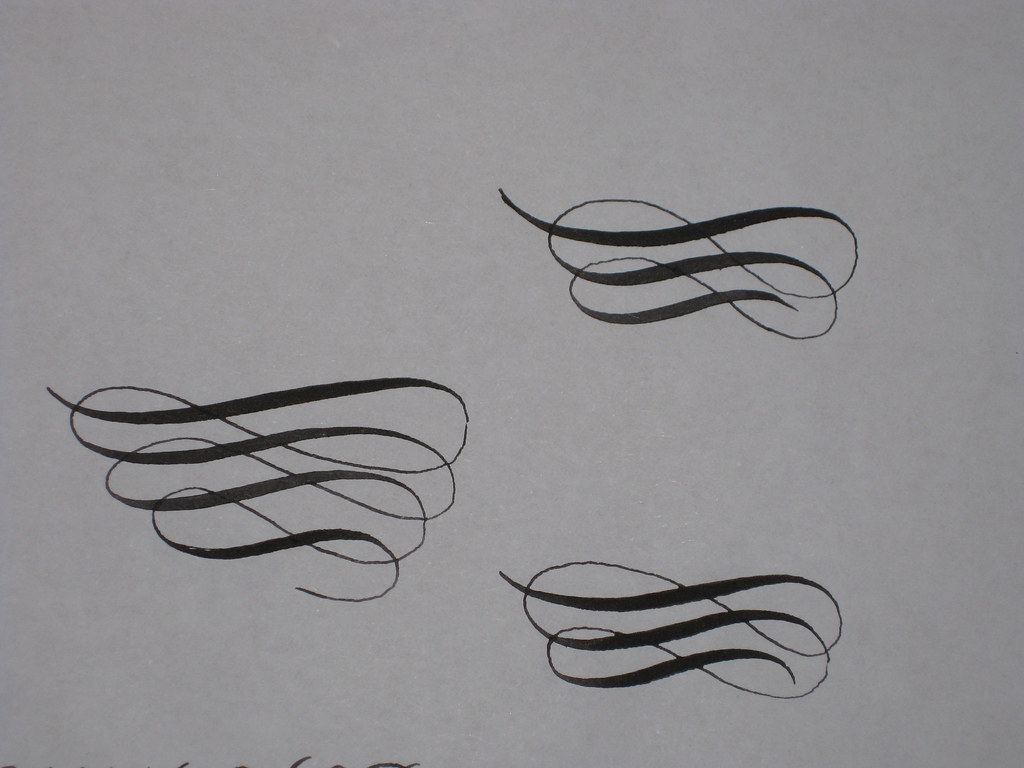
And here's an early attempt at some flourishing. Still waiting [im]patiently for my parcel...

Wednesday, 16 March 2011

The beginnings of an adventure...

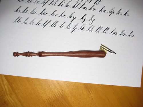
Following several weeks of hard work really getting to grips with the basics of the Italic hand I felt as though I needed a bit of a change, and so decided to return to my foray into learning Copperplate. In keeping with my promise not to get ahead of myself, and to really get a handle on one thing before moving on to the next, I hadn't tried any Copperplate for some time. However, my new oblique pen-holder had arrived from John Neal Booksellers, along with some Leonardt EF Principal nibs from Scribblers, and I felt the time was ripe to have another go.

My new 5/8" Century Oblique Penholder
 Given that my initial attempts in Copperplate were with a straight penholder (necessitating crazy paper-angles) and a not-so-great Leonardt Crown nib, I decided to start again from the beginning to refresh my memory and get used to the new pen and nib. I hadn't been displeased with the start I'd made originally, but the lettering I'm able to produce with my new toys is miles ahead in terms of contrast and elegance (although there's obviously still a long way to go).
  
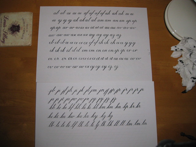
In order to learn in the most thorough way I can, I have been following the tuition in Eleanor Winters' 'Mastering Copperplate Calligraphy', which takes you through step-by-step building up the basic strokes before putting them together to form the lower-case letters. Having painstakingly worked through my alphabet, I'm now onto the heady heights of joined up writing! Each combination is practised in turn (even if you'd never usually use it) and this gives you the chance to look again at your letter forms, and also get a feel for spacing. It's hard work, but very satisfying when you get it right :-) Uses a lot of paper though!

A couple of practice sheets

Some days I can't seem to get it, but most days I find I'm making progress and find it very cathartic. I would recommend it to anyone!


Tuesday, 15 March 2011

Spring has sprung!

Ok, so I have been terribly remiss about posting recently, mainly because I have been really enjoying my scribbling and worked out that time taken posting on my blog = time not spent with a pen in my hand! However, I feel I ought to show off my progress a little, so here goes...

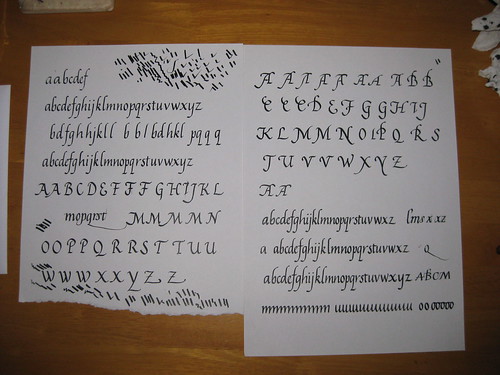
Having spent 3 weeks or so really working on my Italics (miniscules mainly, but I have had a go at some majascules) I took my efforts in to my tutor at the evening class and got some useful pointers and encouragement on how to take things further:

As you can see, quite a lot of scribbling, but a couple of nice complete alphabets. Some of the capitals are also getting there, although I seem to have particular trouble getting the right angles (not right-angles, d'oh!) for the A and M.
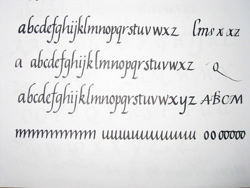
One thing my Tutor suggested was having a go at a more 'flourished' Italic where the ascenders are all curved over to the right in order to match (rotationally) the descenders. I like this much more than the formal Italic - it somehow has a sense of flow to it.


 A closer look at the alphabets seen bottom right in the image above. Sometimes I get carried away and loose the ability to spell! Please forgive the missing 'y's in the first two attempts. Next term, when classes start up again, I'll be using this to attempt a 'job' i.e. a finished piece of writing complete with experiments in layout, colour and design!


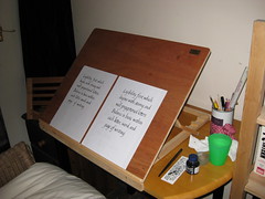
All this has been helped immensely by the appearance of my new calligraphy easel, handmade for me by Rowley Abbey of Abbey Easels - fantastically pleased with the result, and it was made in super-quick time to my own specifications. Great workmanship - I would highly recommend him to anyone.


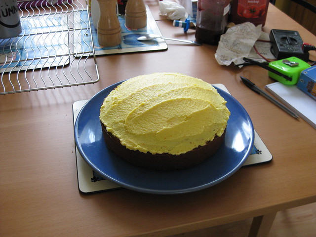
In other news, I've been making cake:
Mmmm, cake :-)
and getting back in to my running which I'm returning to after after several months off due to a hip injury. I'm up to 40mins pain free! Yay! (it's probably just as well after all that cake...).

Tuesday, 15 February 2011

Heart shaped fudge and other stories.

Last Wednesday saw me pootling off to my first calligraphy evening class. Having never been to an evening class before I didn't quite know what to expect, but the group was small and friendly and made me feel very welcome. We spent the evening working on Blackletter or Gothic script, which I enjoyed immensely. I felt fairly comfortable with this hand, possibly because you can be relatively heavy-handed with it and it doesn't really show.

My first attempts at Blackletter
As you can see, my first attempts weren't too disgraceful, and by the end of the evening I was beginning to get the hang of the little hariline flicks on some of the letters too. What I found really interesting was how closely ths script corresponded to the needs of the language; for example the letters K, X and Z weren't in use at the time, and it really shows - these letters feel wrong and difficult to construct within the context of the blackletter miniscule alphabet.

This week we're going to be looking at the Italic hand, which is something that I've been having a go at recently anyway.  I've decided, in my bid to master one thing at a time, that I'll continue with my efforts in Italic and put the Blackletter to one side until I'm happier with my Italic script. To this end I've been trying to practise every day for half an hour or an hour by writing in a journal which should eventaully be nice to flick through and see my progress:


There are some nice bits in here, but I was really tired by this point (having spent some time trying to perfect the inside of a valentines card) and it shows. Slant and nib angle are not consistent, but hopefully this will be rectified to a certain extent by the imminent arrival of a new easel which should mean I'm less cramped when writing. The word 'calligraphic' here is probably the highlight, being the most consistent. The passage is taken from the book I'm using to help with learning Italic.

And finally, I just wanted to share with you this beautiful heart-shaped fudge made for me and my fiance (in return for a carrot cake) by our friend Lance. We arrived home one morning to find it balanced precariously in our letter box :-)
What a sweetie!