Pages

Showing posts with label Italic variations. Show all posts

Monday, 24 October 2011

Dealing with my gilt complex (with thanks to Terry Pratchett)

This week I have mainly been...

1) Panicking about how much calligraphy I want to do (and how little time there is in which to do it)

5 Months have passed since I first joined the CLAS Copperplate Special Interest Group and that can mean only one thing - it's time for another round of envelope exchanges. Disappointingly, only three of the five envelopes I was expecting to receive in the last round turned up, so this time I offered to be in two groups, thereby doubling the number of exciting envelopes that will drop through the door (I know, I didn't think about the 'twice the amount of work' aspect at the time!). On a more positive note, one of the recipients of my envelopes last time was impressed enough to feel the need to write back, so I am busy preparing another envelope to send in reply :-)

2) Gilding/Making a card for a friend (This bit is slightly more interesting and involves more pictures... )

Next weekend we are off to a friend's birthday party and, not needing much of an excuse, I thought I'd have a go at making her a card. Last time I was at a workshop my tutor showed me a commissioned piece that she had recently finished that was gold leaf on an acrylic wash background. 'Oooh', I thought, 'that looks pretty - I wonder if I could do that'.
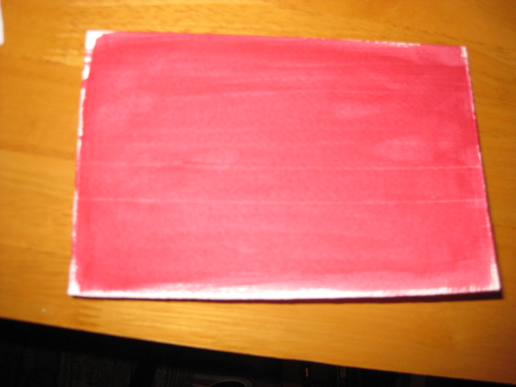
A very out-of-focus picture of a card with acrylic wash
My ever wonderful Mum (who is a watercolour artist and veritable mine of information on all things crafty) had previously provided me with some cards of watercolour grade paper with deckled edges, a book of gold leaf (loose), some size (glue) for sticking the gold leaf to the paper, and a large flat brush for washes. I watered down some crimson acrylic paint and painted a fairly intense wash on two cards (see right) and a piece of watercolour paper for experiments.

I hadn't taped any of these down (mainly because I've lost my masking tape) and to my horror they immediately began to curl up. 'Fallen at the first hurdle', I thought, but actually as they dried they flattened out again - phew!

Some experimentation in black ink on layout paper ensued, to get the right nib size and finalise the Italic variation I would use, and after this I ruled up on the test card (using a white pastel pencil - this shows up against the paint, but will also rub out). Initially I just used the plain size in the nib reservoir to write onto the prepared paper, however not only is it a bugger to see once it's dry, but it's also very thin and flowed too quickly out of the nib. I persevered and made a fairly messy attempt at sticking the gold leaf to it, but I learned some useful lessons before attempting one of the cards.
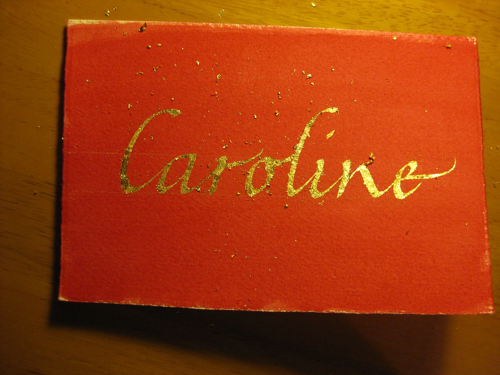
Immediately after the gold had been applied - gold bits EVERYWHERE!

The second time around I added some Dr. Marten's Pen White to the size which had the double effect of thickening the liquid and allowing me to see where I'd written. I then used two very small brushes to apply bits of gold leaf to the writing. Two bits of advice: press the leaf on, don't brush; and DON'T BREATHE! - the stuff is lighter than a feather and will get *everywhere*.


Brushed down, but not birnished


 After replacing any usable bits of gold leaf back in the book, I used an old (soft is the key) make-up brush to brush gently over the surface to get rid of any bits that weren't stuck down. The card then looked like this:


 Finally, some patience was required to let the gold and size dry thoroughly before burnishing (rubbing over to bring out the shine) with a soft cloth. There are special tools to do this, and I have heard that a piece of silk works very well too, but having neither of these I plumped for a soft cotton hanky and it seemed to do the trick:
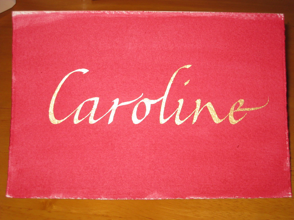

 The result is pleasing, no? Anyhow, I hope she likes it - I had great fun doing it, and will definitely be doing more in the future!

Tuesday, 13 September 2011

Capital punishment

Another weekend, another fabulous course with Gaynor Goffe at Flatford Mill. Most of the usual suspects were there, with the addition of a couple of new faces too. This time I thought I'd dedicate the weekend to getting my capitals sorted out. Majascules always seem to get neglected - it's very easy to work hard on perfecting the minuscules of a particular hand, but when you come to write out a quote, poem or name you suddenly realise you have absolutely no idea how to form the capitals properly. Very annoying!

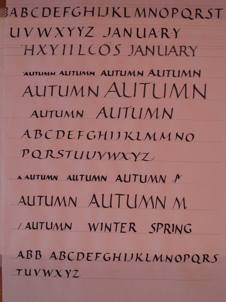
I have, on previous occasions, tried my hand at flourished Italic capitals but found the attempt more than a little frustrating not really knowing anything about the correct proportions or pen angles. This time I jumped in a at the deep end and decided to learn the strict proportions of Roman Capitals, and then branch out into a few variations, including some drawn capitals. A typical sheet from the course looked something like this:

Roman Caps and their variations. WM No.2 nib with black gouache.
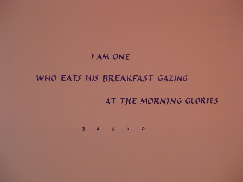
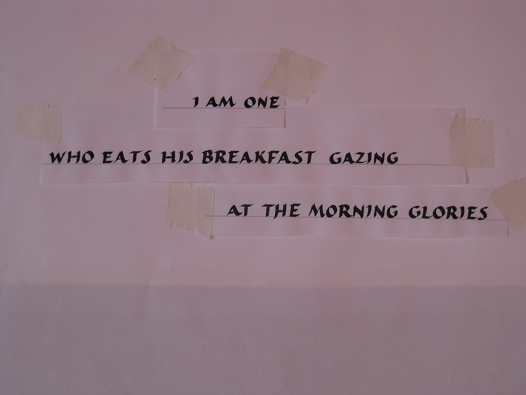
At the top are a few lines of the ordinary Roman caps, followed by some experiments in size (but using the same nib) and then a more relaxed, slightly forward leaning alphabet in the middle and at the bottom. This latter variation really appealed to me - I didn't find it at all taxing to write and it seemed to flow quite naturally so I decided to prepare a small haiku to lay out and write up as a finished piece.


Left is the layout paste-up for the finished piece. Written with a William Mitchell No.2 square cut nib in black gouache this is a slightly squat, more flowing variation of the Roman caps I had been working on. As always, I ruled up for two attempts at a final version.


This one I am particularly proud of :
Final piece - No. 2 nib with custom-mixed Purple gouache (W&N designers)

Other work over the weekend included drawn Roman caps with serifs, and formal and flourished Italic caps
            
  Drawn Roman caps with serifs
Drawn Roman caps, final word to be traced down


Final word traced down, outlined with a pointed nib and painted in with purple gouache

Formal and flourished Italic caps practise sheet

Monday, 11 July 2011

Constable Country...

 Last weekend I spent a very enjoyable weekend on the 'Calligraphy for Beginners and Improvers' course run by the Field Studies Council at their Flatford Mill Centre in Suffolk. Our tutor for the weekend was the wonderful Gaynor Goffe who gave us her undivided attention for several hours each day, and led the more novice of us through several experiments in calligraphic variations and also in the use of colour.


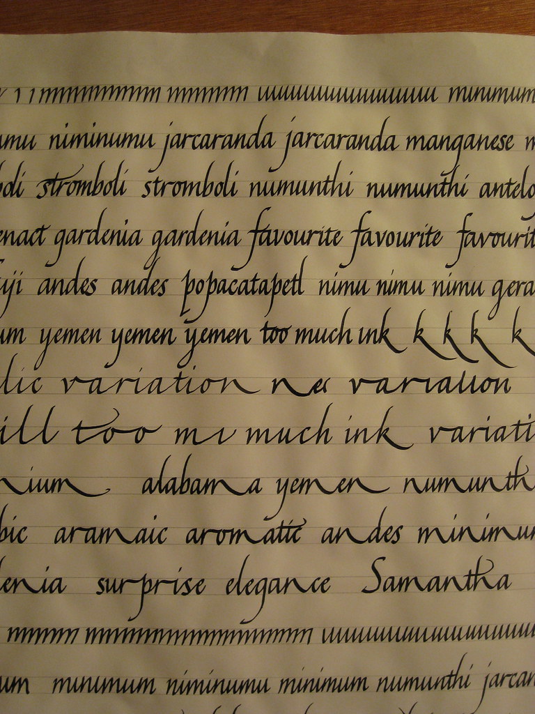
My own efforts were focused on developing my Italics, and one of the very first things Gaynor got me to do was completely change the mechanics of how I write. She got me writing with a far more sweeping gesture moving the whole arm instead of just flexing my fingers. This is wonderful for developing rhythm, but makes you lose most of your control at first (at least that's my excuse).

A new technique (click for bigger)

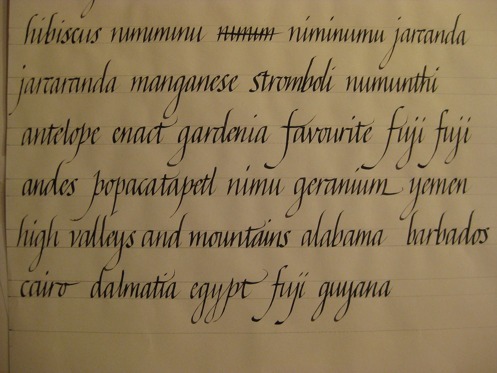
 Pages of practice ensued (I got through a small rainforest) the one on the right being a better example from when I'd regained a modicum of control. Basic concepts were taught and practised using a relatively large nib (2mm), but as we became more proficient we were encouraged to move on to smaller sizes, and then on to italic variations.
Smaller nib size, and some variations


The main variations included sharpened italic, variations in proportion and spacing,  and finally variations produced by picking certain letters, or groups of letters, and consistently extending them (see left).


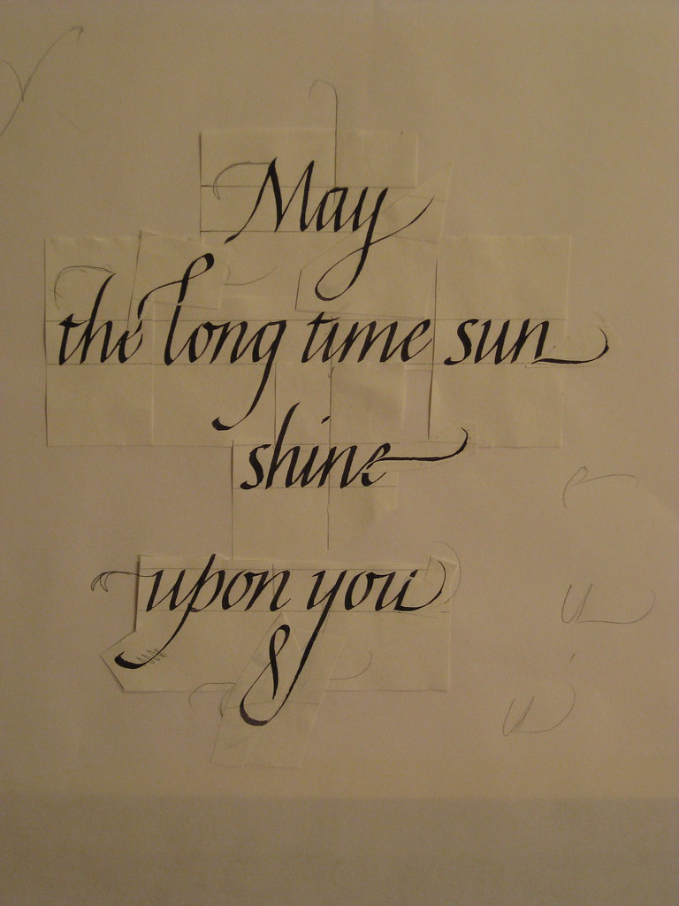
Flourishing (paste-up)
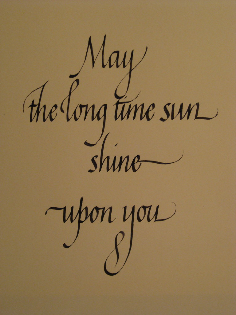
Hot on the heels of these Gaynor went through adding some flourishes with me - this was by far the most engaging and enjoyable part for me, and steep learning curve in terms of what works and what doesn't (and which flourishes work in combination with others). To the right is a paste-up of the my favourite piece or work from the weekend. As well as a considerable amount of technical tuition, I also learnt heaps of tips and tricks for ruling up, laying-out and centring pieces of work. As you can see from the picture, all the individual flourishes are pasted on - this allowed to me play around with different combinations of flourishes without having to write the piece out hundreds of times. The finished piece, I think deserves a big picture all of it's own.

Flourishes - final version
The weekend was incredibly intense - every time I felt I'd got a handle on one thing we were whisked on to the next, but it was definitely the best use of the time available;  if you wait until you've perfected one thing before trying something else, you'll basically never get past step one. Gaynor persuaded us to lay aside fears of 'getting it wrong' and got us to just give new things a go. Sometimes it worked, sometimes it didn't, but I learnt something from everything I tried. The challenge over the next few weeks is to re-visit all the things we covered during the course and try to consolidate it all.

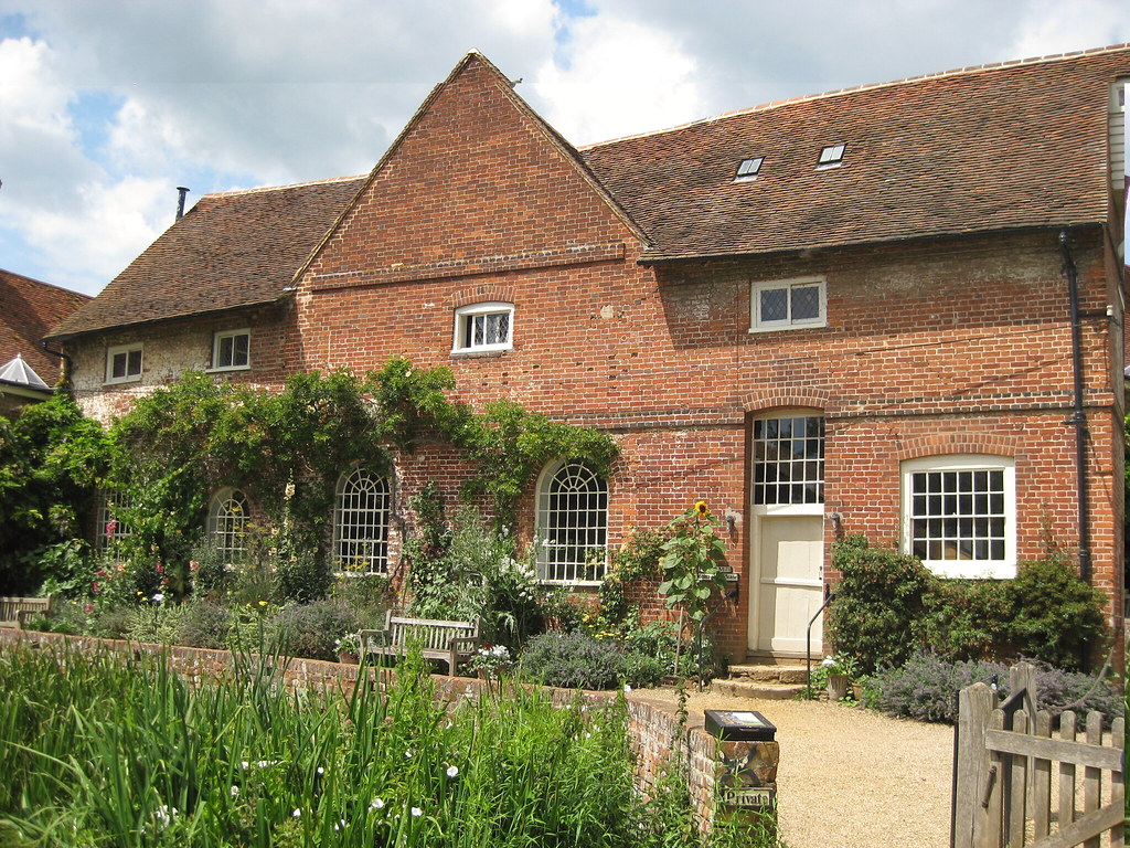
Oh, and Flatford Mill is a beautiful place for a course like this!