Continuing the theme of awe-inspiring religious buildings, take a few seconds to have a look at this 360 degree panorama of the inside of St. Paul's Cathedral in London.
http://www.sphericalimages.com/st-pauls-cathedral-gigapan/stpauls-giga-pan.html
Even if churches aren't your thing, try zooming in as close as you can go and having a look at the artwork on the ceiling - the level of detail is truly staggering.
Also, you can make yourself feel really dizzy by holding down pan-right (or left - whichever takes your fancy) and spinning round and round. Bet you're not allowed to do that if you actually visit St. P's :-)
Just thought I'd share!
Wednesday, 13 April 2011
Tuesday, 12 April 2011
Sunshine, stained glass and struggles with Copperplate.
What fantastic weather we've had these last few days! It's so good to be reminded what it feels like to be warm enough to go out in t-shirt and shorts. I realise that that probably was summer, but I enjoyed it nonetheless.
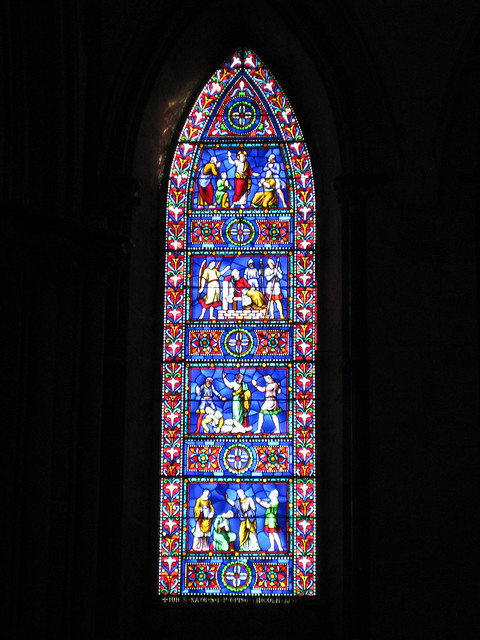
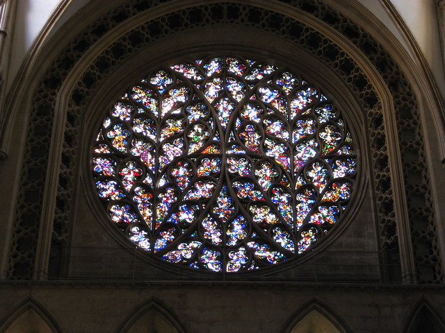
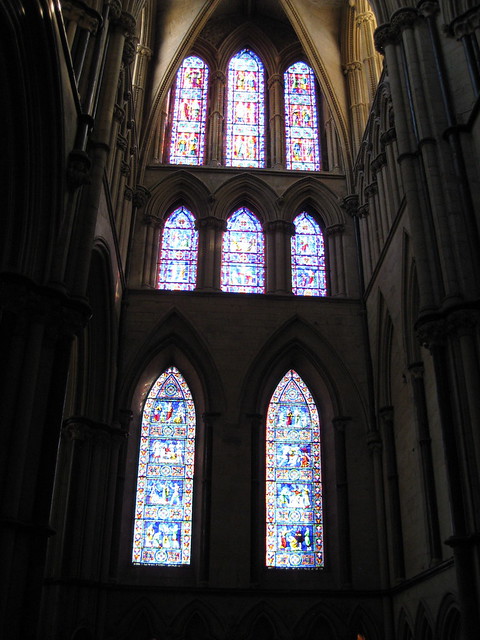
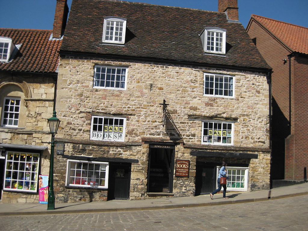 On Friday I took a little trip up to Lincoln for the day to meet my Big Sis. Lincoln happens to be about halfway between the two of us, and as neither of us had been there before we decided it would be a nice place to explore. The weather obliged with wall-to-wall sunshine and we spent a lovely day pootling round the old part of the town looking in all the interesting shops and going round the Cathedral. The Imperial Tea shop on Steep Hill is well worth a visit (although the lady behind the counter gave the distinct impression she'd never made a cup of tea before), as is Pimento's tea room where we had lunch.
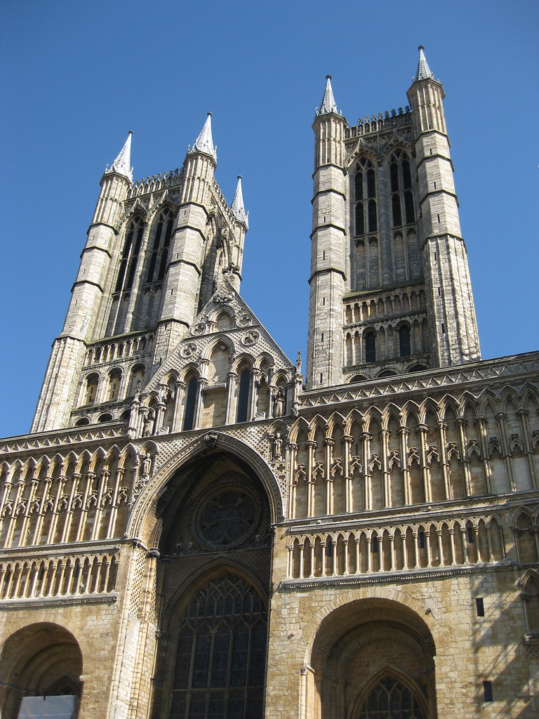
Lincoln is, of course, dominated by the Cathedral which is impressively large. So large in fact that it's impossible to get a decent picture of it without wide-angle lens. Unfortunately I only have a little compact camera and this is the best I could do:
Aside from being quite big, it also boasts some lovely stained glass, which looked spectacular in the cool darkness of the cathedral, backlit by the bright sunshine outside.
A lovely day was had all round - maybe next time we'll catch an Evensong or go on the roof-top tour.
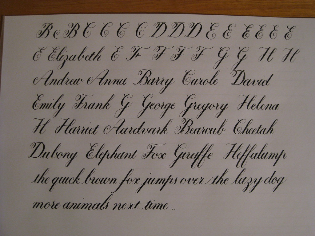
Despite the blue sky and sunshine I did manage to persuade myself to stay indoors long enough to do a bit of calligraphy over the weekend. Yet more copperplate I'm afraid, but this time I've been having fun with the capitals, whilst still keeping the minuscules ticking along. Majascules, I have discovered, are simultaneously fun and frustrating; there's a lot more freedom in their creation, but it does mean you have to use your judgement with the flourishes - how much/where/how big etc. and this takes time to get an eye for.
This is one of my practice pages for the A-H group, including some names and some animals. I was reliably informed that a Dubong was a real animal, but in fact it turns out that I'm slightly deaf and it is in fact a Dugong. So apologies to all you Dugongs out there reading this. Heffalumps are of course entirely real and not at all made up.
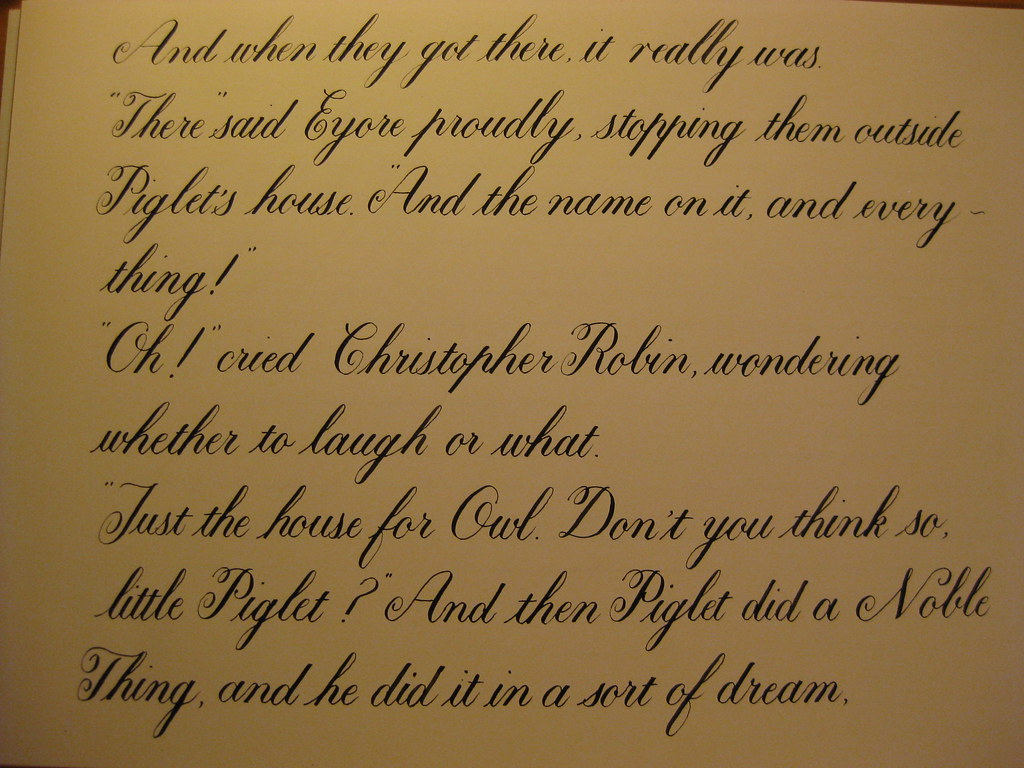
After another couple of pages along similar lines (if you'll excuse the pun) I thought I'd bite off more than I can chew and write out one of my favourite passages from Winnie the Pooh. I've been working on this for a couple of days and have to admit that I was finding it rather frustrating. The tines of my nib kept catching on the paper, my letters wobbly and inconsistent and I was generally struggling and finding it quite hard work. HOWEVER, yesterday evening I had a bit of an epiphany: I've been gripping my pen far too tight in an effort to control it, and have consequently worn the tines unevenly. Now, when I relaxed my grip and moved my hand further down the pen I found that not only did it stop catching on the paper, but my flow and control had come back! Magic! Here is the first section:
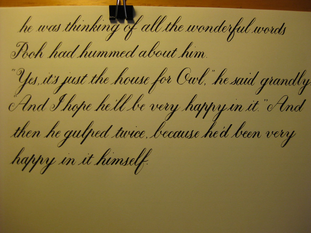
The rest of the story is on it's way (in a much more relaxed fashion, naturally). More next time on 'other useful things I've learnt by trying to run before I can walk' :-) ttfn.
Lincoln is, of course, dominated by the Cathedral which is impressively large. So large in fact that it's impossible to get a decent picture of it without wide-angle lens. Unfortunately I only have a little compact camera and this is the best I could do:
Aside from being quite big, it also boasts some lovely stained glass, which looked spectacular in the cool darkness of the cathedral, backlit by the bright sunshine outside.
 |  |  |
Despite the blue sky and sunshine I did manage to persuade myself to stay indoors long enough to do a bit of calligraphy over the weekend. Yet more copperplate I'm afraid, but this time I've been having fun with the capitals, whilst still keeping the minuscules ticking along. Majascules, I have discovered, are simultaneously fun and frustrating; there's a lot more freedom in their creation, but it does mean you have to use your judgement with the flourishes - how much/where/how big etc. and this takes time to get an eye for.
 |
| (this page was done with an EF Princiapl and Higgins Eternal ink) |
This is one of my practice pages for the A-H group, including some names and some animals. I was reliably informed that a Dubong was a real animal, but in fact it turns out that I'm slightly deaf and it is in fact a Dugong. So apologies to all you Dugongs out there reading this. Heffalumps are of course entirely real and not at all made up.
After another couple of pages along similar lines (if you'll excuse the pun) I thought I'd bite off more than I can chew and write out one of my favourite passages from Winnie the Pooh. I've been working on this for a couple of days and have to admit that I was finding it rather frustrating. The tines of my nib kept catching on the paper, my letters wobbly and inconsistent and I was generally struggling and finding it quite hard work. HOWEVER, yesterday evening I had a bit of an epiphany: I've been gripping my pen far too tight in an effort to control it, and have consequently worn the tines unevenly. Now, when I relaxed my grip and moved my hand further down the pen I found that not only did it stop catching on the paper, but my flow and control had come back! Magic! Here is the first section:
Lesson 1: Relaxation = Control.
The rest of the story is on it's way (in a much more relaxed fashion, naturally). More next time on 'other useful things I've learnt by trying to run before I can walk' :-) ttfn.
Monday, 4 April 2011
Experiments in Gouache (for Mother's Day)
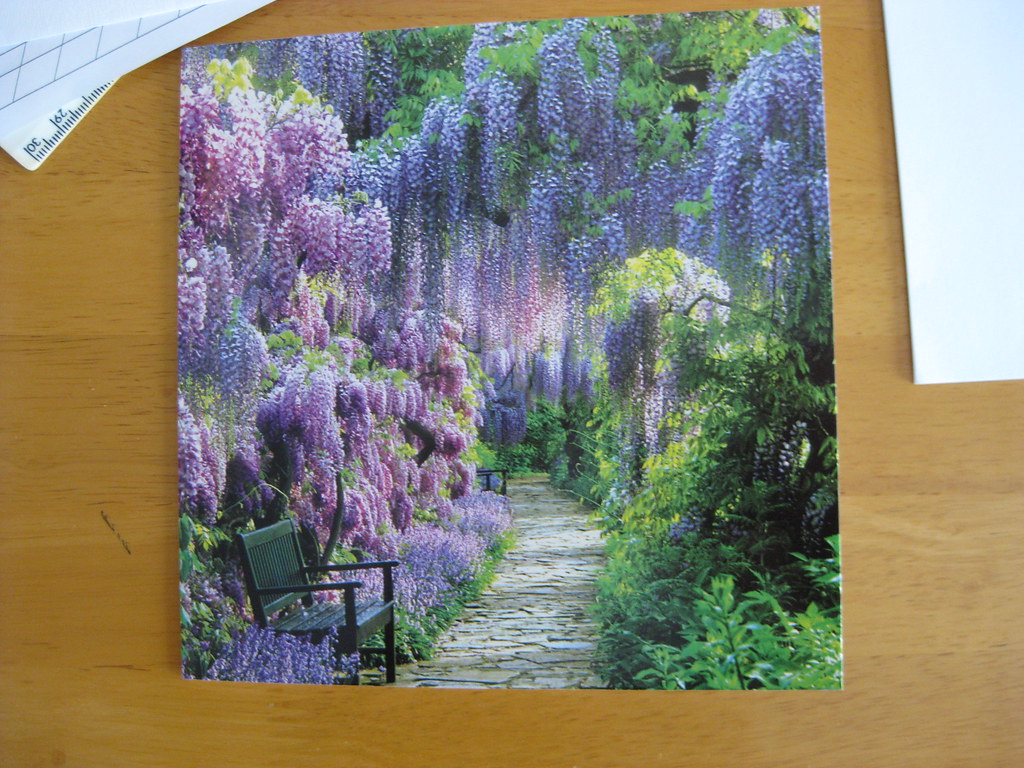 |
| Exhibit A |
Gouache is similar to watercolour but has a higher pigment : water ratio so produces a more intense and opaque finish. I'd read about watering it down to use as ink in several places and thought it might be more fun to try than merely going out and buying lots of different coloured inks. The one I used for the inside of Mum's card was Winsor & Newton's Designer Gouache in Brilliant Purple. This type of paint is sold in small tubes so it's easy to use as little (or as much) as you feel like - I started off with 1/2 an inch of paint squeezed into a small pot that I then watered down with drops of distilled water from a dropper. I think in the end I used about 10 drops, but you just have to keep dropping and mixing and trying it out on a bit of scrap paper until you're happy with the consistency.
I used my mixing brush to load the nib with the inky mixture and then set about getting a feel for the flow, and also making my first stab a the capitals I'd need for the card. My practice page looked a bit like this:
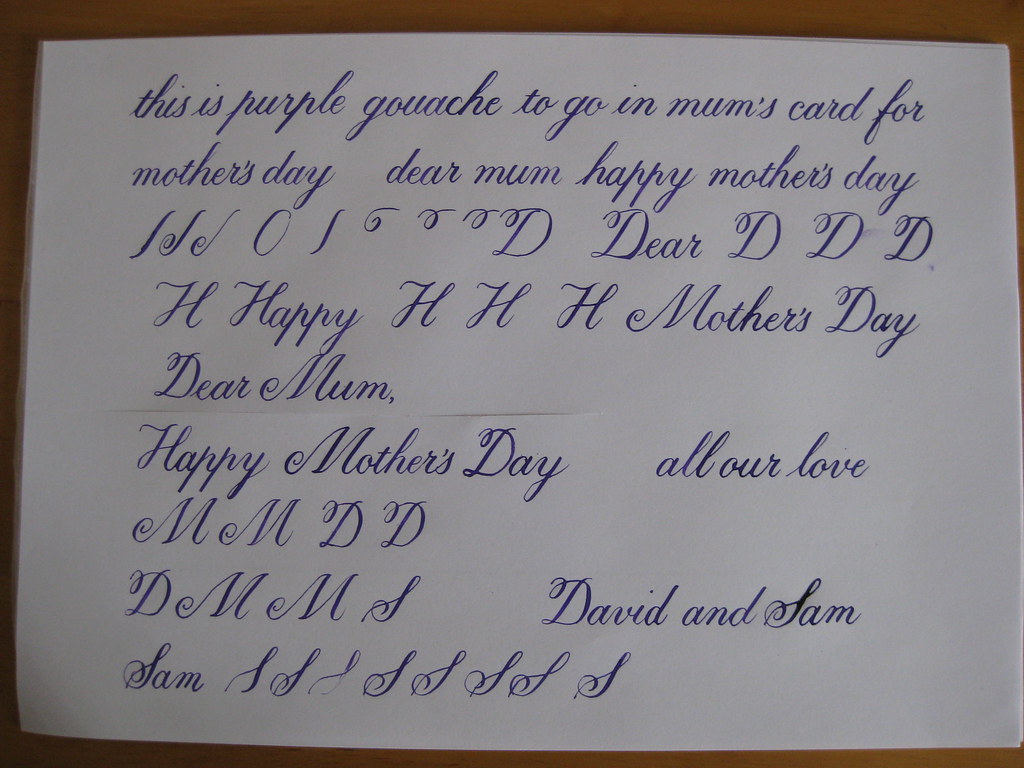
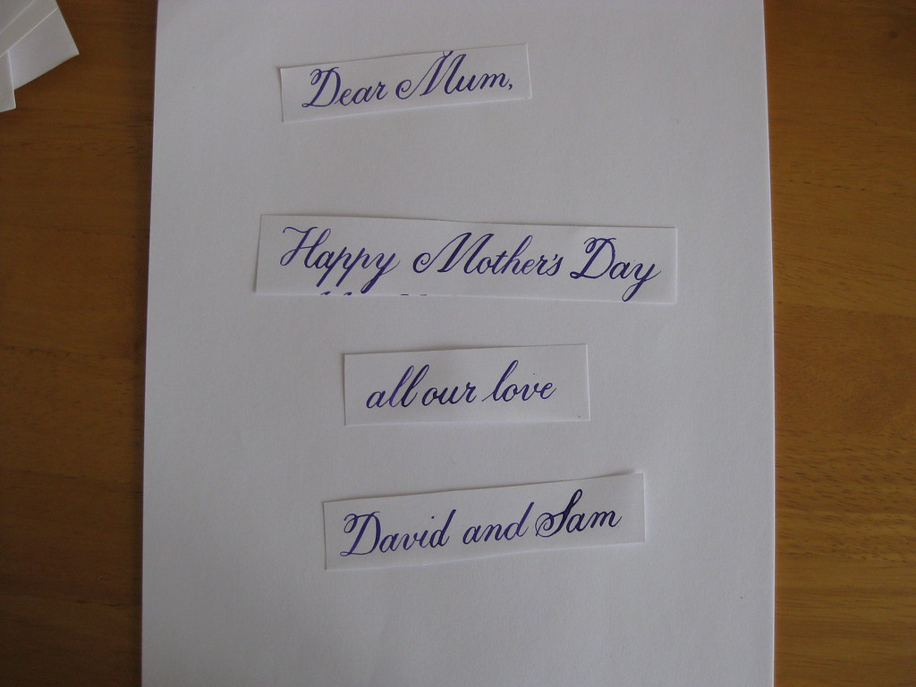
I opted for setting it out on paper and sticking this into the card rather than writing directly on the card itself - mainly because I'm a chicken, but also partly because I wasn't sure how the surface of the card would take the gouache 'ink', and I didn't have time to get a second one if it all went horribly wrong!
I'm pleased to say that I only needed one attempt to get a good copy that I was relatively happy with. The finished thing ended up looking like this:
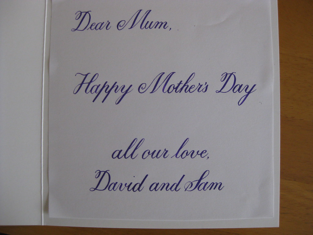
I was quite nervous when I first put pen to paper, but soon found myself enjoying the flow of ink and the sense of achievement. One thing about attempting majascules is that it makes the miniscules seem much easier! I was nearly tempted try a little flourishing as well... but I know my limitations - one step at a time, I think.
Overall, I was really pleased with how my experiments turned out. I did find that the gouache mixture tended to dry up quite quickly, especially under the heat of my desk lamp, but you can keep adding a drop of water and it dries on the paper in a beautifully uniform manner. It's a bit of a faff for everyday practising, but I'll definitely be trying some different combinations out for finished pieces.
Apart from my colourful adventures I also made cake (surprise!). This time it was Nigel Slater's Black Banana Cake. Seriously yummy and easy peasy to make - we've eaten one of them already (so it's a good job I made two!).
Friday, 1 April 2011
How happy are you?

Never mind the official Census - the Today Programme has the right idea. Click here to participate in The Other Census.
Monday, 28 March 2011
Pangramania
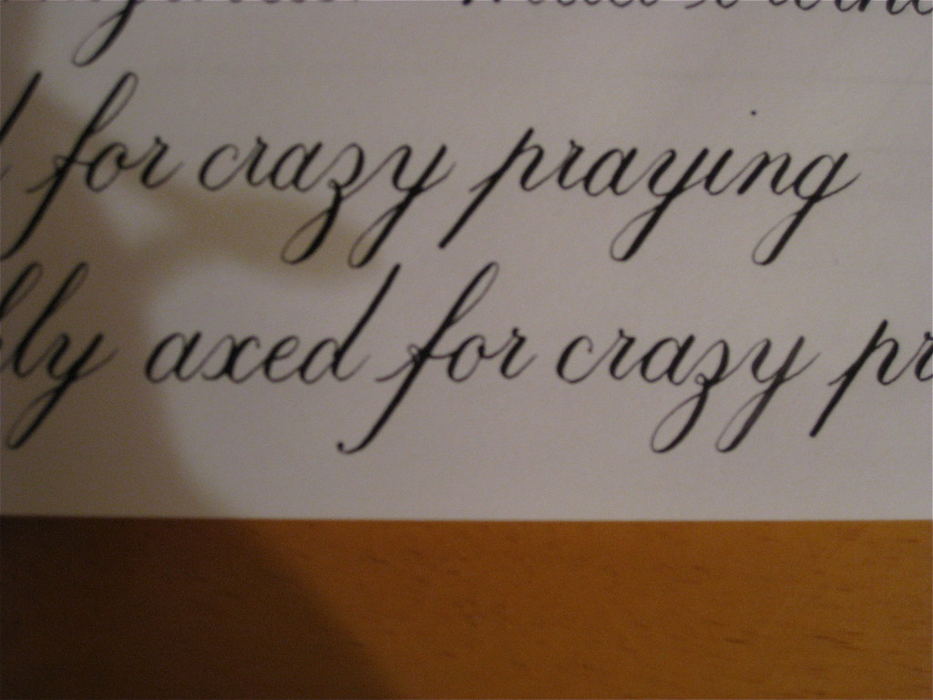
Who would have thought that the dizzy heights of being able to do joined-up writing would cause so much excitement? It's almost like being back at primary school - rushing downstairs every 5 minutes to show anyone who'll stand still for long enough my latest sentence, pointing out the bits I'm particularly proud of (and the bits that went wrong).
As you've probably guessed by now, I've progressed from the slightly mind-numbing exercises linking every conceivable combination of letters together, to practising whole words and sentences :-) This is soooo much more interesting, and also brings to light any inconsistencies between letter forms. It's all very well being able to reproduce the same letter shape again and again, but if it doesn't match other, similar letters then it's all going to look a bit weird. Anyhow, enough of me wittering, here are some pictures:
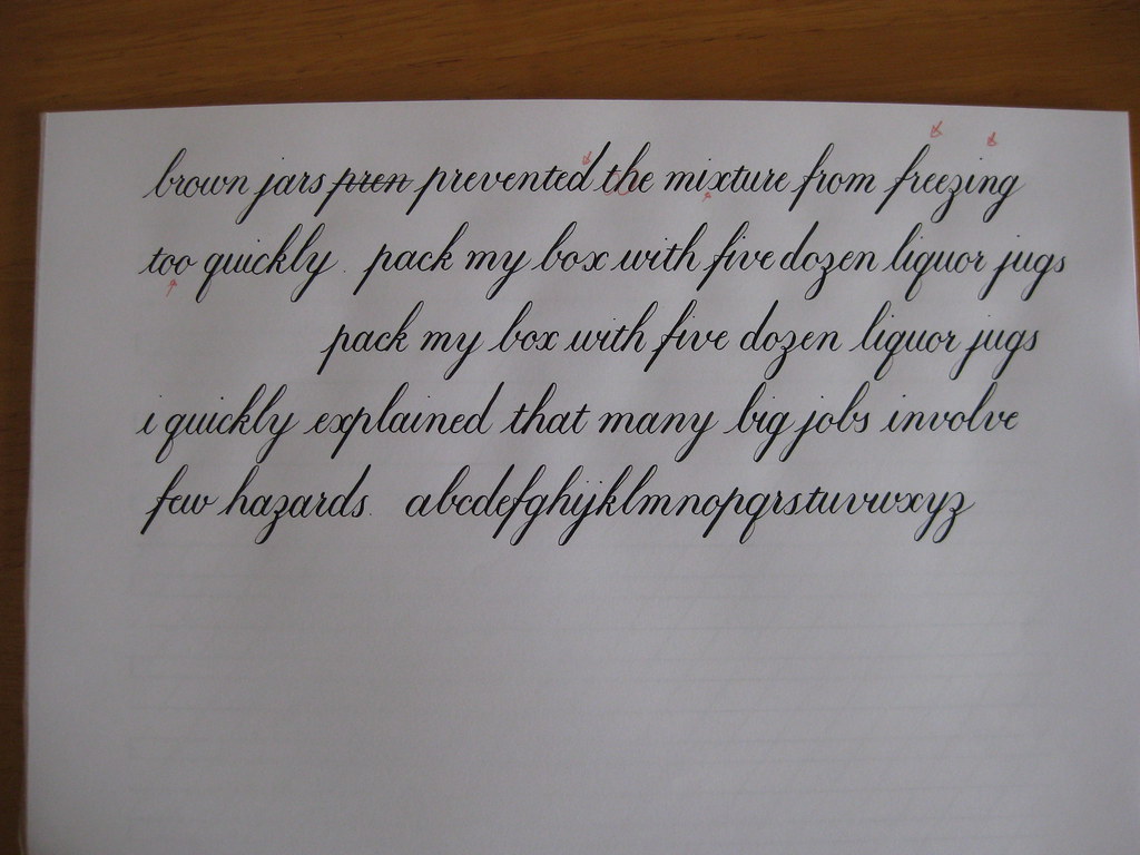
So, half-way through the morning my practice page looked a bit like this...
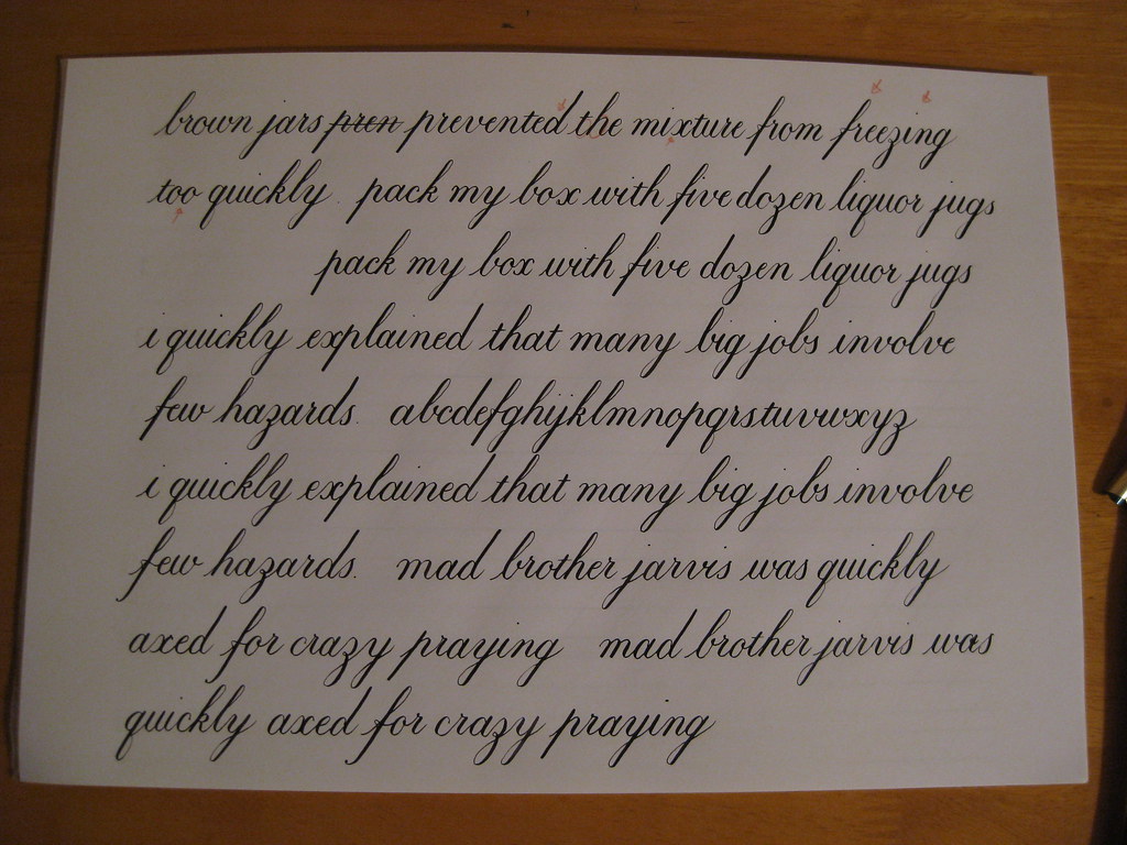
...and after a small amount of tea I had a full page of joined-up-ness :-)
I am really pleased with the progress I've been making, and it's lovely to be able to produce a whole page of relatively consistent looking writing. Of course there are still tons of things to work on - that's never going to change - but working hard at something like this, where consistency is key, really appeals to my inner perfectionist.
The sentences I've been using for practise are pangrams (sentences that use every letter of the alphabet at least once) and they're usually complete nonsense, or at least quite wacky, but they do allow you to work on all your letter forms in a single sentence. My favourite so far is "seven wildly panting fruit flies gazed anxiously at the juicy bouncing kumquat". If you have any favourites let me know and I'll write them out and post them next time.
Having got a solid grasp of the basics I've started experimenting with different nibs and letter forms. The page above was written with a Brause 361 nib (Higgins Eternal ink) which I got on really well with; it felt quite robust after the EF Principal but held the ink nicely and was quite forgiving, and was definitely less scratchy. I also gave a Gillot 303 a whirl, which was definitely *not* forgiving, but beautifully springy and delicate - one to go back to once I've done a bit more work I think.
 Left is an alternative 'f' that I've been playing with (sorry for the out-of-focus picture) with a slightly more stylish descender than the one I initially learnt. Plenty more variations to play around with, along with some attractive ways of combining double letters and maybe then I'll be ready for the capitals, which looks to be a whole new ball game!
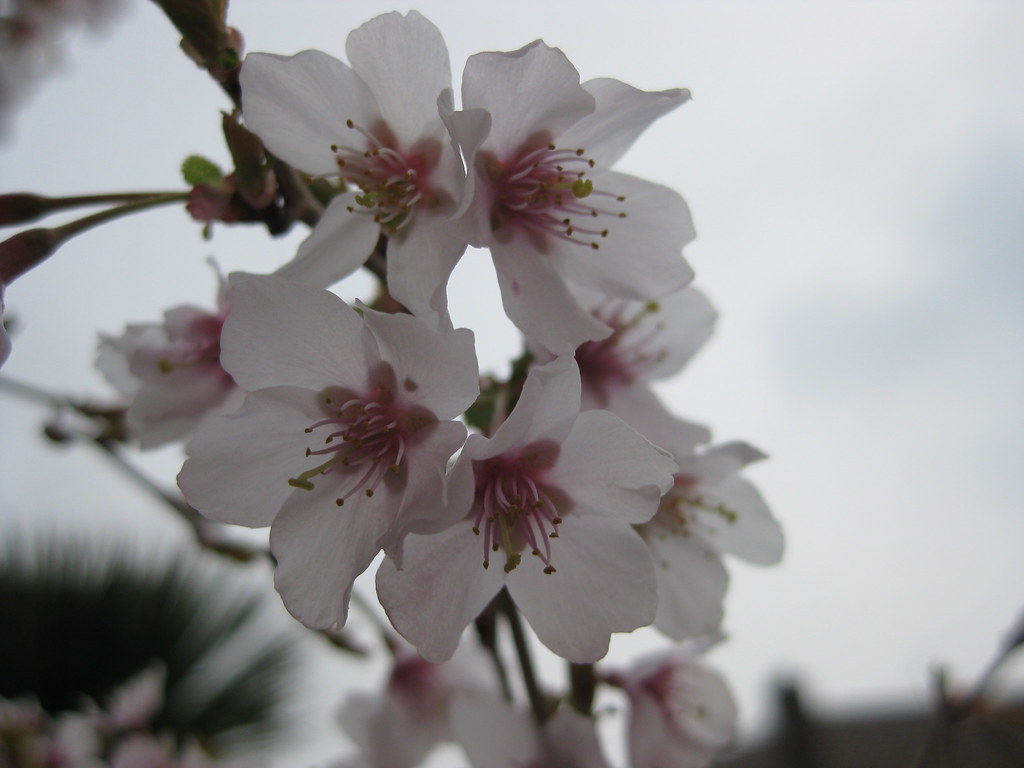
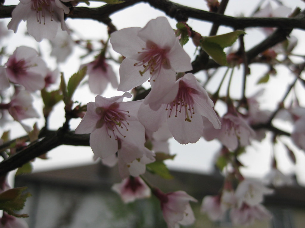
Finally (and I promise I'll be quiet after this), my cherry tree is in flower. AND I've found the macro setting on the camera :-D
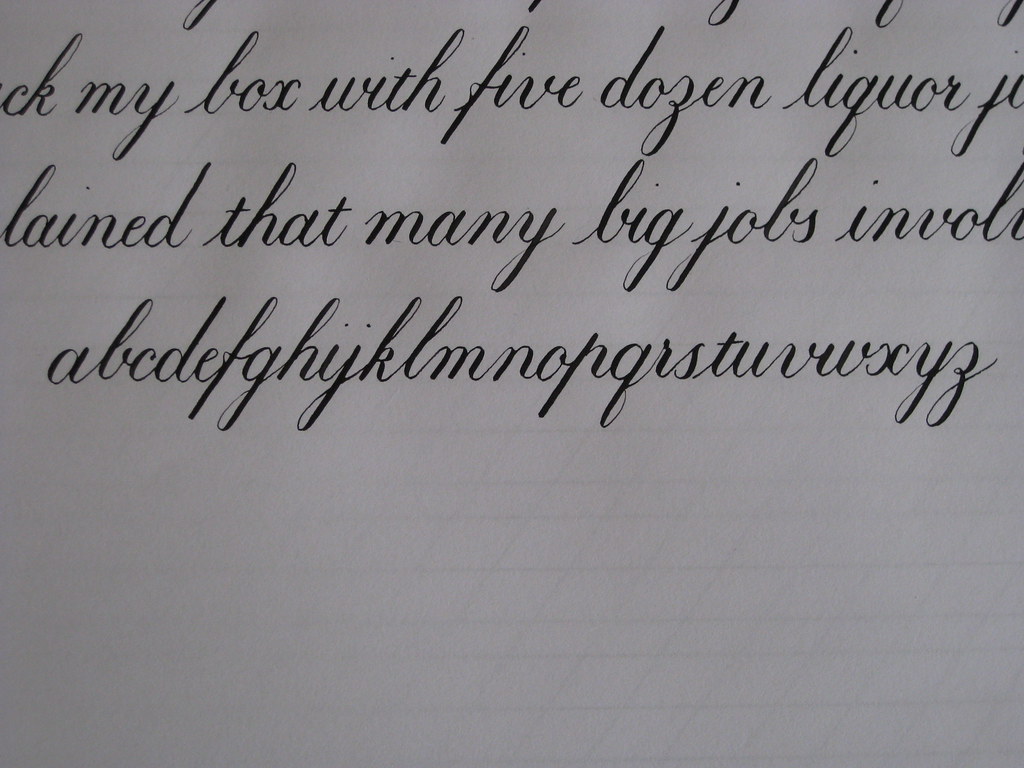
As you've probably guessed by now, I've progressed from the slightly mind-numbing exercises linking every conceivable combination of letters together, to practising whole words and sentences :-) This is soooo much more interesting, and also brings to light any inconsistencies between letter forms. It's all very well being able to reproduce the same letter shape again and again, but if it doesn't match other, similar letters then it's all going to look a bit weird. Anyhow, enough of me wittering, here are some pictures:
So, half-way through the morning my practice page looked a bit like this...
(with a closer look at the alphabet - all the letters this time, and even in the right order!)
...and after a small amount of tea I had a full page of joined-up-ness :-)
I am really pleased with the progress I've been making, and it's lovely to be able to produce a whole page of relatively consistent looking writing. Of course there are still tons of things to work on - that's never going to change - but working hard at something like this, where consistency is key, really appeals to my inner perfectionist.
The sentences I've been using for practise are pangrams (sentences that use every letter of the alphabet at least once) and they're usually complete nonsense, or at least quite wacky, but they do allow you to work on all your letter forms in a single sentence. My favourite so far is "seven wildly panting fruit flies gazed anxiously at the juicy bouncing kumquat". If you have any favourites let me know and I'll write them out and post them next time.
 | ||||
| Brause 361 |
Finally (and I promise I'll be quiet after this), my cherry tree is in flower. AND I've found the macro setting on the camera :-D
Friday, 18 March 2011
Inky fingers
This time last week I was excited to be taking a trip to London Town, and the British Library in particular, to visit two exhibitions of note: namely the CLAS annual Art and the Letter Exhibition which takes place alongside their AGM and features work from Fellows and Lay-members alike, and the BL's own Evolving English exhibition. Both of these I had been looking forward to for a long time, and neither were disappointing.
Had I known that I would be allowed to take pictures of (some of) the work exhibited at the CLAS exhibition I would have taken my camera along to get some decent resolution images of those pieces I found most inspiring. Alas, I hadn't been so organised, so ended up with four snaps taken with my little 'phone camera as an aide memoire. The Fellows' room and some of the lay-members work was truly awe-inspiring, and I quickly began to feel more than a little overwhelmed and disheartened at the idea of ever achieving such beautiful results with my own writing. After a closer look at some of the 'Beginner' and 'Intermediate' entries, however, I found my spirits rising with the realization that some of my lettering (although not incorporating any design elements) is well on the way to being as good as some of that on display (a 'Beginner' by these rules can have as many as 3 years experience). So there's hope for me yet, and I look forward to entering a piece of my own next year.
I also met Timothy Noad - one of the CLAS Fellows exhibiting - who some years ago completed a commission for my sister, which I always admire every time I visit, and which hangs in pride of place in her home. He was very kind and gave me a beautiful card of his to send to her.
After a quick sandwich and an ENORMOUS piece of cake in the BL's cafe, I sauntered through to the Evolving English exhibition. I have always been fascinated by the use and abuse of the English language, and as my day job is in a wonderful library in Cambridge I am always happy to see other librarys' exhibitions and manuscripts on display, knowing a little about the hard work that goes into such things. Evolving English is an exhibition of epic proportions, even for somewhere like the BL, and is incredibly well thought out. I got to see the earliest written version of Beowulf, I listened to interviews with folk from across the country and round the world talking about their use of the English language, there was a competitive quiz about what you'd seen and read in the exhibition (I won! by virtue of being the only person playing. And I had help), and best of all, I spent 20 minutes chortling my way through 90 years of comic sketches particularly relating to the (mis)use of language - think the Two Ronnies Fork 'andles sketch. My favourite by far was the Monty Python 'Argument Clinic' which I had never seen before, but feel the need to share here:
Aside from all this excitement I spent a very happy morning this morning playing with my new pot of Higgins Eternal Ink which arrived from Scribblers yesterday. It's SO much better than the ink I had been using for my Copperplate - it's the right consistency and beads and blobs far less than anything I've tried to date. Much less frustrating :-) I'm looking forward to doing some more scrawling over the weekend, including trying out a couple of new Speedball nibs in small sizes.
Wednesday, 16 March 2011
The beginnings of an adventure...
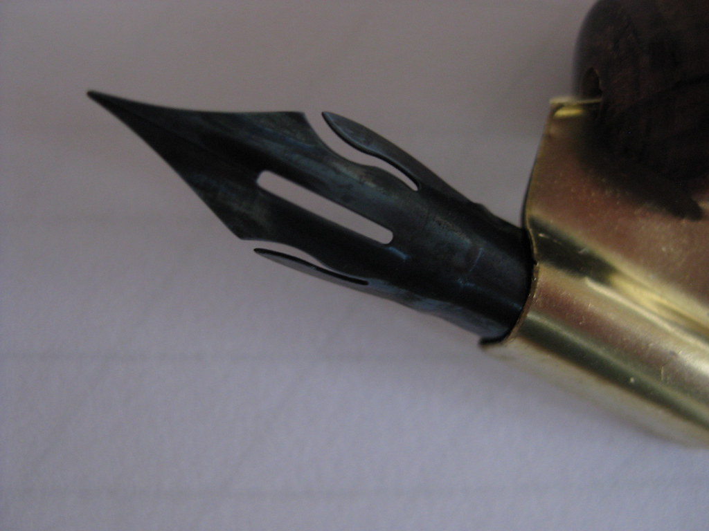
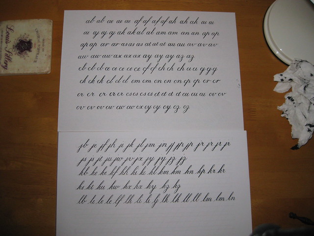
Following several weeks of hard work really getting to grips with the basics of the Italic hand I felt as though I needed a bit of a change, and so decided to return to my foray into learning Copperplate. In keeping with my promise not to get ahead of myself, and to really get a handle on one thing before moving on to the next, I hadn't tried any Copperplate for some time. However, my new oblique pen-holder had arrived from John Neal Booksellers, along with some Leonardt EF Principal nibs from Scribblers, and I felt the time was ripe to have another go.
Given that my initial attempts in Copperplate were with a straight penholder (necessitating crazy paper-angles) and a not-so-great Leonardt Crown nib, I decided to start again from the beginning to refresh my memory and get used to the new pen and nib. I hadn't been displeased with the start I'd made originally, but the lettering I'm able to produce with my new toys is miles ahead in terms of contrast and elegance (although there's obviously still a long way to go).
In order to learn in the most thorough way I can, I have been following the tuition in Eleanor Winters' 'Mastering Copperplate Calligraphy', which takes you through step-by-step building up the basic strokes before putting them together to form the lower-case letters. Having painstakingly worked through my alphabet, I'm now onto the heady heights of joined up writing! Each combination is practised in turn (even if you'd never usually use it) and this gives you the chance to look again at your letter forms, and also get a feel for spacing. It's hard work, but very satisfying when you get it right :-) Uses a lot of paper though!
Some days I can't seem to get it, but most days I find I'm making progress and find it very cathartic. I would recommend it to anyone!
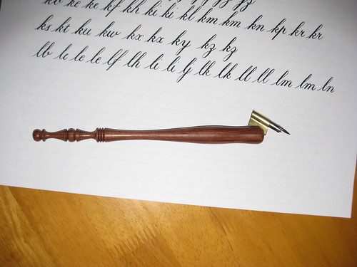 |
| My new 5/8" Century Oblique Penholder |
In order to learn in the most thorough way I can, I have been following the tuition in Eleanor Winters' 'Mastering Copperplate Calligraphy', which takes you through step-by-step building up the basic strokes before putting them together to form the lower-case letters. Having painstakingly worked through my alphabet, I'm now onto the heady heights of joined up writing! Each combination is practised in turn (even if you'd never usually use it) and this gives you the chance to look again at your letter forms, and also get a feel for spacing. It's hard work, but very satisfying when you get it right :-) Uses a lot of paper though!
 | ||
| A couple of practice sheets |
Tuesday, 15 March 2011
Spring has sprung!
Ok, so I have been terribly remiss about posting recently, mainly because I have been really enjoying my scribbling and worked out that time taken posting on my blog = time not spent with a pen in my hand! However, I feel I ought to show off my progress a little, so here goes...
Having spent 3 weeks or so really working on my Italics (miniscules mainly, but I have had a go at some majascules) I took my efforts in to my tutor at the evening class and got some useful pointers and encouragement on how to take things further:
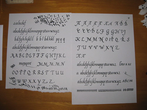 As you can see, quite a lot of scribbling, but a couple of nice complete alphabets. Some of the capitals are also getting there, although I seem to have particular trouble getting the right angles (not right-angles, d'oh!) for the A and M.
One thing my Tutor suggested was having a go at a more 'flourished' Italic where the ascenders are all curved over to the right in order to match (rotationally) the descenders. I like this much more than the formal Italic - it somehow has a sense of flow to it.
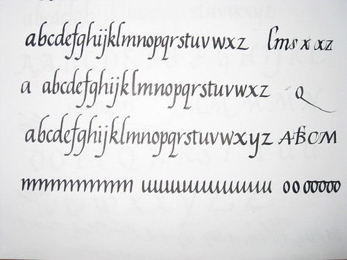
A closer look at the alphabets seen bottom right in the image above. Sometimes I get carried away and loose the ability to spell! Please forgive the missing 'y's in the first two attempts. Next term, when classes start up again, I'll be using this to attempt a 'job' i.e. a finished piece of writing complete with experiments in layout, colour and design!
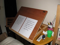
All this has been helped immensely by the appearance of my new calligraphy easel, handmade for me by Rowley Abbey of Abbey Easels - fantastically pleased with the result, and it was made in super-quick time to my own specifications. Great workmanship - I would highly recommend him to anyone.
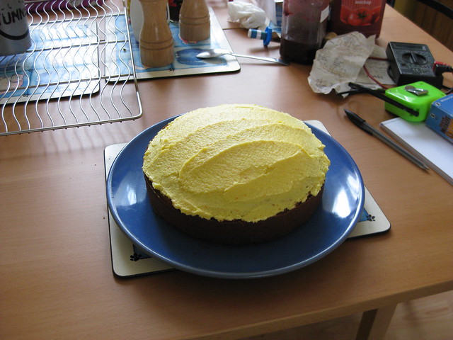
In other news, I've been making cake:
and getting back in to my running which I'm returning to after after several months off due to a hip injury. I'm up to 40mins pain free! Yay! (it's probably just as well after all that cake...).
Having spent 3 weeks or so really working on my Italics (miniscules mainly, but I have had a go at some majascules) I took my efforts in to my tutor at the evening class and got some useful pointers and encouragement on how to take things further:
One thing my Tutor suggested was having a go at a more 'flourished' Italic where the ascenders are all curved over to the right in order to match (rotationally) the descenders. I like this much more than the formal Italic - it somehow has a sense of flow to it.
A closer look at the alphabets seen bottom right in the image above. Sometimes I get carried away and loose the ability to spell! Please forgive the missing 'y's in the first two attempts. Next term, when classes start up again, I'll be using this to attempt a 'job' i.e. a finished piece of writing complete with experiments in layout, colour and design!
All this has been helped immensely by the appearance of my new calligraphy easel, handmade for me by Rowley Abbey of Abbey Easels - fantastically pleased with the result, and it was made in super-quick time to my own specifications. Great workmanship - I would highly recommend him to anyone.
In other news, I've been making cake:
 |
| Mmmm, cake :-) |
Subscribe to:
Posts (Atom)