Pages

Showing posts with label CLAS. Show all posts

Tuesday, 3 April 2012

A Cunning Plan (otherwise known as Wedding calligraphy #2)

Actually just a table plan, but I thought a cunning plan sounded more interesting. Back in my post about place cards I mentioned that my pictures of the table plan-in-progress had got eaten somewhere between memory card and computer - I am happy to announce that my husband is a genius and has caused them to reappear from the abyss.

Laid out but not mounted yet.
So, my table plan consisted of 5 tables of 9 all named after various places in One Hundred Acre Wood. After seeing some invites printed and overlaid with vellum paper, I thought I'd use a similar idea and write out the names on vellum paper and mount this over cornflower Khadi paper (the idea being that you could still see the flowers through the overlaid paper). All this mounted on some Ivory Canford card and stuck in a nice frame would look lovely.

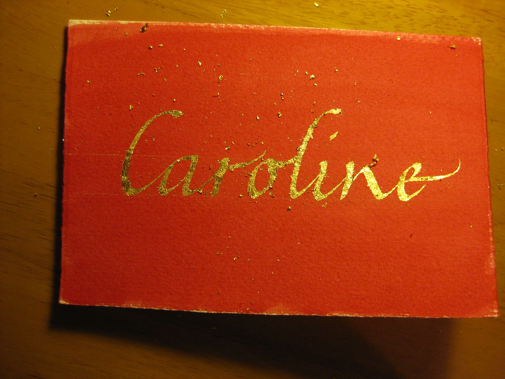
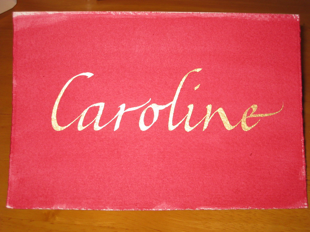
I think it did look nice in the end, but writing copperplate on vellum paper is not to be attempted lightly (or if you have a short temper). The trouble is that vellum paper (and we're talking vellum paper, as opposed to proper Vellum here) doesn't absorb ink very well. Or at all, really. If you try and use gouache then the paper crinkles up and you loose the intensity of colour as it dries; if you use ink (I used Moon Palace Sumi ink in the end) it keeps it's lovely intensity but takes a long time to dry. The surface tended to be both skiddy and scratchy all at the same time - in short an absolute nightmare to write on. I attempted most of the tables at least twice, and found it really difficult to control uneven descenders and wobbly ascenders. Persistence, however, paid off and I finally had an acceptable version of each for the finished thing. I have a sneaking suspicion that if you prepare the surface with gum sandarac then writing on vellum paper becomes a lot easier - unfortunately I had neither the time nor the means to experiment with this before needing the finished thing.

Cutting and sticking materials.


Other important equipment for assembling the plan can be seen on the right and include: a putty rubber, a prit-stick, scissors, a soft pencil, double sided tape, a very sharp scalpel + cutting mat (be careful with these!), and a metal ruler.
The nice thing about khadi papers is that they can be torn along the edge of a ruler giving you a nice straight edge, but maintaining the nice ragged, rustic look of the natural edges.


All in all I think it turned out rather well considering I'd never attempted anything like it before, and was really just making it up seat-of-the-pants style. The finished thing, mounted and framed looked like this:

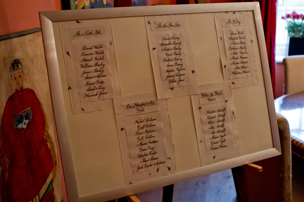
(Photo courtesy of the wonderful Kirsten Hunter)


Aside from the aforementioned trouble with the vellum paper, if I were to do a similar piece again I'd probably double mount the tables with a stronger colour behind the khadi paper (perhaps dark purple or blue), and include a similarly mounted title at the top (either simply 'Table Plan' or the Bride and Groom's names and wedding date) to prevent it looking a little bit on the naked side. We live and learn!

Tomorrow, I'm very excited to be heading into London to attend the CLAS Living Letter IV exhibition: All that Glisters at the Oxo Gallery on the South Bank. It'll also be visiting the Design Centre at Sunderland University, and Bath Central Library over the coming weeks, so do go along if you have the opportunity - it features beautiful works from some of the country's top calligraphers and I am anticipating being truly inspired by their skill (I've had a sneak peak at the catalogue and know I won't be disappointed). I'll report back here once I've recovered!

Monday, 24 October 2011

Dealing with my gilt complex (with thanks to Terry Pratchett)

This week I have mainly been...

1) Panicking about how much calligraphy I want to do (and how little time there is in which to do it)

5 Months have passed since I first joined the CLAS Copperplate Special Interest Group and that can mean only one thing - it's time for another round of envelope exchanges. Disappointingly, only three of the five envelopes I was expecting to receive in the last round turned up, so this time I offered to be in two groups, thereby doubling the number of exciting envelopes that will drop through the door (I know, I didn't think about the 'twice the amount of work' aspect at the time!). On a more positive note, one of the recipients of my envelopes last time was impressed enough to feel the need to write back, so I am busy preparing another envelope to send in reply :-)

2) Gilding/Making a card for a friend (This bit is slightly more interesting and involves more pictures... )

Next weekend we are off to a friend's birthday party and, not needing much of an excuse, I thought I'd have a go at making her a card. Last time I was at a workshop my tutor showed me a commissioned piece that she had recently finished that was gold leaf on an acrylic wash background. 'Oooh', I thought, 'that looks pretty - I wonder if I could do that'.

A very out-of-focus picture of a card with acrylic wash
My ever wonderful Mum (who is a watercolour artist and veritable mine of information on all things crafty) had previously provided me with some cards of watercolour grade paper with deckled edges, a book of gold leaf (loose), some size (glue) for sticking the gold leaf to the paper, and a large flat brush for washes. I watered down some crimson acrylic paint and painted a fairly intense wash on two cards (see right) and a piece of watercolour paper for experiments.

I hadn't taped any of these down (mainly because I've lost my masking tape) and to my horror they immediately began to curl up. 'Fallen at the first hurdle', I thought, but actually as they dried they flattened out again - phew!

Some experimentation in black ink on layout paper ensued, to get the right nib size and finalise the Italic variation I would use, and after this I ruled up on the test card (using a white pastel pencil - this shows up against the paint, but will also rub out). Initially I just used the plain size in the nib reservoir to write onto the prepared paper, however not only is it a bugger to see once it's dry, but it's also very thin and flowed too quickly out of the nib. I persevered and made a fairly messy attempt at sticking the gold leaf to it, but I learned some useful lessons before attempting one of the cards.

Immediately after the gold had been applied - gold bits EVERYWHERE!

The second time around I added some Dr. Marten's Pen White to the size which had the double effect of thickening the liquid and allowing me to see where I'd written. I then used two very small brushes to apply bits of gold leaf to the writing. Two bits of advice: press the leaf on, don't brush; and DON'T BREATHE! - the stuff is lighter than a feather and will get *everywhere*.


Brushed down, but not birnished


 After replacing any usable bits of gold leaf back in the book, I used an old (soft is the key) make-up brush to brush gently over the surface to get rid of any bits that weren't stuck down. The card then looked like this:


 Finally, some patience was required to let the gold and size dry thoroughly before burnishing (rubbing over to bring out the shine) with a soft cloth. There are special tools to do this, and I have heard that a piece of silk works very well too, but having neither of these I plumped for a soft cotton hanky and it seemed to do the trick:


 The result is pleasing, no? Anyhow, I hope she likes it - I had great fun doing it, and will definitely be doing more in the future!


Friday, 18 March 2011

Inky fingers

This time last week I was excited to be taking a trip to London Town, and the British Library in particular, to visit two exhibitions of note: namely the CLAS annual Art and the Letter Exhibition which takes place alongside their AGM and features work from Fellows and Lay-members alike, and the BL's own Evolving English exhibition. Both of these I had been looking forward to for a long time, and neither were disappointing.

Had I known that I would be allowed to take pictures of (some of) the work exhibited at the CLAS exhibition I would have taken my camera along to get some decent resolution images of those pieces I found most inspiring. Alas, I hadn't been so organised, so ended up with four snaps taken with my little 'phone camera as an aide memoire. The Fellows' room and some of the lay-members work was truly awe-inspiring, and I quickly began to feel more than a little overwhelmed and disheartened at the idea of ever achieving such beautiful results with my own writing. After a closer look at some of the 'Beginner' and 'Intermediate' entries, however, I found my spirits rising with the realization that some of my lettering (although not incorporating any design elements) is well on the way to being as good as some of that on display (a 'Beginner' by these rules can have as many as 3 years experience). So there's hope for me yet, and I look forward to entering a piece of my own next year.
I also met Timothy Noad - one of the CLAS Fellows exhibiting - who some years ago completed a commission for my sister, which I always admire every time I visit, and which hangs in pride of place in her home. He was very kind and gave me a beautiful card of his to send to her.

After a quick sandwich and an ENORMOUS piece of cake in the BL's cafe, I sauntered through to the Evolving English exhibition. I have always been fascinated by the use and abuse of the English language, and as my day job is in a wonderful library in Cambridge I am always happy to see other librarys' exhibitions and manuscripts on display, knowing a little about the hard work that goes into such things. Evolving English is an exhibition of epic proportions, even for somewhere like the BL, and is incredibly well thought out. I got to see the earliest written version of Beowulf, I listened to interviews with folk from across the country and round the world talking about their use of the English language, there was a competitive quiz about what you'd seen and read in the exhibition (I won! by virtue of being the only person playing. And I had help), and best of all, I spent 20 minutes chortling my way through 90 years of comic sketches particularly relating to the (mis)use of language - think the Two Ronnies Fork 'andles sketch. My favourite by far was the Monty Python 'Argument Clinic' which I had never seen before, but feel the need to share here:


Aside from all this excitement I spent a very happy morning this morning playing with my new pot of Higgins Eternal Ink which arrived from Scribblers yesterday. It's SO much better than the ink I had been using for my Copperplate - it's the right consistency and beads and blobs far less than anything I've tried to date. Much less frustrating :-) I'm looking forward to doing some more scrawling over the weekend, including trying out a couple of new Speedball nibs in small sizes.