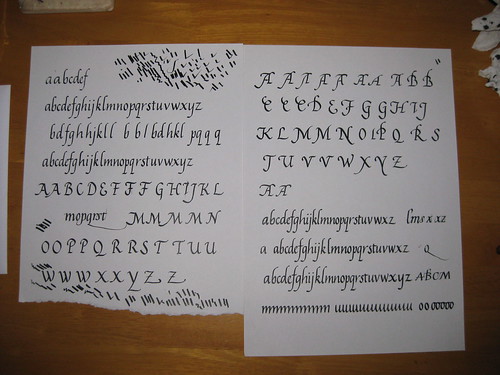
Having spent 3 weeks or so really working on my Italics (miniscules mainly, but I have had a go at some majascules) I took my efforts in to my tutor at the evening class and got some useful pointers and encouragement on how to take things further:
As you can see, quite a lot of scribbling, but a couple of nice complete alphabets. Some of the capitals are also getting there, although I seem to have particular trouble getting the right angles (not right-angles, d'oh!) for the A and M.
One thing my Tutor suggested was having a go at a more 'flourished' Italic where the ascenders are all curved over to the right in order to match (rotationally) the descenders. I like this much more than the formal Italic - it somehow has a sense of flow to it.
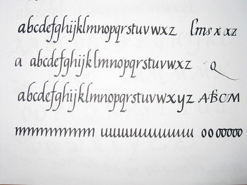
A closer look at the alphabets seen bottom right in the image above. Sometimes I get carried away and loose the ability to spell! Please forgive the missing 'y's in the first two attempts. Next term, when classes start up again, I'll be using this to attempt a 'job' i.e. a finished piece of writing complete with experiments in layout, colour and design!
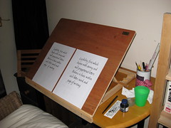
All this has been helped immensely by the appearance of my new calligraphy easel, handmade for me by Rowley Abbey of Abbey Easels - fantastically pleased with the result, and it was made in super-quick time to my own specifications. Great workmanship - I would highly recommend him to anyone.
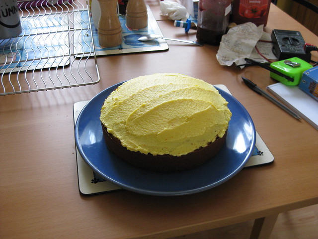
In other news, I've been making cake:
 |
| Mmmm, cake :-) |


No comments:
Post a Comment