Pages

Tuesday, 27 March 2012

The Death of the Letter?

(courtesy of Jenny Mackness. CC licensed)
Controversy in the British Press today as Royal Mail announce a 30% increase in stamp prices . A first class stamp is going to rise from 46p to 60p, and second class will go from 36p to 50p; I remember a time when a first class stamp was 27p, and it wasn't that long ago (10 years to be exact).

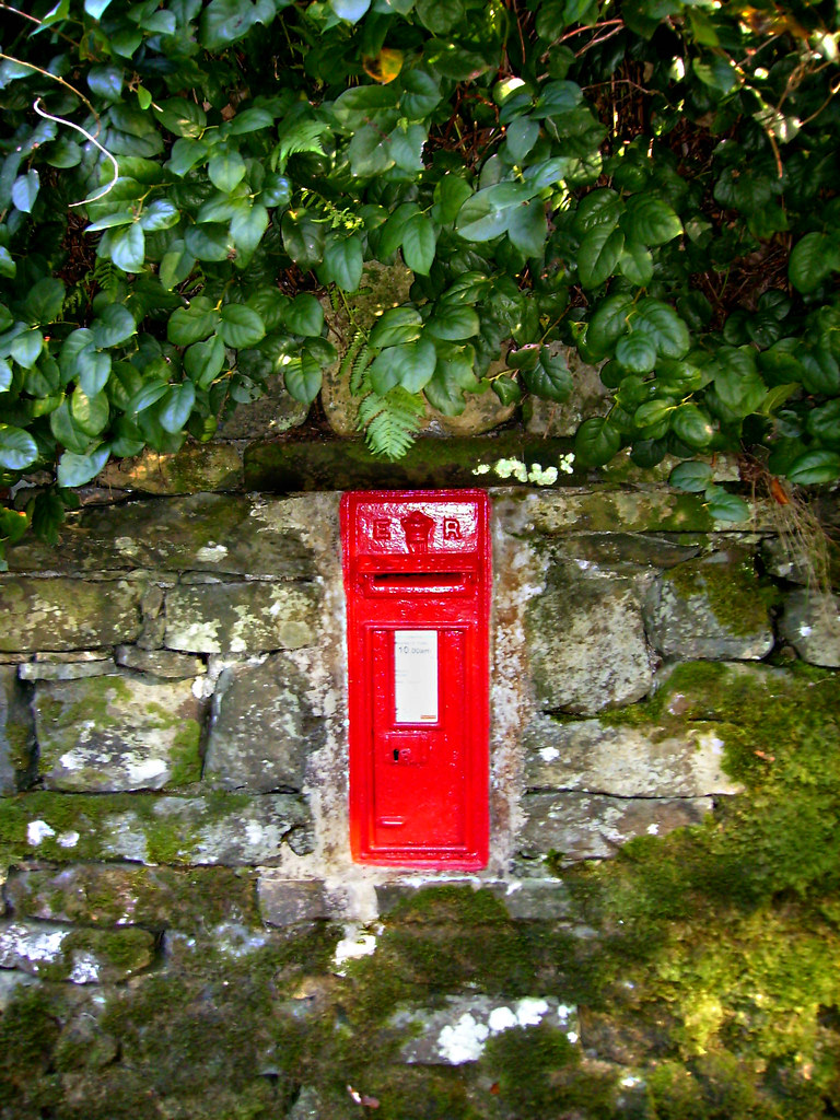
If the comments on the BBC article are anything to go by, reactions to this news have been mixed to say the least. Many are proclaiming the death of the handwritten letter (I suspect these to be the same people who believe that ebooks spell the demise of the printing press and real books along with it); some think that the elderly will suffer most and it is our social duty to teach them all how to use email; some believe that something ought to be done, but not this (strangely lacking in other bright ideas as to how to tackle the issue though - funny that); and there are a few brave souls who have put their hands up to say they think it's a good idea, and that 60p is a small price to pay for "a physical item, collected within a short walk from your house, transported to the other end of the country and put through a specific door, all within 24-48 hours" - foolhardy behaviour indeed in a BBC comments section where such reasonable and well expressed opinions are not much appreciated by the anonymous lurking populous.

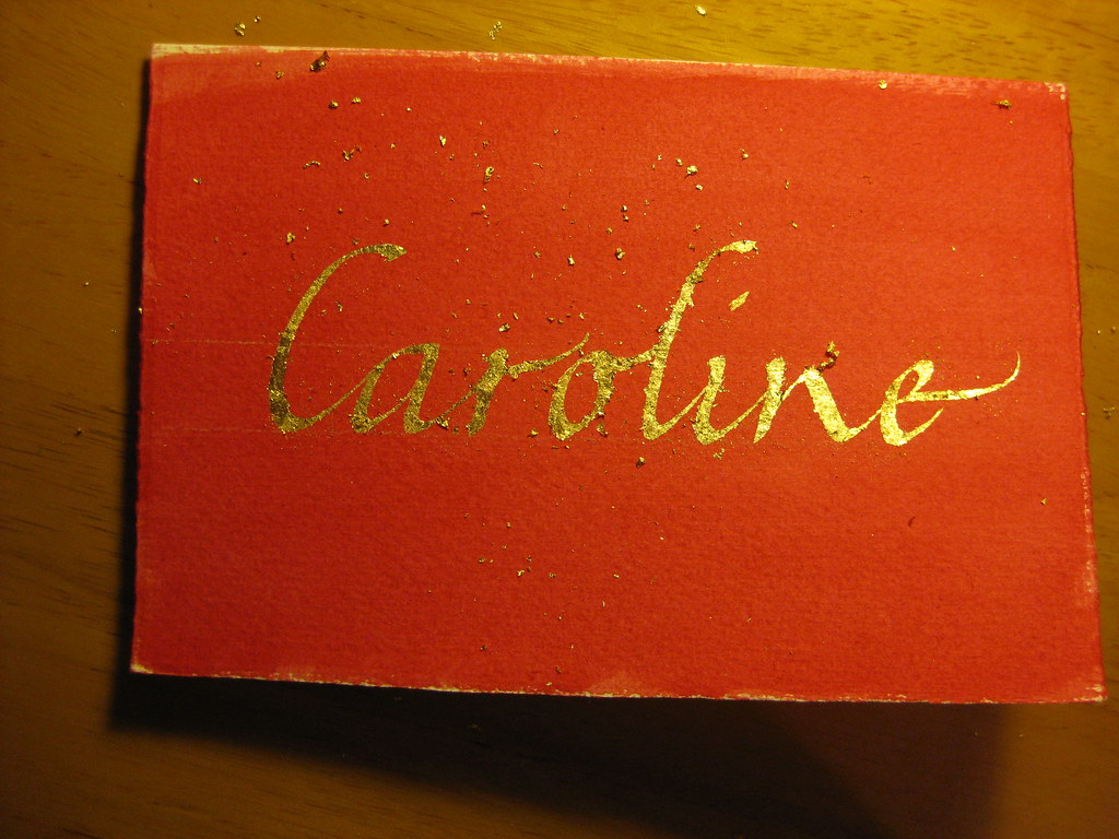
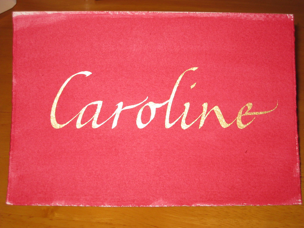
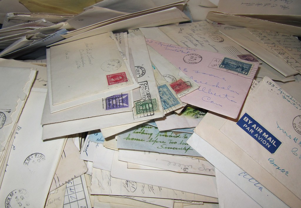
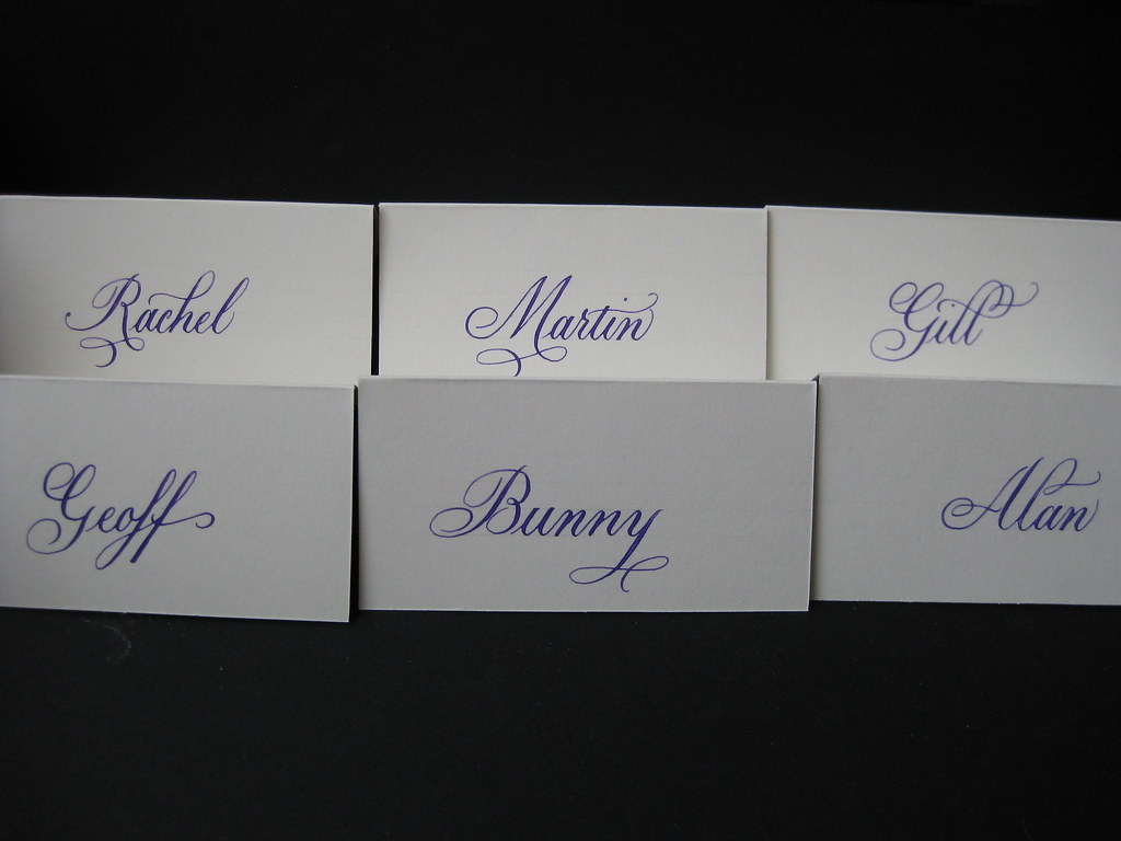
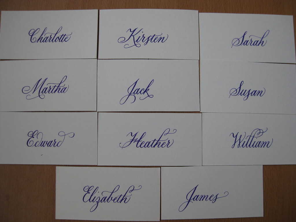
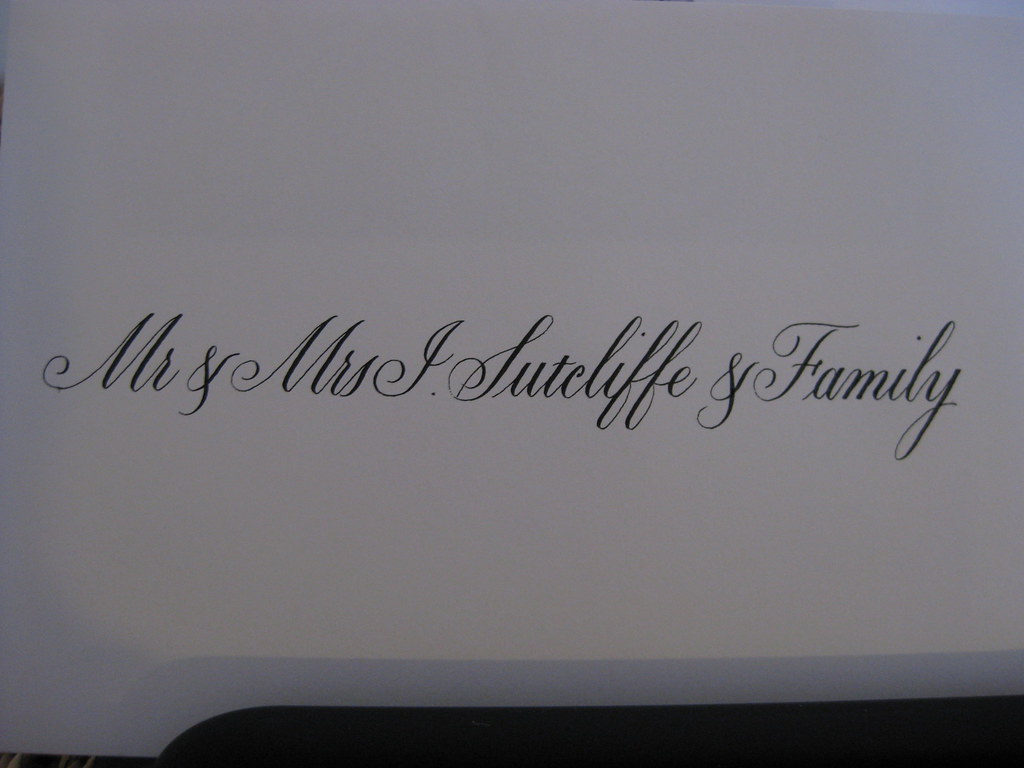
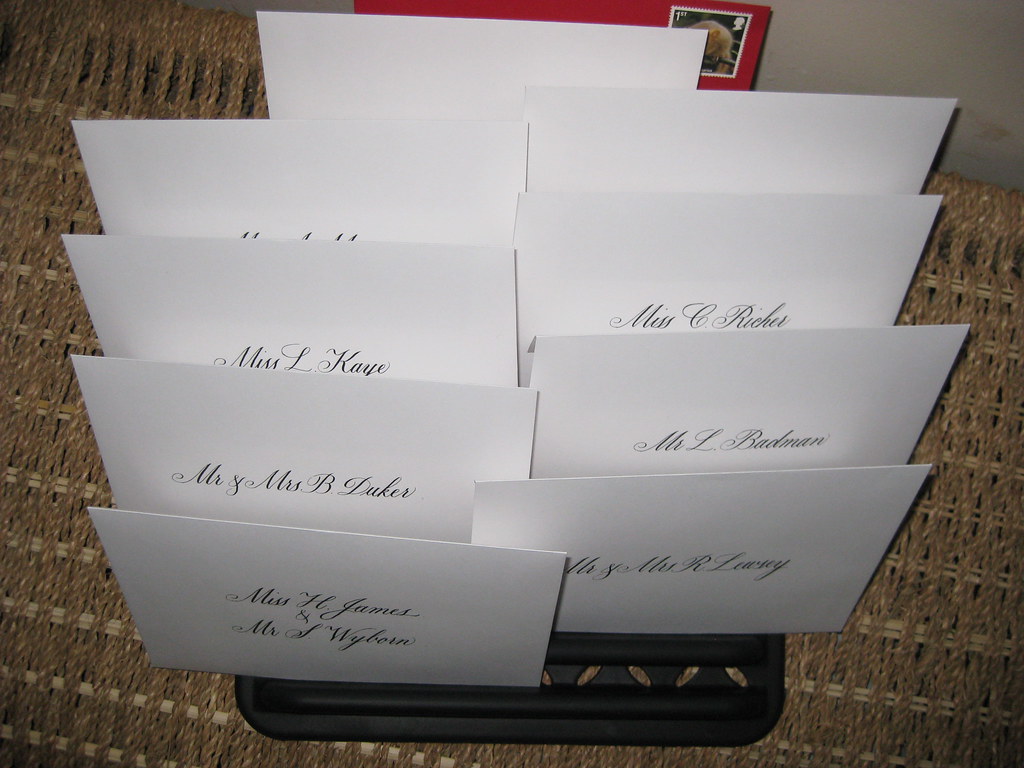
What has all this got to do with Calligraphy I hear you cry? Regular readers of this blog will know that I am member of two envelope exchange groups through the CLAS Copperplate Special Interest Group.They run on a 6 monthly cycle and you work your way through your list of names and addresses sending an envelope you have designed and written to a different person each month - if everything works smoothly then by the end of the cycle each group member has received an envelope from each of the other members.

(courtesy of whistlepunch. CC licensed)
What with one thing and another I had got a little bit behind with my envelopes recently, and yesterday I made my way to the Post Office with 4 envelopes in hand ready to go off to various locations around the world. I can't remember the exact cost, but in total it came to about £1.30 - one of the envelopes was going to Ireland, one to Australia, and two were staying in this country (all first class). In my opinion that is a bargain. Will the price rise put me off from continuing with the envelope exchange? No. Would I be happy to pay a bit more for this service to continue? Yes, most definitely. Each month I receive beautifully written and designed envelopes (the most recent of which also included an exquisite hand illustrated moth on the front) from all over the world; for 60p you can keep them coming!

Whilst reading the various reactions to this story a few things have come to my attention that piqued me into writing this post in the first place:

  • The repeated assertion that such an enormous and unjustified price rise will drive people ever further towards 'free' types of communication such as email. Err, excuse me? This must be some new meaning of the word 'free' then. Last time I bought a computer it cost over £300 pounds (it only lasted 2 years) and that certainly didn't include access to the internet. So the argument that we should persuade the [hard up] elderly to forget paying 50p for a stamp, and instead pay ~£500 for a computer and goodness-knows-how-much on broadband provision isn't really going to fly - they're not stupid you know.
  • There's no guarantee that your mail will be delivered to the right place, or won't get 'lost'. To be fair, there's no guarantee that your email won't end up languishing in somebody's spam folder either (or get lost in thin air for that matter - it's happened before). And there's an awful lot more to go wrong with a computer than a pen and paper; when have you ever experienced the blue screen of death when writing a good old fashioned letter? The worst that could happen is you can't find a pen...
  • The assumption that most people who write letters and use the post (for personal correspondence) are a) old, and b) only do so because they are incapable of using any other means of communication. Given that I am not yet 30 years old, I have not quite written myself off as 'old'. I am also quite clearly capable of using a computer when I put my mind to it. I write and send letters because I choose to. Shocking, isn't it? I also enjoy receiving letters in return, and firmly believe that the art of letter writing is not yet dying, and the romance of receiving letters is far from dead. The only people who would have you believe so are to be pitied, because they are missing out on both.

Friday, 2 March 2012

Wedding calligraphy #1

Here's a sneaky peak at some of the place cards I wrote out for my wedding in February. The colour scheme included creams and purples, so for the place cards I mixed some purple gouache and used it with a Brause 66EF nib.


The names were originally written on standard ivory tent-style place cards (from Hobbycraft), but once we'd decided to get the favours from the world famous Grasmere gingerbread shop Sarah Nelson's, I cut each 'tent' in half to give a flat card and tucked them inside a strip of ribbon tied round each box.

Elizabeth is officially the most gorgeous name to write in Copperplate. More people should call their daughters Elizabeth.

I had great fun practicing some little flourishes to add to each of the names. Some lend themselves more naturally to this approach than others, but trying to find something to add to every name was a nice challenge.


I had a lot of positive feedback from our guests, with many of them saying that they'd be keeping their cards as a memento of the day. Unfortunately I don't yet have any pictures of the cards in situ, but I hope that one might crop up somewhere.

I also wrote out our table plan in copperplate. My pictures of this, as a work in progress, got eaten on the journey from the camera to the computer :-( but I should be able to obtain some pictures of the finished thing to share with you soon. The creation of the table plan is worthy of an entire post on it's own! (now there's something to look forward to).


Monday, 6 February 2012

Stop gap...

I have been terribly remiss about posting the last few weeks; not because I haven't got anything to show for myself - in fact I've been doing lots of lettering - I'm just lacking the time to take some pretty pictures and post properly!

For the moment, here's a link to an excellent calligraphy blog with some amazingly beautiful lettering. This particular post gives very useful step-by-step instructions on how to recover small mistakes - very handy indeed, and very kindly shared expertise by the Constant Scribe.

How to save an Envelope

Stay tuned for some photos of recent work, just as soon as I have five minutes!

Saturday, 24 December 2011

Happy Christmas :-)

Gold gouache on black card. Brause 66EF nib.

I hope you all have a lovely Christmas and get to enjoy some time off over the coming days.


And while I had the Gold gouache out...


Tuesday, 13 December 2011

Putting my Copperplate into practice

Wow, it would appear to be quite a long time since my last post - the last few weeks have flown by in a whirl of invitations, envelopes and settling in our new cat!

Working through my first full set of  wedding invitations and envelopes has been quite a steep learning curve. Copperplate script is a very popular style when it comes to wedding stationary, whether it's the whole invitation laid out in beautiful swirly writing or just the names added to pre-printed cards; it adds an extra dimension and a touch of something a little bit special. Having the envelopes addressed in the same lets the recipient know that this isn't any ordinary bit of post, and usually grabs their attention from the pile they've picked up from the mat.


Once the most appropriate x-height, nib and ink have been decided upon there are a few more things that need attention: it's important to settle on a particular style of capitals so that the appearance throughout the envelope and card is unified and doesn't look undecided, and it's also important to establish a method for working.


Envelopes drying out in my drying rack


One piece of kit that's essential is some form of envelope drying rack. Now you can by lovely wooden ones from places such as Paperinkarts in the States, which hold 9 envelopes (I've not managed to find a UK stockist of such things), or I chose to use a plastic dish rack which holds 20 envelopes or invitation inserts and was relatively cheap from Amazon! Whatever you decide to use, it's an absolute must in terms of organising your work.


If you haven't thought about it first, it very quickly becomes clear that you need a quick and reliable method of centring names and working out where best to sit them in relation to the text above and below them. The first is easily done with a strip of paper the width of the envelope or invitation, folded centrally and marked off with the start position of each name (working from a practice version written out beforehand). For the second, guidelines marked with an x on the appropriate line help immensely. I'm sure that eventually, when I become practised enough, I'll be able to judge more easily where things start and finish, but for the moment it's safest for me to do a rehearsal version first (on layout paper) to guard against any nasty surprises!


 As for the cat, it's best to try and keep him safely out of the room so that he doesn't walk muddy paw-prints all over your work!

Doesn't he look hard-done-by?

Friday, 28 October 2011

Skewings!


Ferruginous Hawk by contemplicity (CC licensed)
This guy is accipitrine

As a little addendum to my previous post I've just learnt that the technical term for the little bits of gold leaf left over after gilding (as in this picture here) are called skewings. How great is that :-)

Along with two further excellent words I've learnt this week: accipitrine (meaning of the falcon kind; hawk-like); and sybaritic (characterized by or devoted to excessive luxury (that's me!)) I'm feeling rather pleased with myself!

Monday, 24 October 2011

Dealing with my gilt complex (with thanks to Terry Pratchett)

This week I have mainly been...

1) Panicking about how much calligraphy I want to do (and how little time there is in which to do it)

5 Months have passed since I first joined the CLAS Copperplate Special Interest Group and that can mean only one thing - it's time for another round of envelope exchanges. Disappointingly, only three of the five envelopes I was expecting to receive in the last round turned up, so this time I offered to be in two groups, thereby doubling the number of exciting envelopes that will drop through the door (I know, I didn't think about the 'twice the amount of work' aspect at the time!). On a more positive note, one of the recipients of my envelopes last time was impressed enough to feel the need to write back, so I am busy preparing another envelope to send in reply :-)

2) Gilding/Making a card for a friend (This bit is slightly more interesting and involves more pictures... )

Next weekend we are off to a friend's birthday party and, not needing much of an excuse, I thought I'd have a go at making her a card. Last time I was at a workshop my tutor showed me a commissioned piece that she had recently finished that was gold leaf on an acrylic wash background. 'Oooh', I thought, 'that looks pretty - I wonder if I could do that'.

A very out-of-focus picture of a card with acrylic wash
My ever wonderful Mum (who is a watercolour artist and veritable mine of information on all things crafty) had previously provided me with some cards of watercolour grade paper with deckled edges, a book of gold leaf (loose), some size (glue) for sticking the gold leaf to the paper, and a large flat brush for washes. I watered down some crimson acrylic paint and painted a fairly intense wash on two cards (see right) and a piece of watercolour paper for experiments.

I hadn't taped any of these down (mainly because I've lost my masking tape) and to my horror they immediately began to curl up. 'Fallen at the first hurdle', I thought, but actually as they dried they flattened out again - phew!

Some experimentation in black ink on layout paper ensued, to get the right nib size and finalise the Italic variation I would use, and after this I ruled up on the test card (using a white pastel pencil - this shows up against the paint, but will also rub out). Initially I just used the plain size in the nib reservoir to write onto the prepared paper, however not only is it a bugger to see once it's dry, but it's also very thin and flowed too quickly out of the nib. I persevered and made a fairly messy attempt at sticking the gold leaf to it, but I learned some useful lessons before attempting one of the cards.

Immediately after the gold had been applied - gold bits EVERYWHERE!

The second time around I added some Dr. Marten's Pen White to the size which had the double effect of thickening the liquid and allowing me to see where I'd written. I then used two very small brushes to apply bits of gold leaf to the writing. Two bits of advice: press the leaf on, don't brush; and DON'T BREATHE! - the stuff is lighter than a feather and will get *everywhere*.


Brushed down, but not birnished


 After replacing any usable bits of gold leaf back in the book, I used an old (soft is the key) make-up brush to brush gently over the surface to get rid of any bits that weren't stuck down. The card then looked like this:


 Finally, some patience was required to let the gold and size dry thoroughly before burnishing (rubbing over to bring out the shine) with a soft cloth. There are special tools to do this, and I have heard that a piece of silk works very well too, but having neither of these I plumped for a soft cotton hanky and it seemed to do the trick:


 The result is pleasing, no? Anyhow, I hope she likes it - I had great fun doing it, and will definitely be doing more in the future!


Wednesday, 12 October 2011

Scissors and glue

Here's a quick picture of a paste-up I did over the weekend for a piece using the Apache Wedding Blessing:

This is two sheets of A3; landscape and taped together. Written in a No. 3 Mitchell Roundhand nib and black gouache. It's currently laid out at 3 body-widths spacing, but it may end up being 2 1/2, with the second block split to keep the narrowness of the first. I'll also have a play around with the text centred and offset before deciding on the final layout. Quite pleased with how the Italics are coming on though!