Pages

Showing posts with label Flourishing. Show all posts

Friday, 20 December 2013

The final pieces in situ...

I decided to re-do the inside cover for the box in the same copper colour as the other piece. I still haven't managed to find the flow and balance of the flourishes that I had in the original attempt, but the technical execution of the actual writing is much better, so I've decided to go with the new one. It's so difficult to bring it all together in a final piece and do everything to my satisfaction, but I guess that is what will ultimately drive my improvement!

Also, cutting pieces down and mounting them is a considerable pain, especially when you cut your finger with the scalpel and have to avoid dripping blood on your work!

Thursday, 19 December 2013

A little something for my Mum

It's my Mum's 70th birthday - we're throwing her a party at the weekend and I've been inspired to get my pens out to do a couple of little pieces for the guest book. After 18 months of no calligraphy I genuinely have no idea how I've survived without it. It's been wonderful to spend the last few days rediscovering my love of Copperplate, and I've really had to struggle to tear myself away from it!

Anyway, here are the pieces - I hope she likes them.

Thursday, 23 June 2011

I have come to the conclusion...

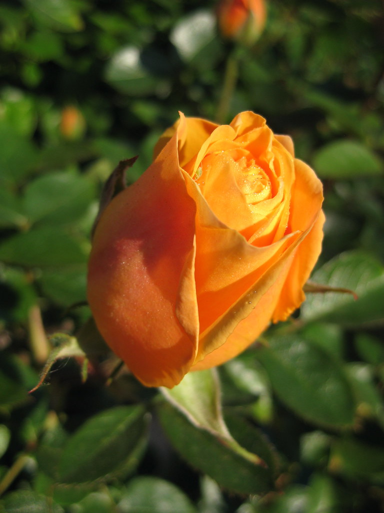
...that Envelope Exchange envelopes are like buses; you wait ages for the first one and then three turn up at once! Two more have arrived since my last post here - both nice examples of Copperplate, the most recent one being an absolutely superb example of what you can achieve in terms of layout and making the most of the space available - it rather raises the bar! (although in my defence I believe they've all been at it a bit longer than I have).

In turn I have sent my second envelope off to:
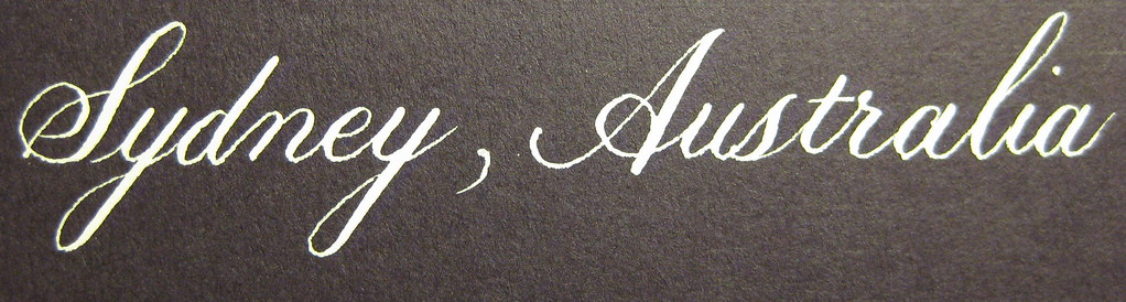
This one was written using my Brause 66EF nib in Dr. Martin's Bleedproof White. It's actually a dark purple envelope, but seems to have come out more black in the photo.

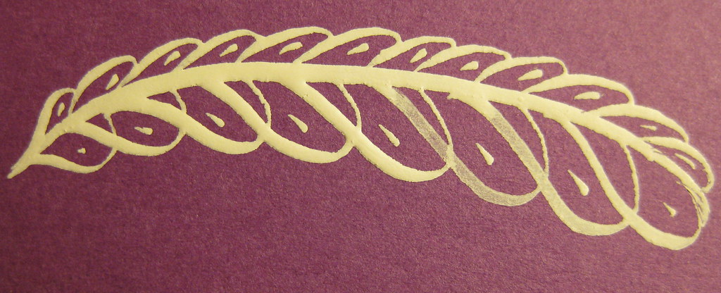
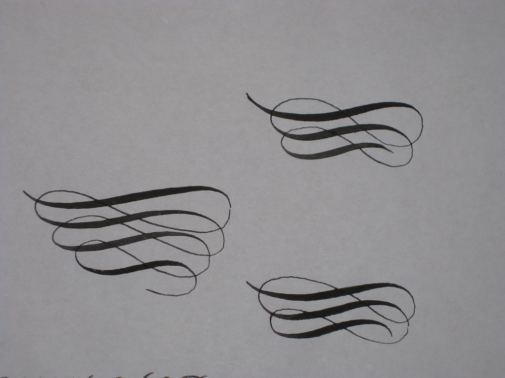
I also added a little offhand flourish like the feather pictured left (this was one of my practice ones). I'm always slightly terrified of adding things to an envelope that I'm pleased with, just in case I ruin it, but it's no excuse not to try really.


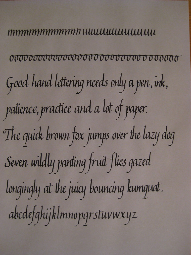
 Having received the set of Brause Bandzug nibs I mentioned here, I embarked on the 8 lines of continuous text needed for the CLAS certificate. I also decided to have a look and see what it looked like using the Schminke Red Pearl gouache watered down to use as ink. The results of my first attempt looked like this:
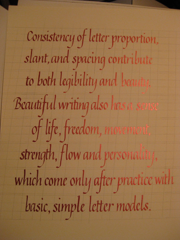
(apologies for the rather under-exposed photo - click for bigger)
I have to admit that I had huge difficulties getting the ink to flow nicely from the nib, resulting in several severely botched letters (it seemed reluctant to flow from both tines at once). I think it was simply a case of it being too thick ('Sorry Gromit, that was a bit thick!'), but having started I tried to persevere. Layout-wise it's not too bad, apart from needing to be consistently an inch further to the right, and this photo shows the pearl sheen of the ink really well. Unfortunately I don't think it's good enough to send in, so will have to do it again (probably just in black this time), but I was encouraged to see that amongst all the mistakes there's also so really nice lettering in there.
The deadline for entries is the 30th of June, so I'm going to be hard-pushed to get it all done in time, but if I work hard over the weekend I might be lucky!

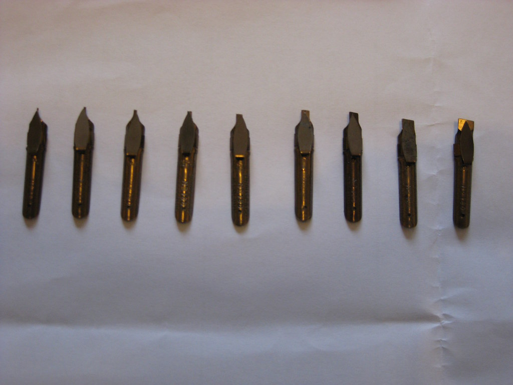
And finally, here's a picture of the full set of Bandzugs in all their glory:

Wednesday, 18 May 2011

Taking a break from the pointed pen

This time last week I was wittering on about looking forward to learning the basics of Carolingian minuscule at my evening class. Here's how I got on:

(click for bigger)
We tend to spend the first half of the evening discussing a particular script and practising the basic letter forms, and if we feel we're getting on well enough we can then go on and try using it for a passage of writing. I'm a firm believer in running before I can walk, so like to practice by writing things out rather than just copying out the alphabet ad nauseum.
The rounded bowl-shapes of the m, n and h lean more towards Uncial than Carolingian (as does the rounded ascender of the d), but my Calligrapher's Bible used these and I preferred the more distinctive look it gave over the straighter stems that were more like Foundation hand. A great hand for anything with a slightly Celtic feel to it - especially with a Celtic-knot border. Care needs to be taken over the spacing though, as it really shows up any overly-large white spaces (or any cramped lettering).


In other news, my Italics also seem to be progressing well. Here's a practice page from last week:
Much more consistent than earlier attempts, but this does appear to have been at the detriment of my Copperplate script, which I've been taking a little break from recently.


The lovely blossoming Crab Apple tree that I posted a picture of last time has sadly become a casualty of the building works at home :-( but we do have some lovely roses (see right) to make up for it a little bit. Looking forward to choosing a replacement tree to plant in November though.


And here's an early attempt at some flourishing. Still waiting [im]patiently for my parcel...

Tuesday, 10 May 2011

Getting distracted

A couple of weeks ago I had every intention of diligently pursuing Dr. Joe Vitolo's videos on IAMPETH on Copperplate majuscules, but I appear to have got distracted by several other things and am yet to find the time to watch them.

First off I received my copy of Ken Fraser's Copperplate Handwriting and spent some time going back to basics and working my way through some pages of exercises. I won't go into too much detail here as I intend to write a proper review of it as soon as I get the chance. Then the builders moved in at home, bringing with them their own special kind of chaos; next I thought I'd try my hand at some offhand flourishing exercises (which is an excellent way of ruining a perfectly serviceable nib, but very satisfying all the same - pictures to follow); and finally I received my list of envelope exchange addresses for the next 6 months :-)

The envelope exchange is run by the CLAS Copperplate Special Interest Group and basically means you complete an envelope design for a different person each month. It's great because not only do you have a small project to focus on, but you get to receive a lovely envelope each month too. Obviously I'm not going to be posting pictures of people's names and addresses, but let's just say that the one I've sent this month is PURPLE with silver ink :-) (and even a small attempt at a flourish in the corner). I'm quite pleased with the way it's turned out, but have learnt that Winsor & Newton metallic inks need to be thinned with water before being used for pointed pen work.

Things I'm looking forward to include:
  • receiving my fist envelope exchange envelope
  • receiving my latest order from John Neal Bookseller, which includes a DVD on flourishing techniques and some nibs to play with
  • attending some workshops with renowned local calligrapher Gaynor Goffe
  • learning Carolingian at my class tomorrow evening
And because this post would be otherwise entirely devoid of pretty pictures, here's some Crab Apple blossom: